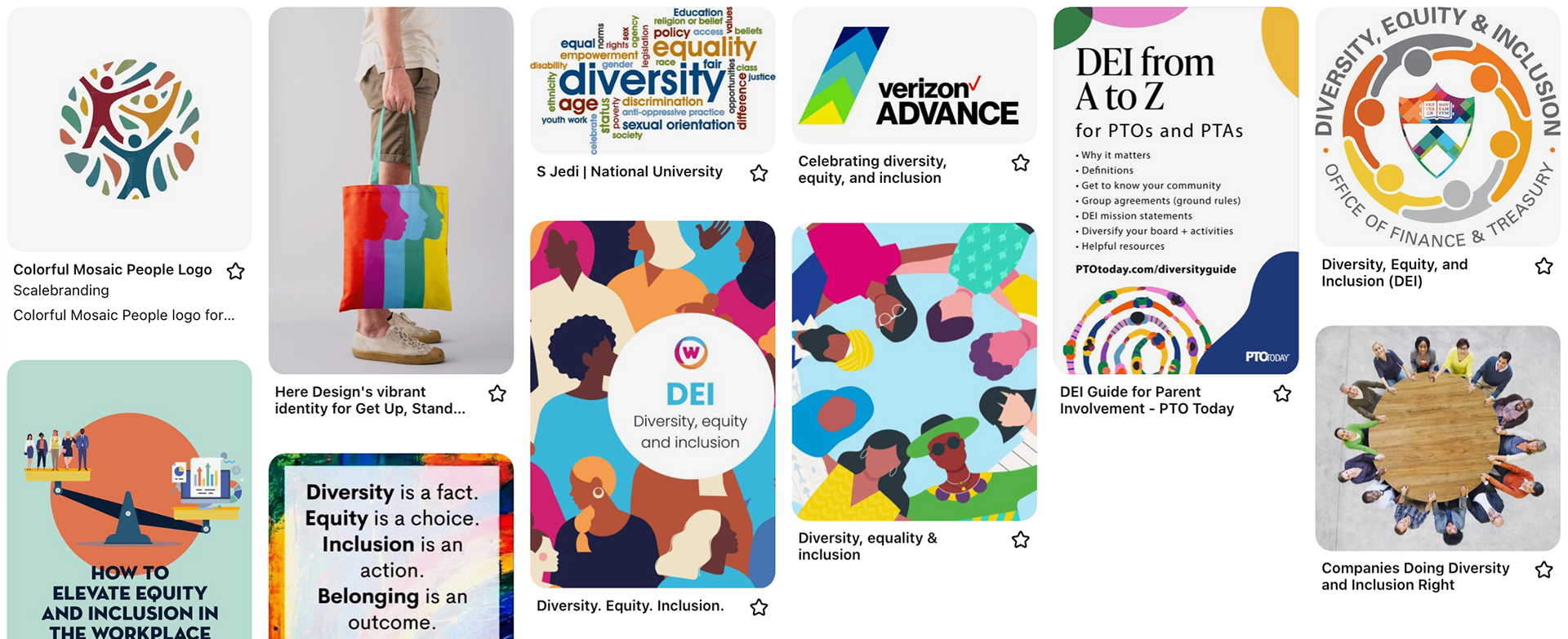
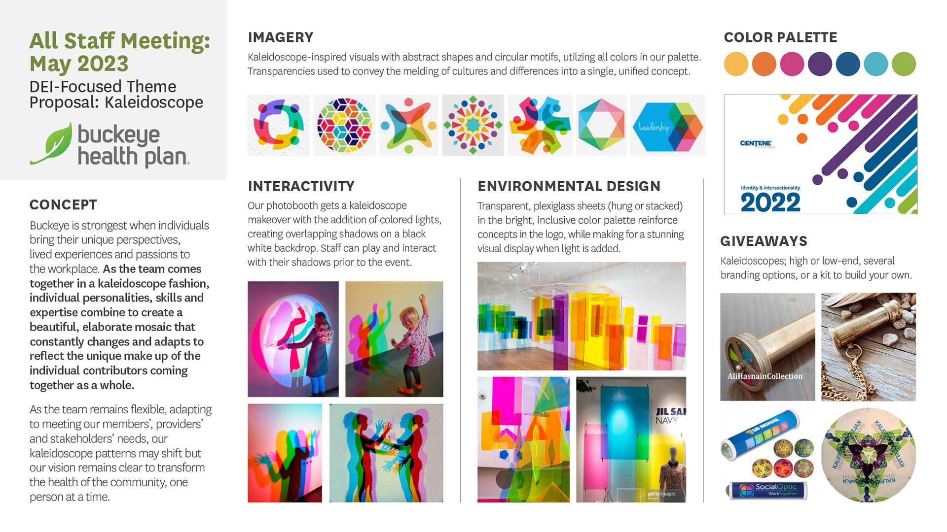
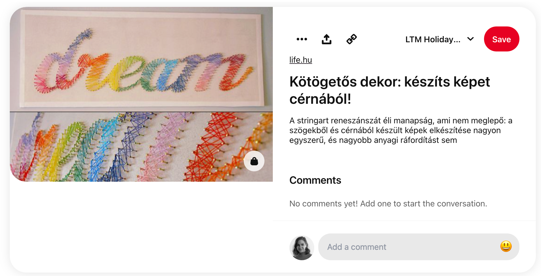
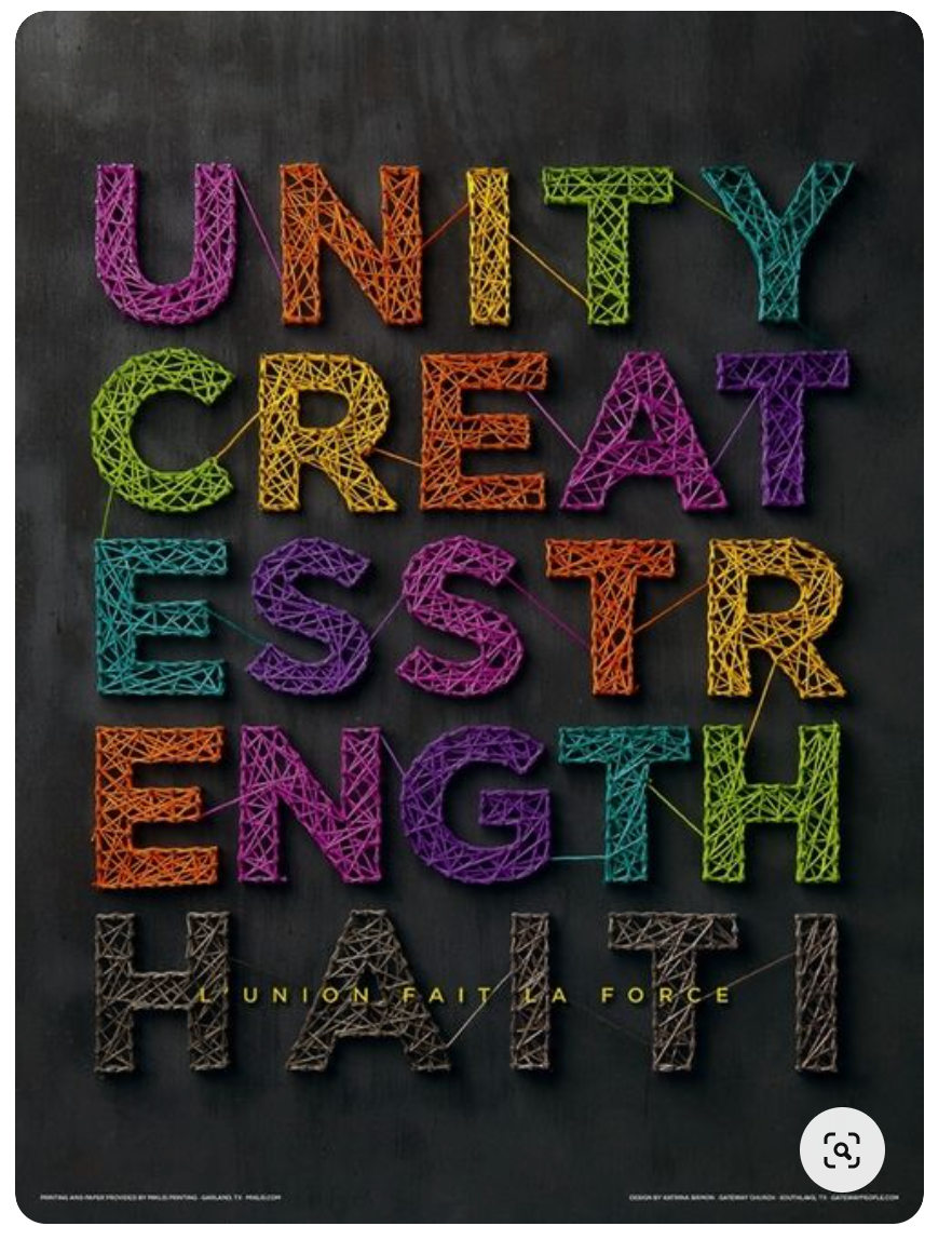
The client came to us ahead of this meeting with a request to center the theme around diversity and inclusion - without explicitly saying so. They provided this visual, from their parent organization, Centene, as the visual basis for this theme.
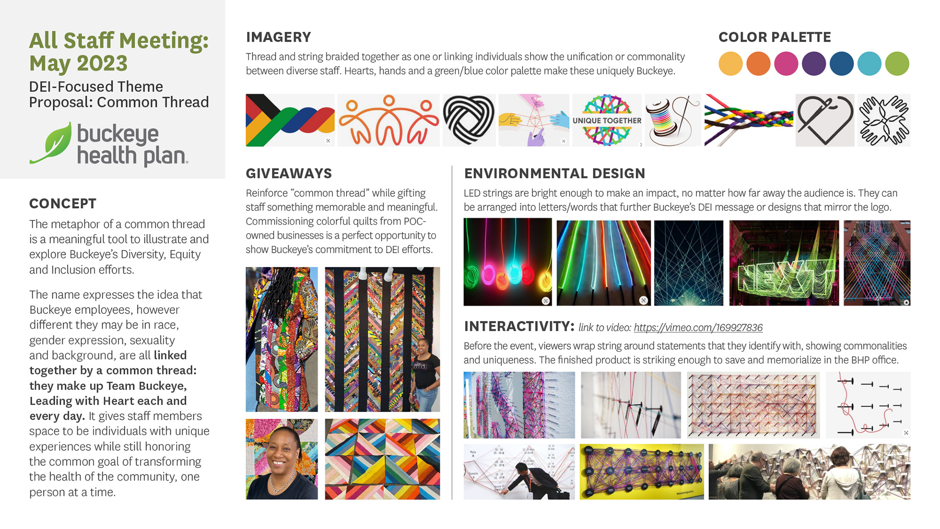
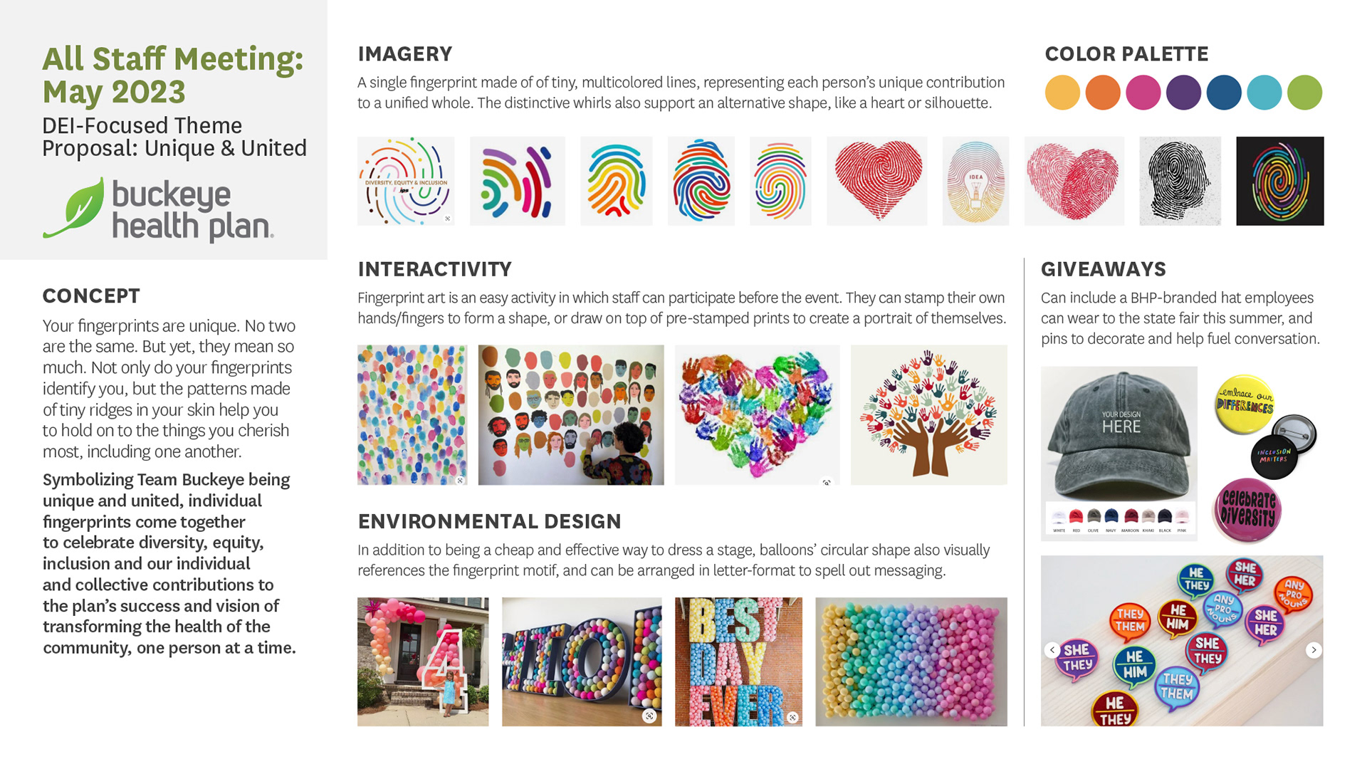
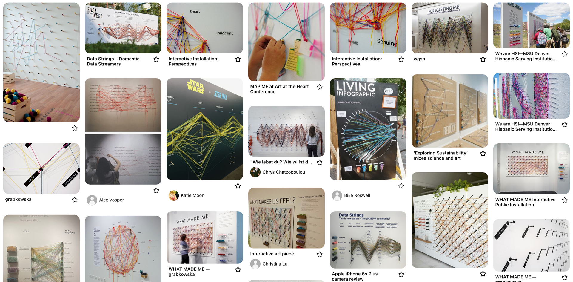
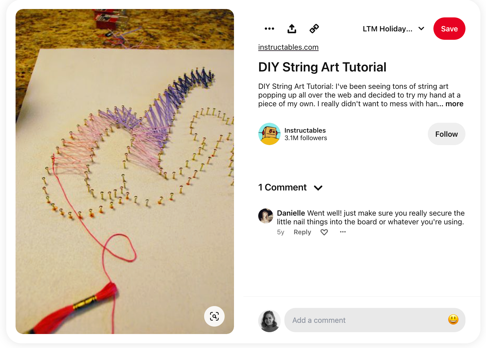
The client emphasized the importance of promoting diversity, equity, and inclusion (DEI) without causing division among employees. We started by examining how other corporations successfully conveyed DEI messages that are inclusive and apolitical. As I collected visuals meeting these criteria, I categorized them into themes that resonated both literally and metaphorically.
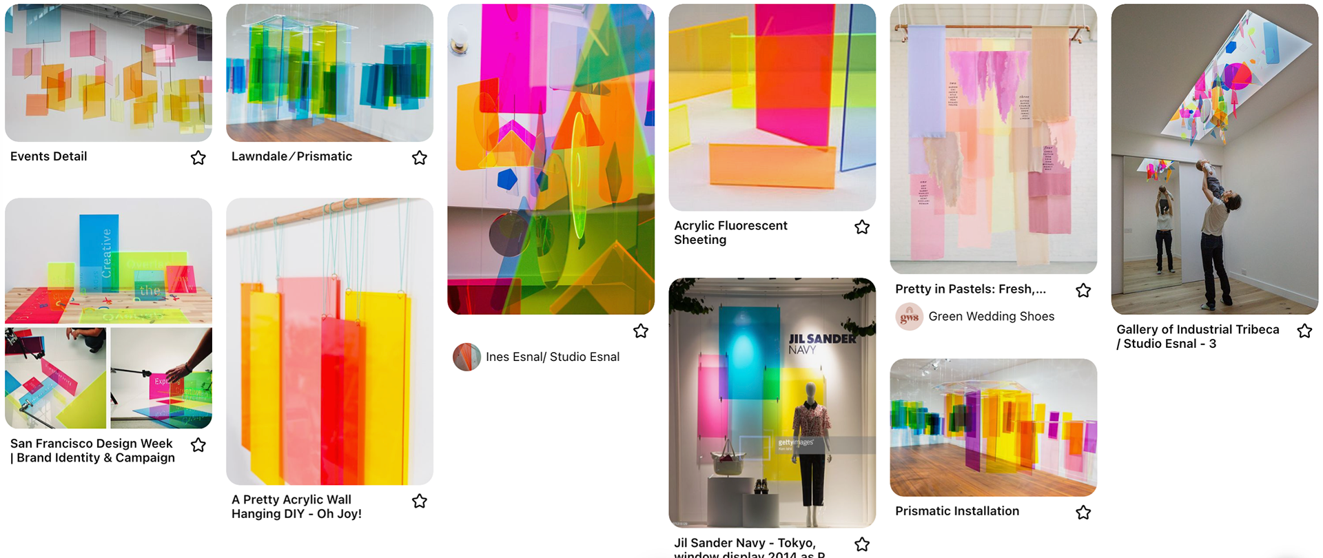
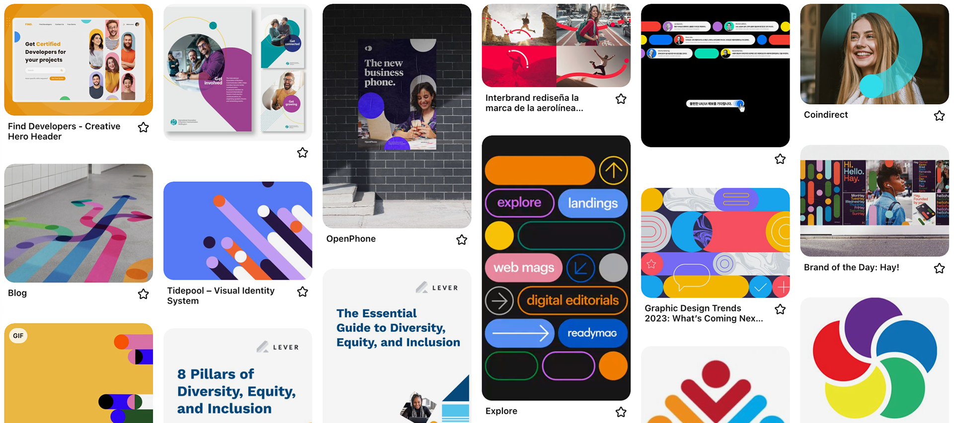
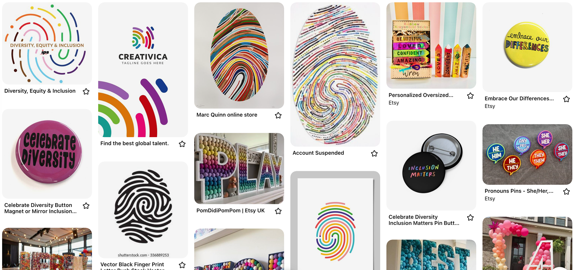
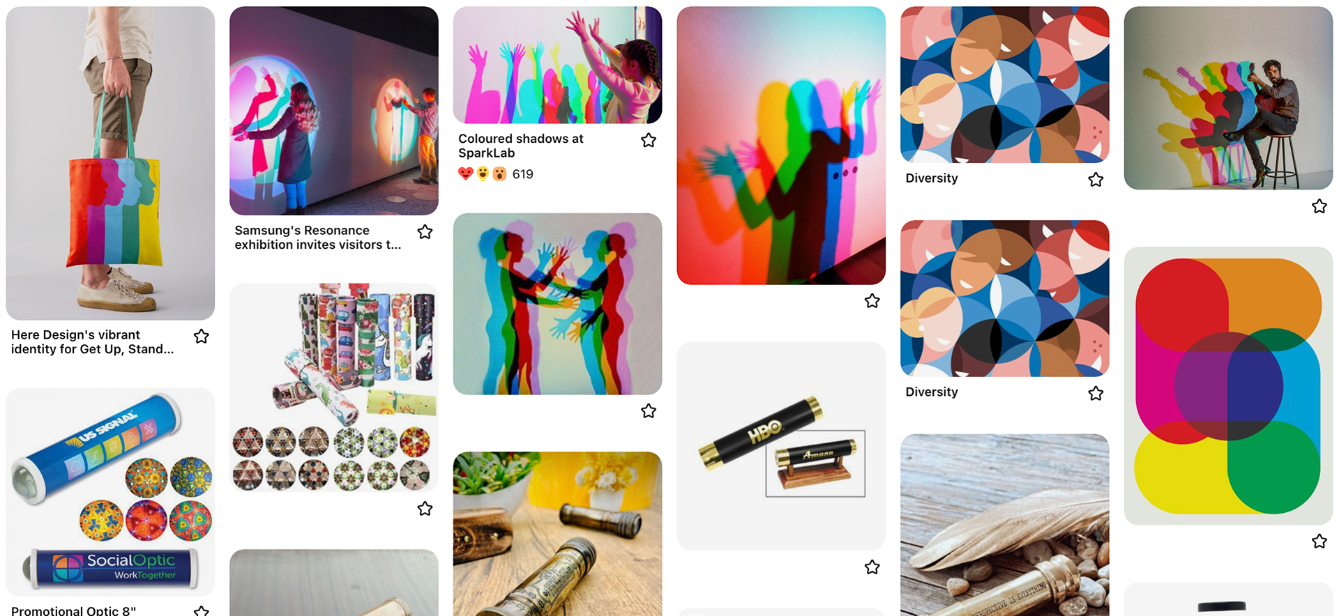
After developing visual themes, I worked with a copywriter to craft proposal slates for client presentation. These slates distilled key inspiration, providing a clear explanation of our intentions and how they could be realized at the event.
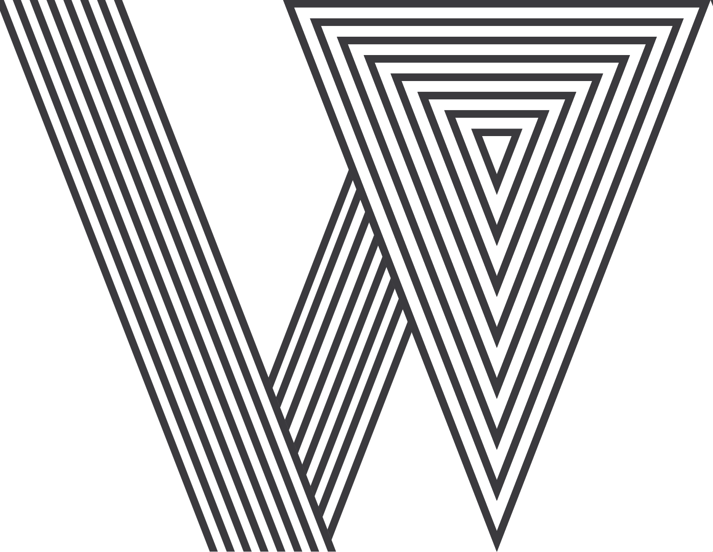
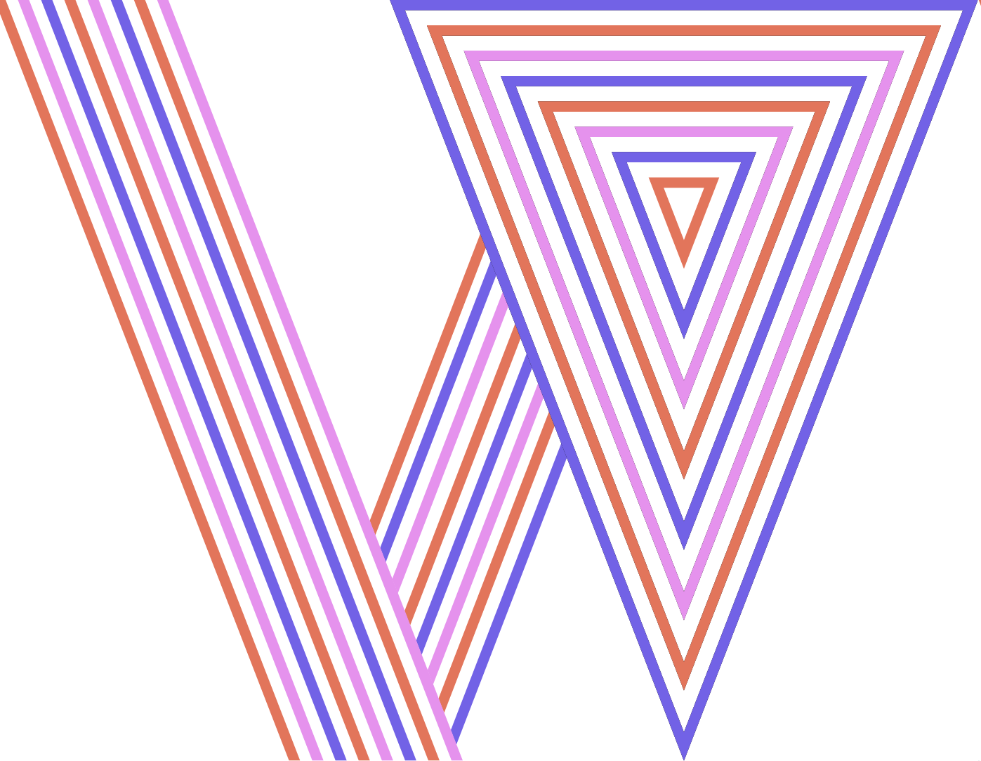
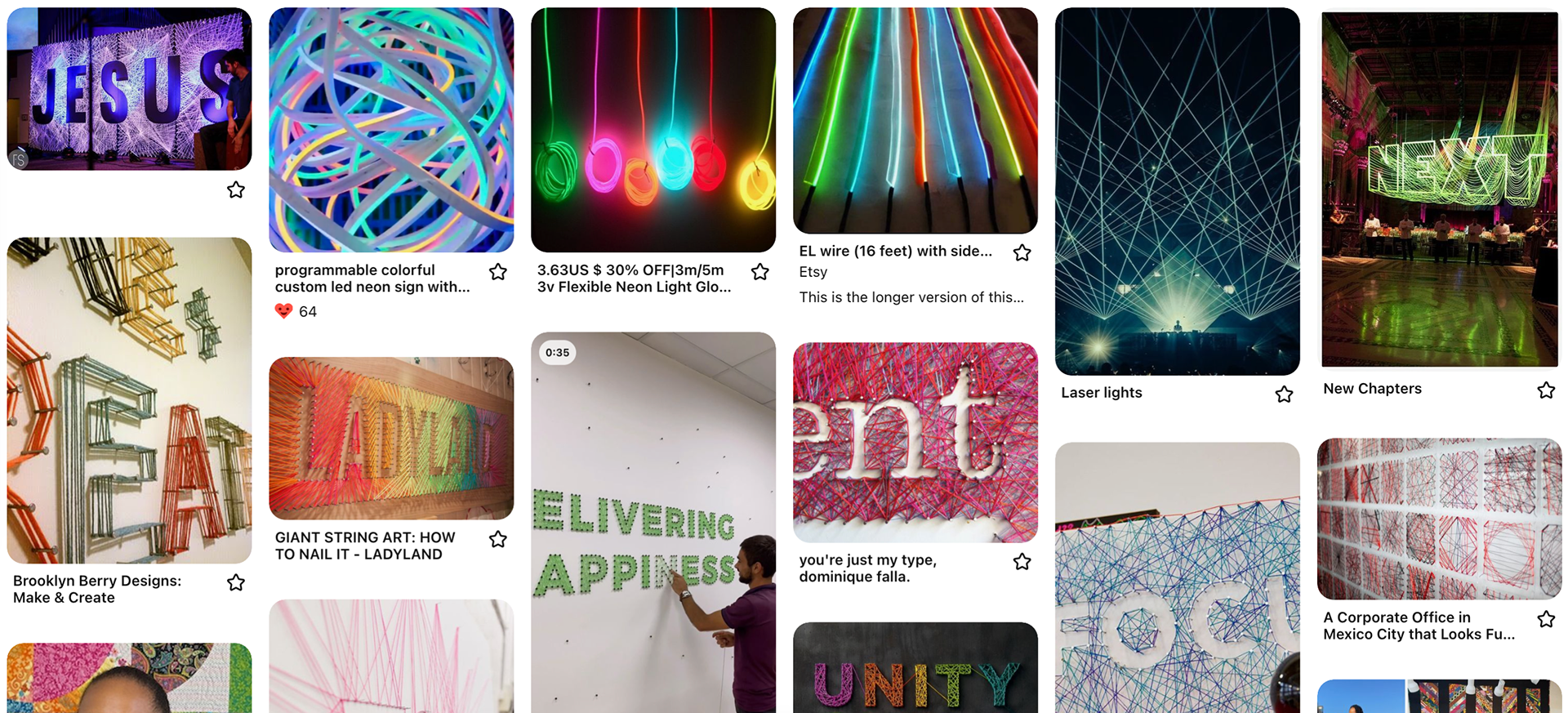
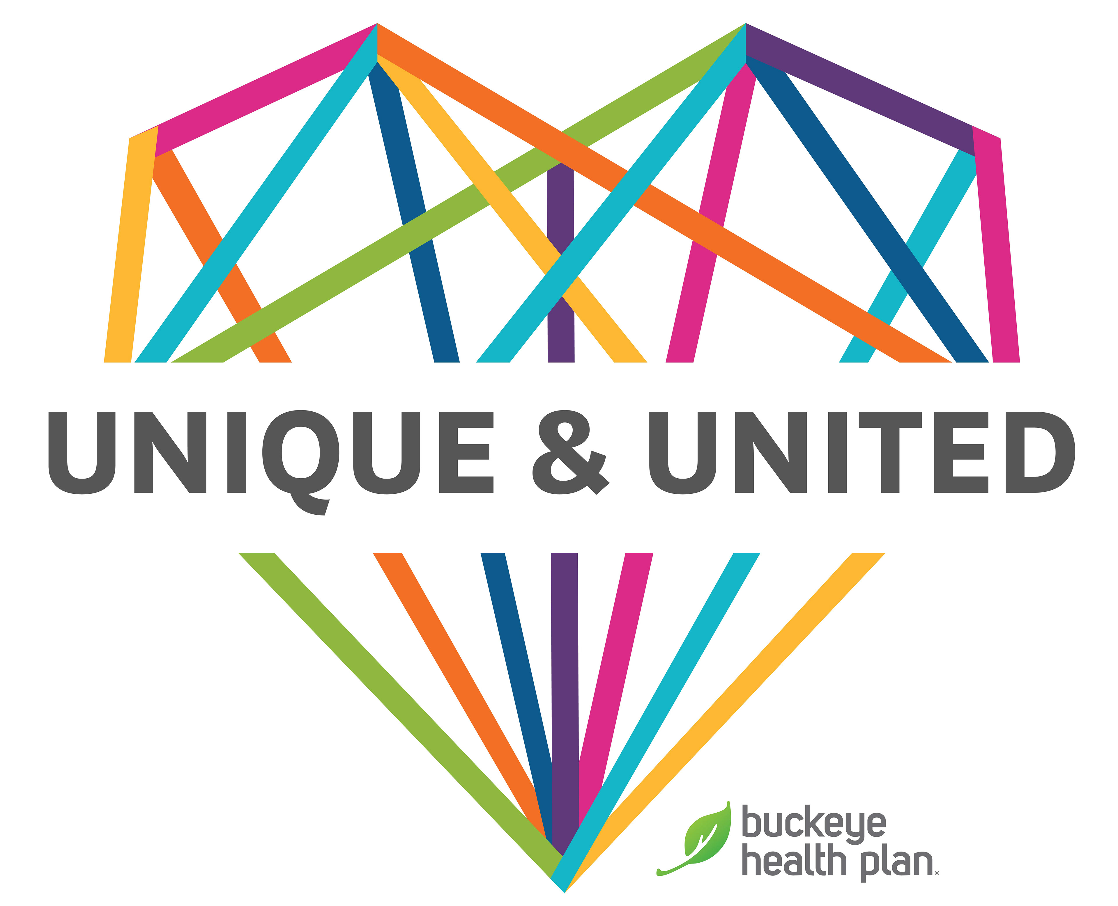
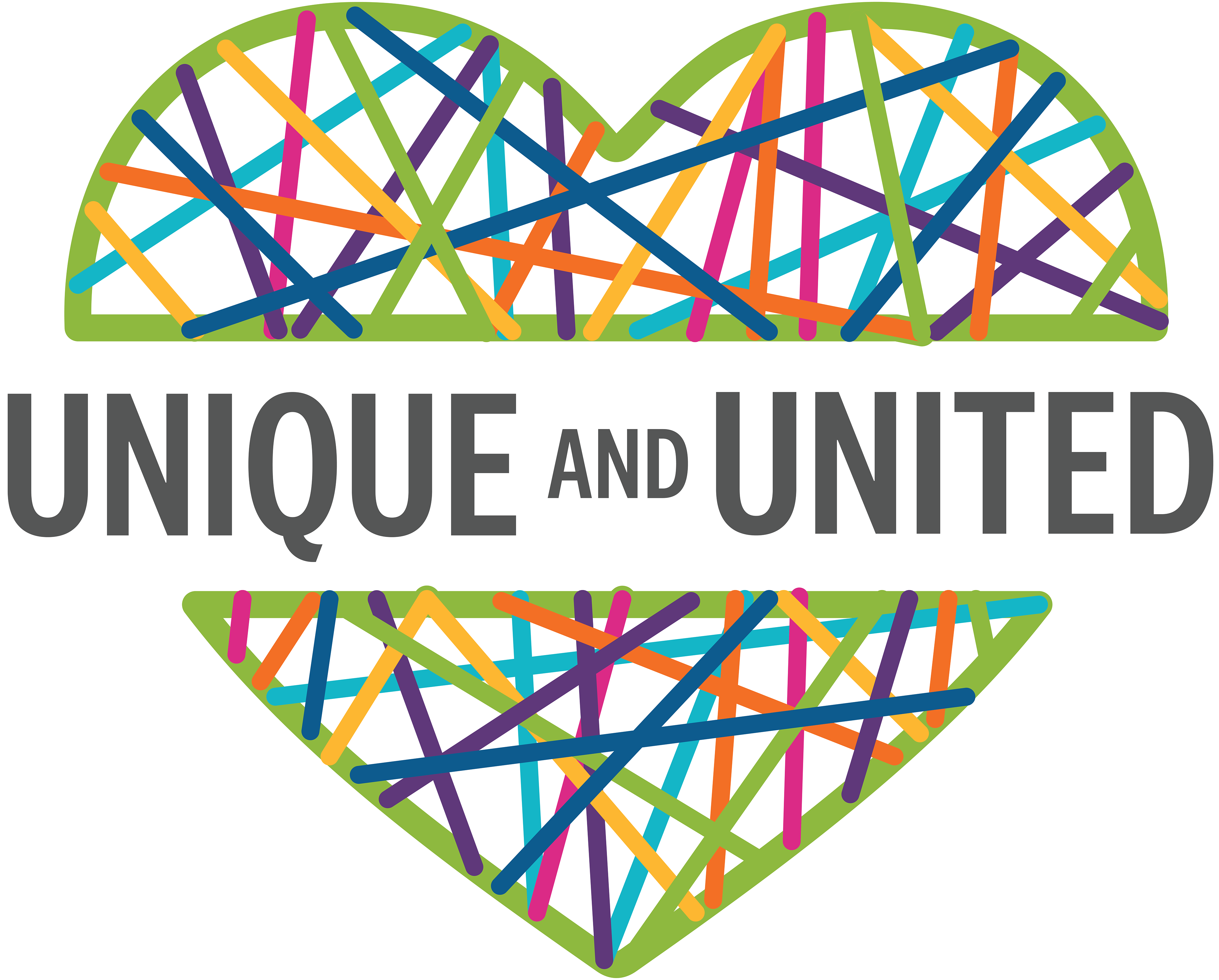
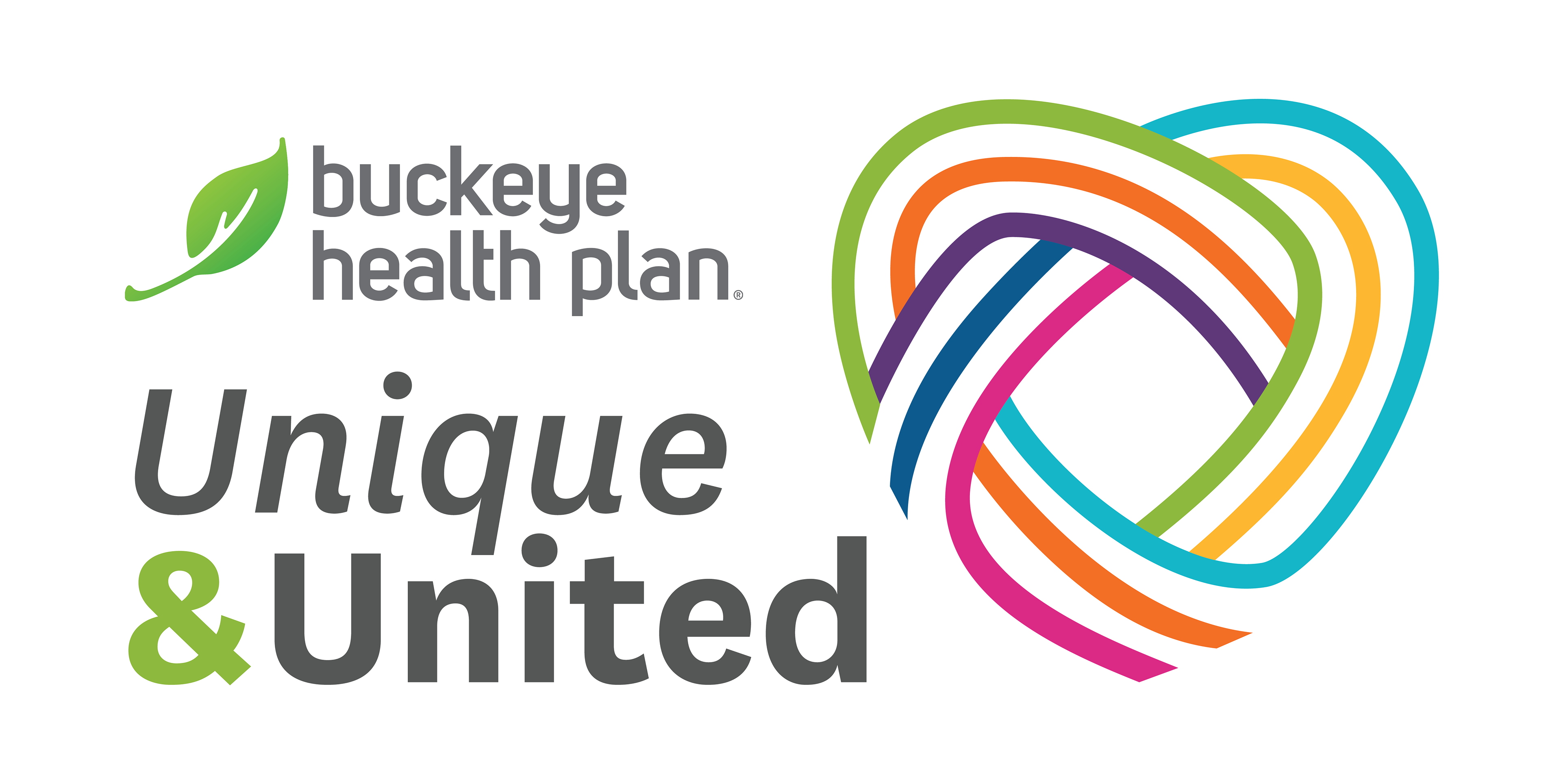
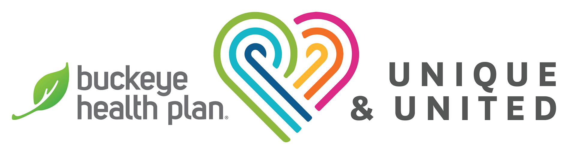
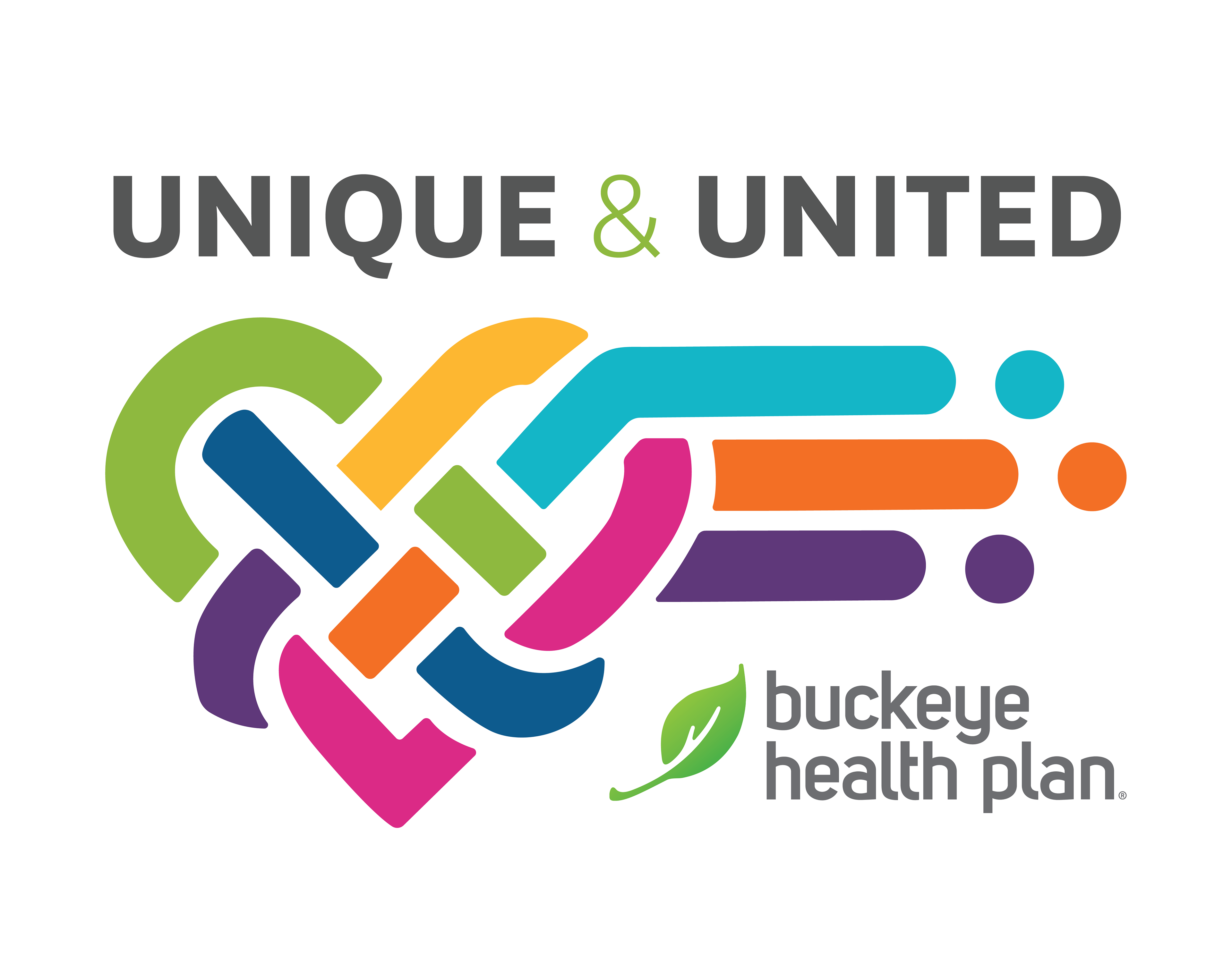
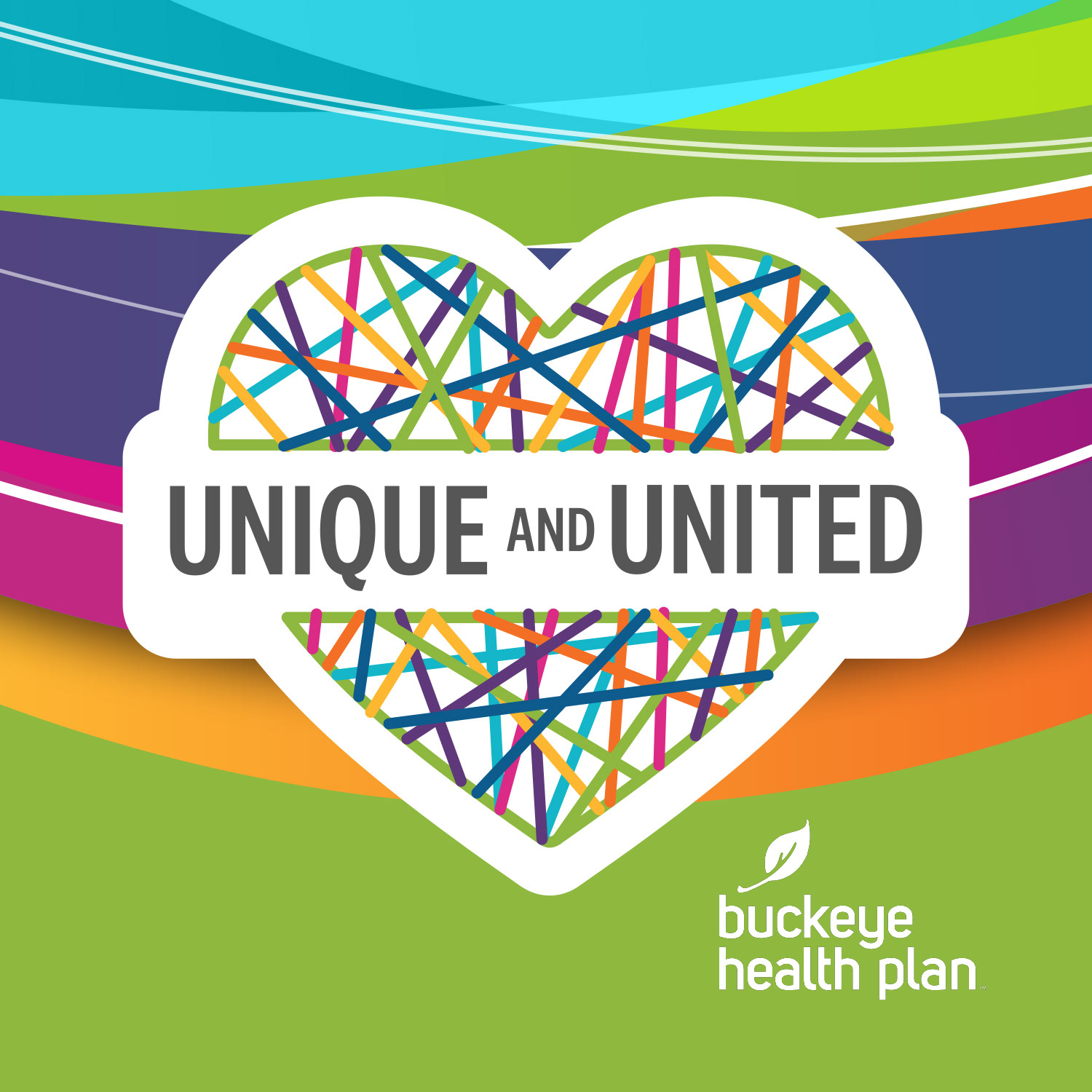
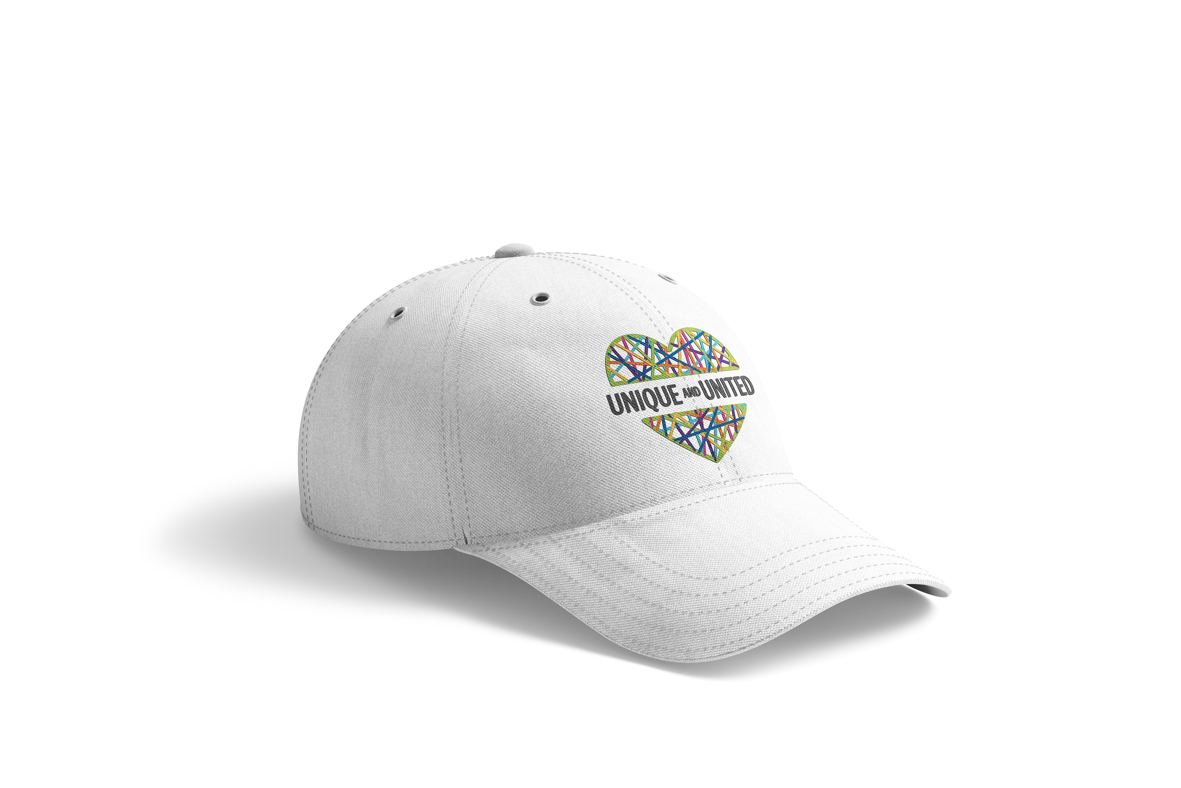
The client chose an unexpected blend of elements from the three slates. Using the selected name, I designed several logos and logo lockups inspired by their preferred "string art" concept. From these, our team selected three favorite logos, which I integrated into a new slate encompassing all the client's choices for presentation.
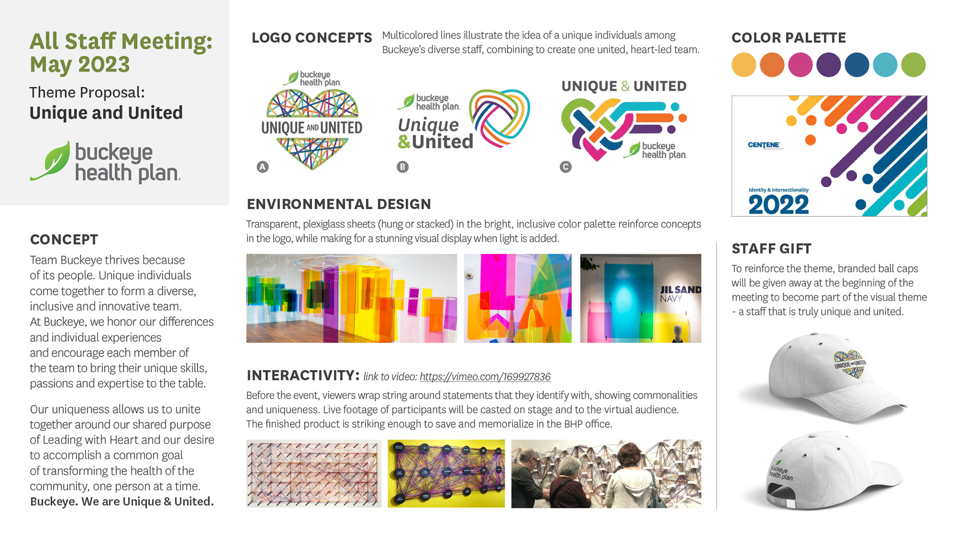
Following a conclusive meeting with the client, we solidified all the elements for the meeting, including the keynote speaker and grand finale. I consolidated them into a final slate for CEO approval, which then served as our theme "bible" and the foundation for the show.
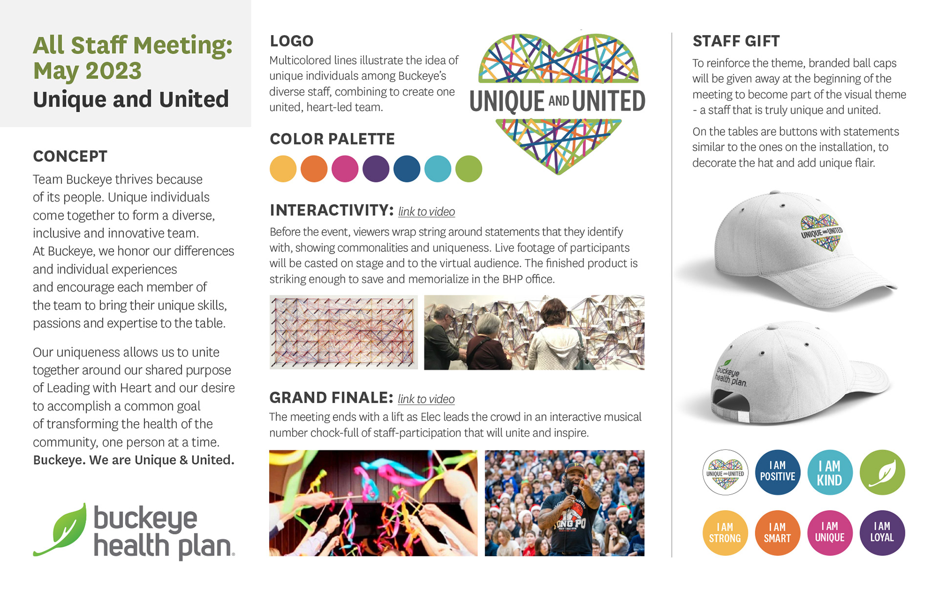
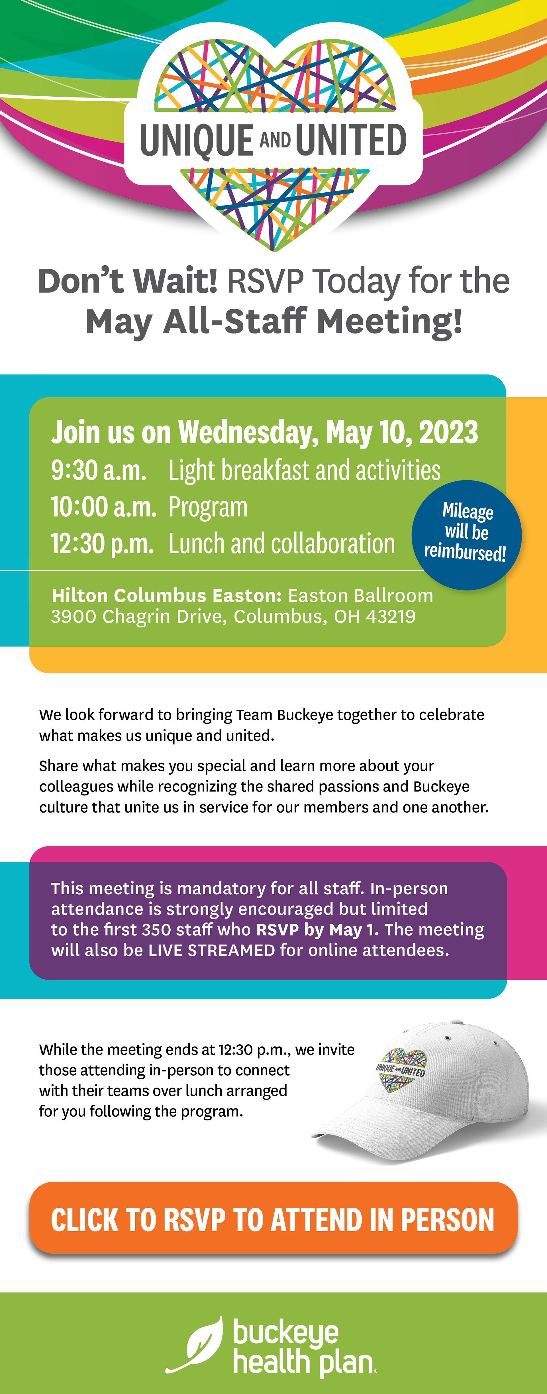
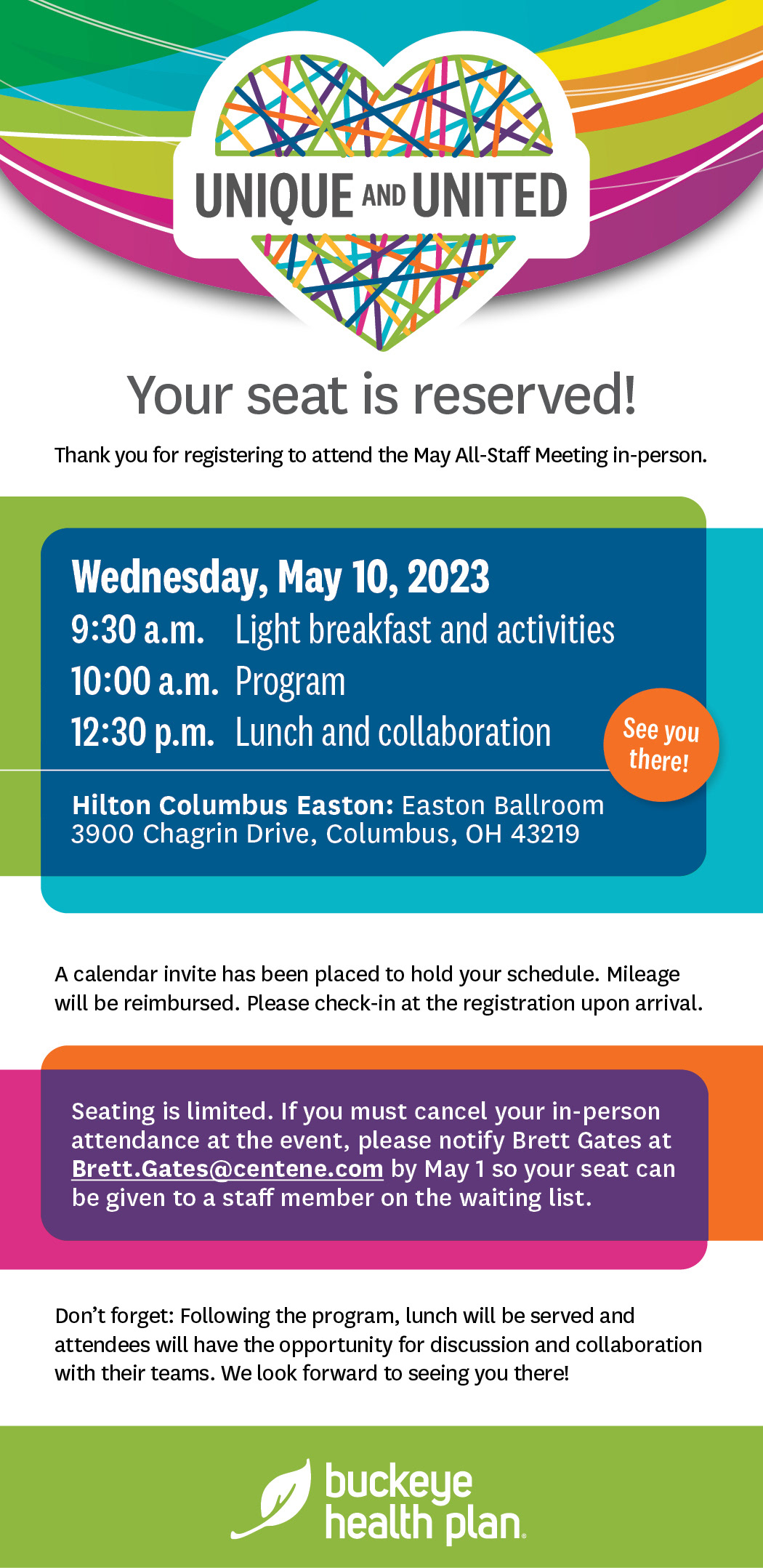
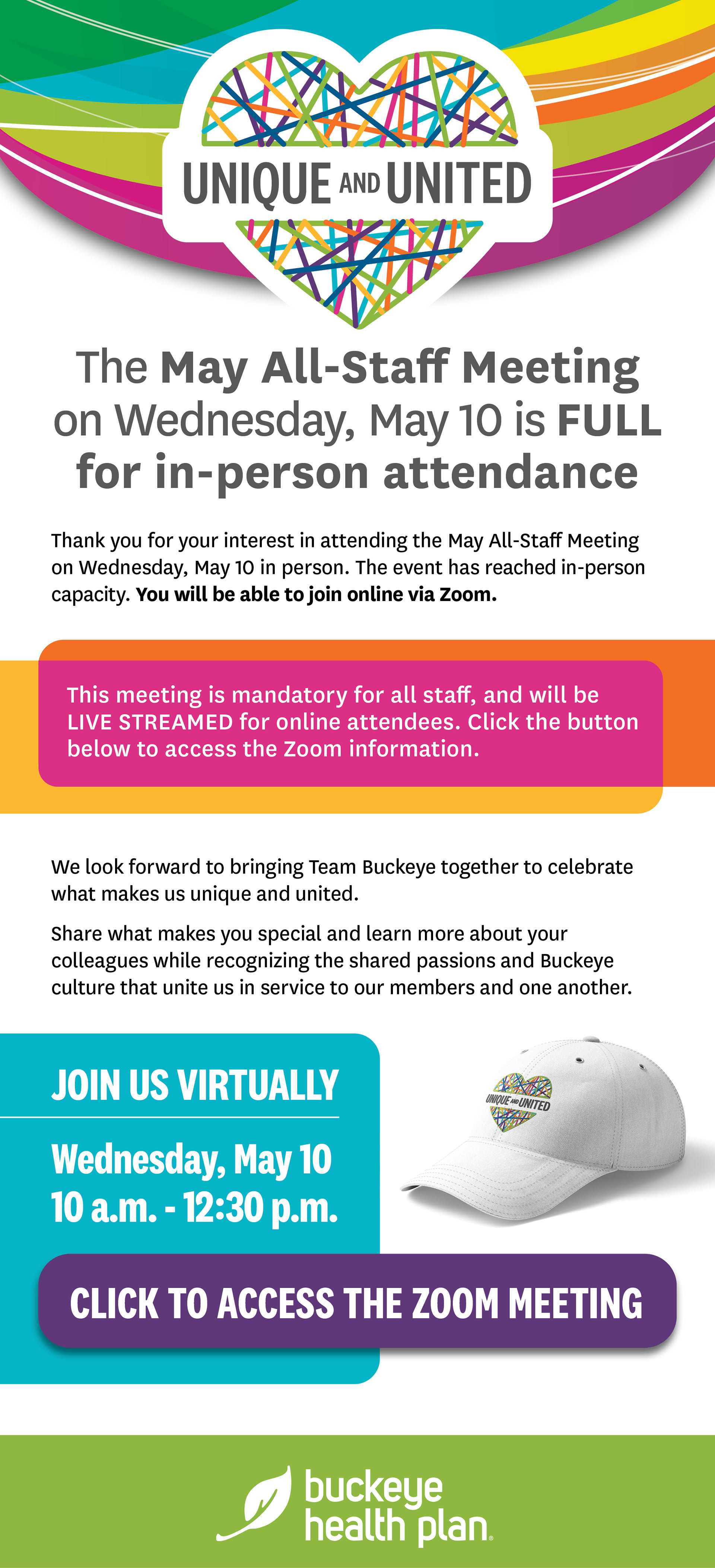
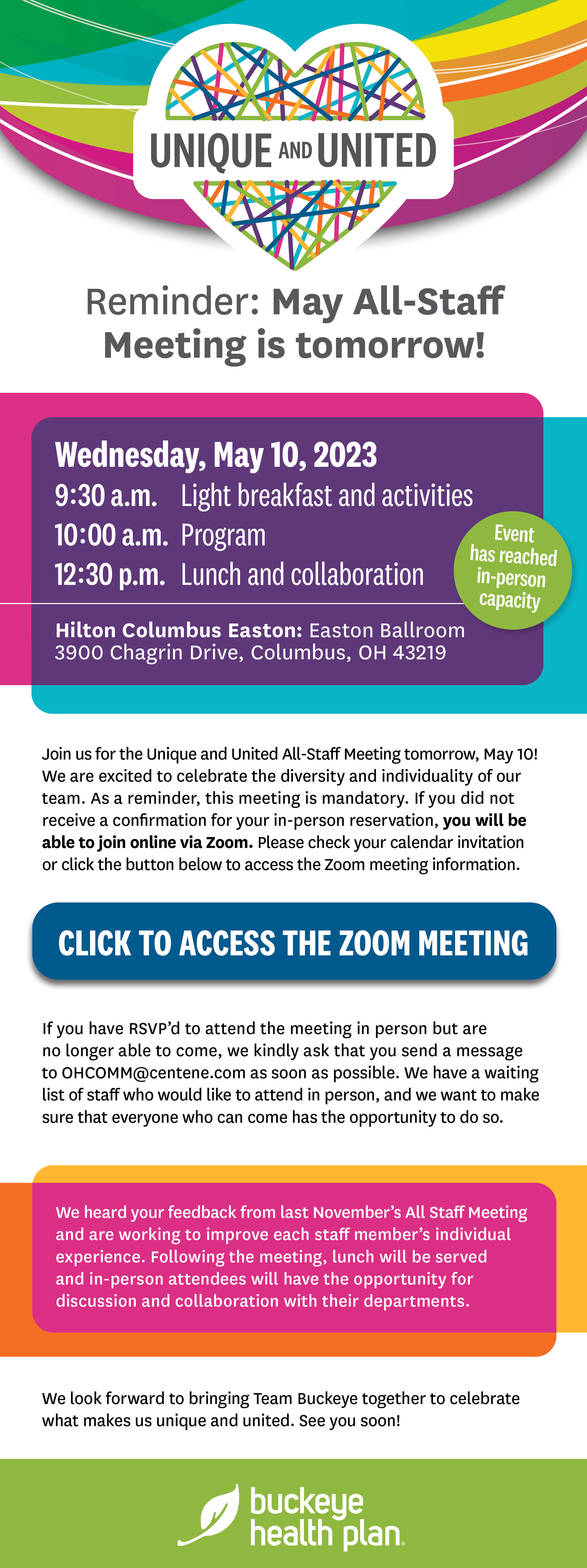
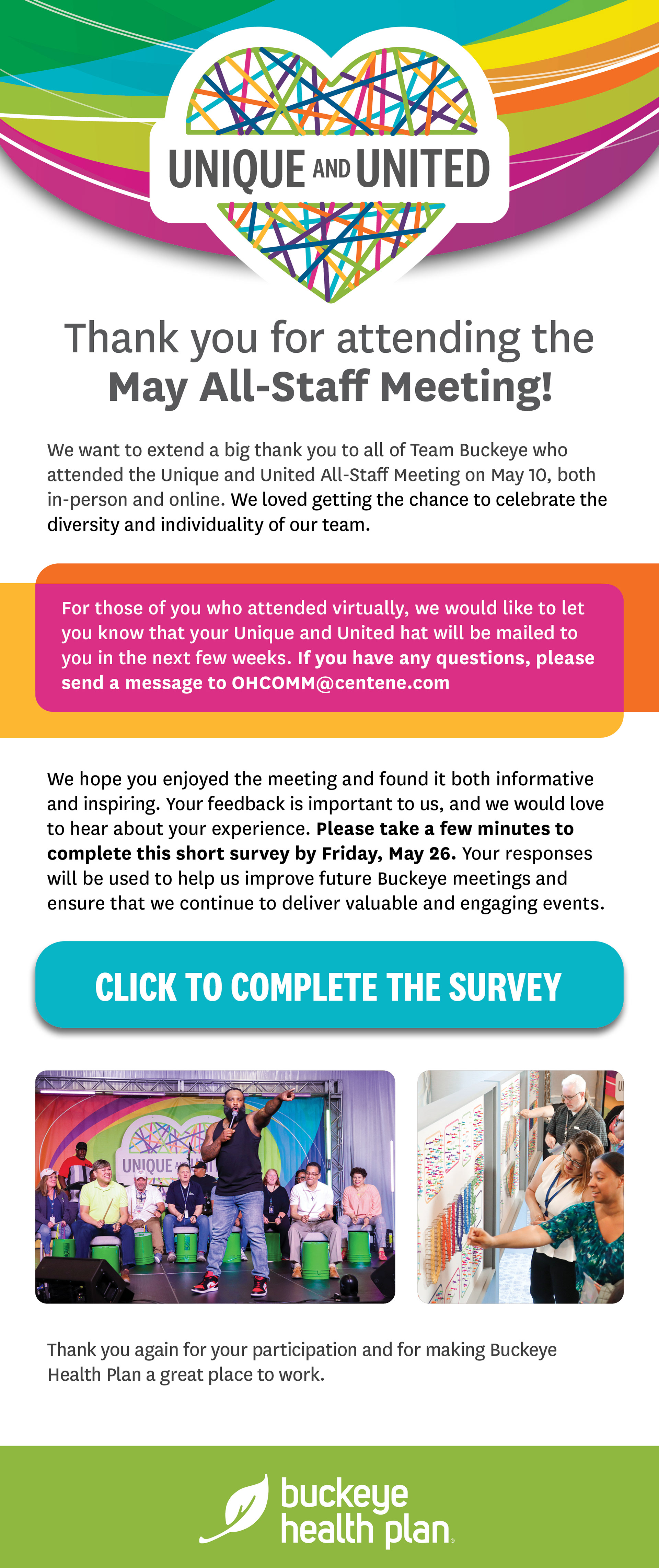
With approved visual direction, I initiated an internal communications plan, composing and designing event promotion emails for employees while establishing the sending schedule.
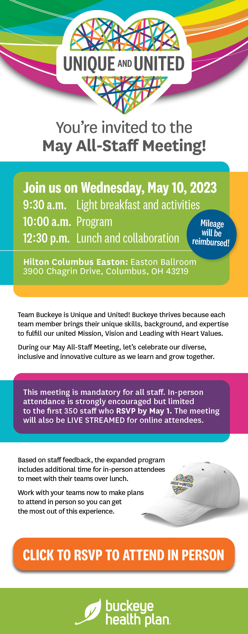
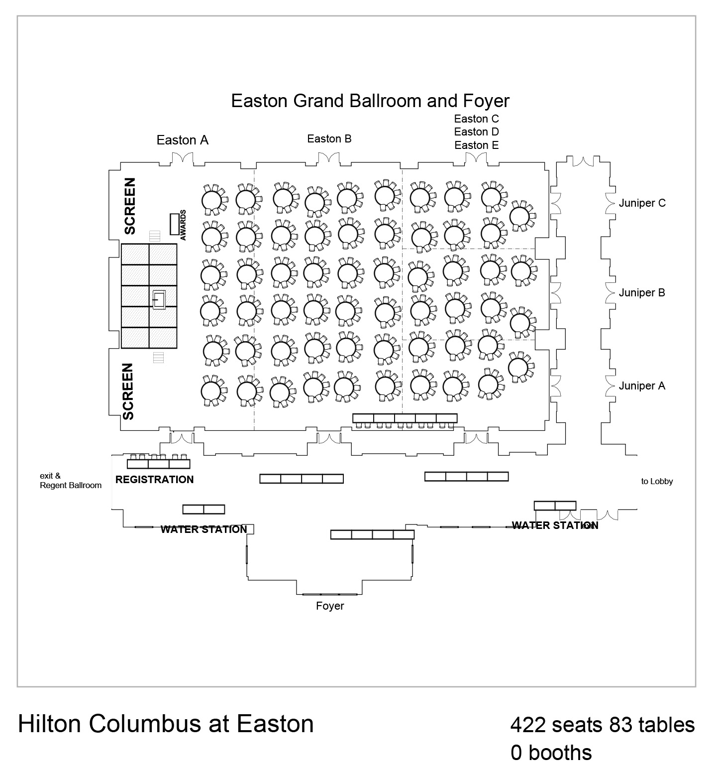
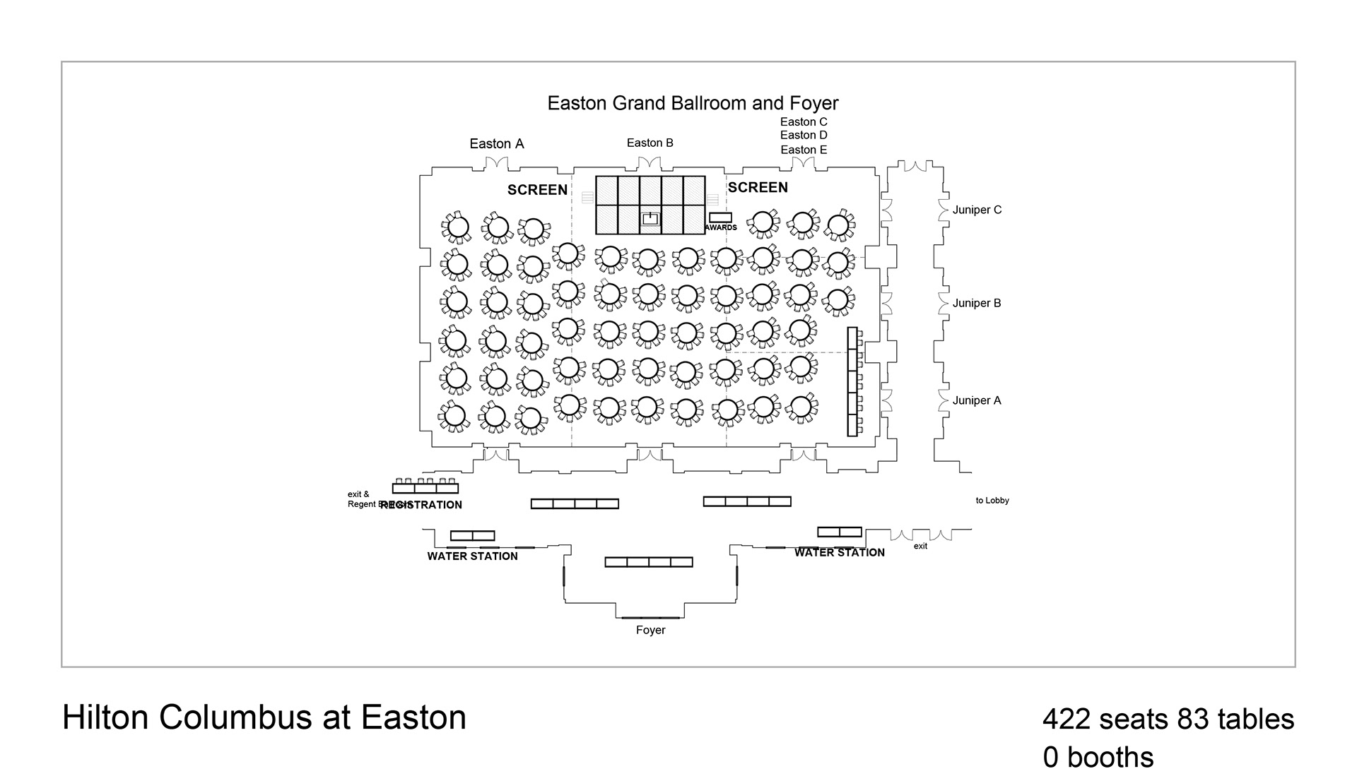
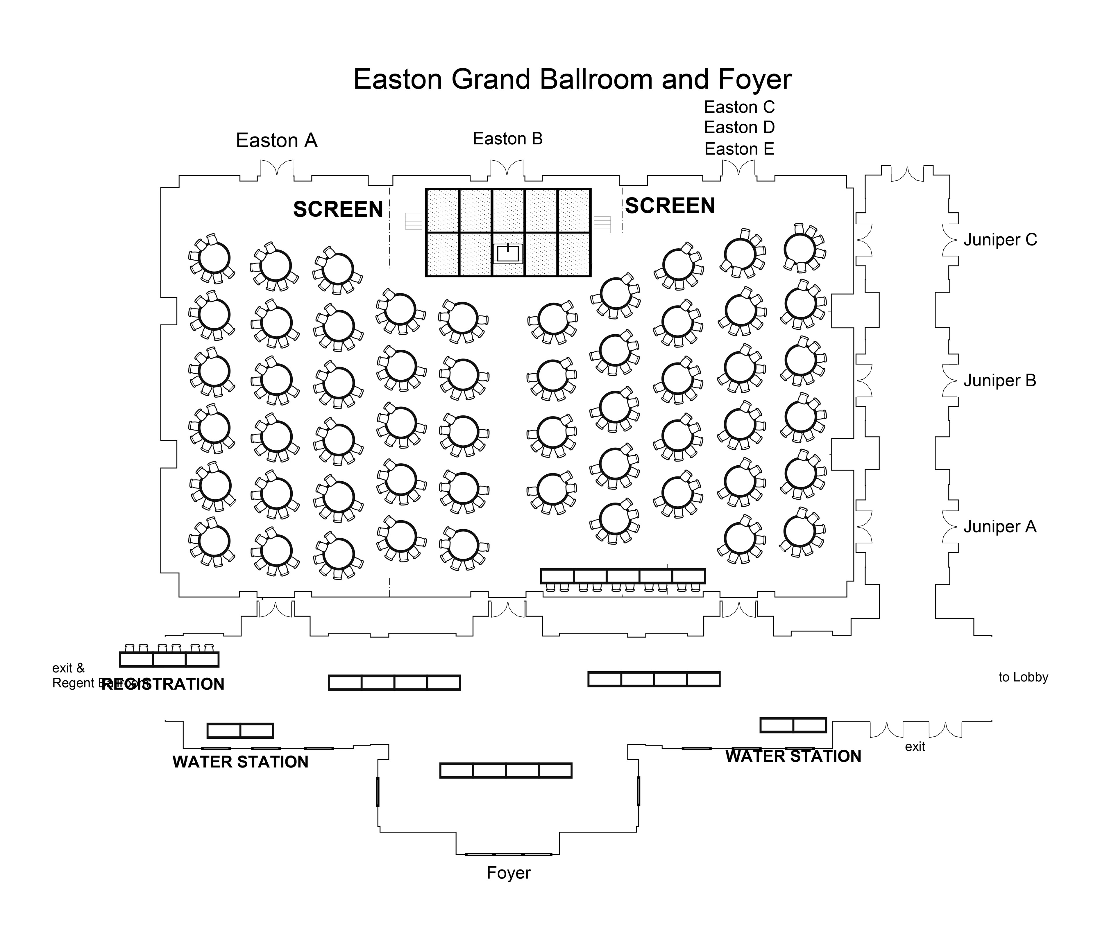
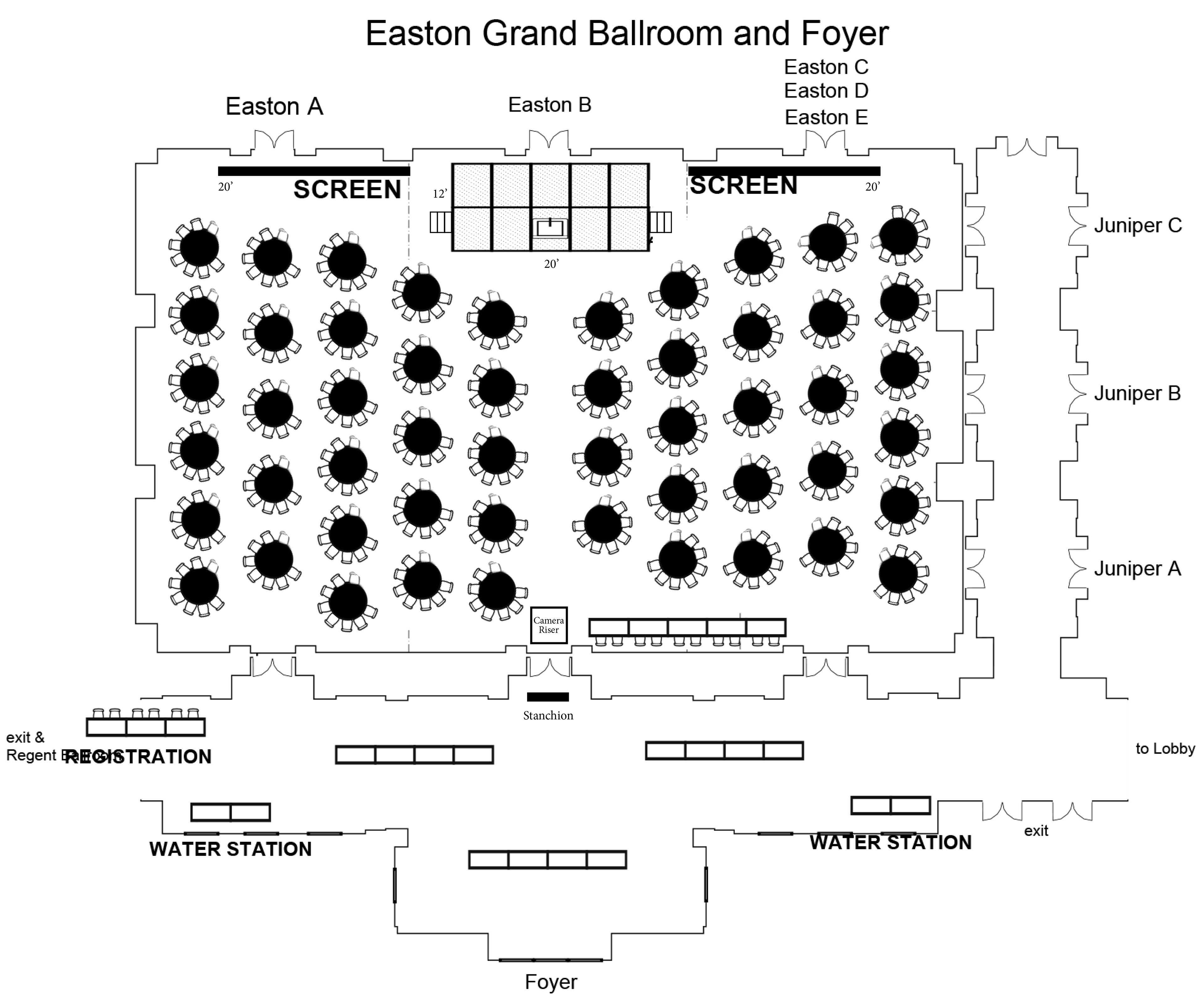
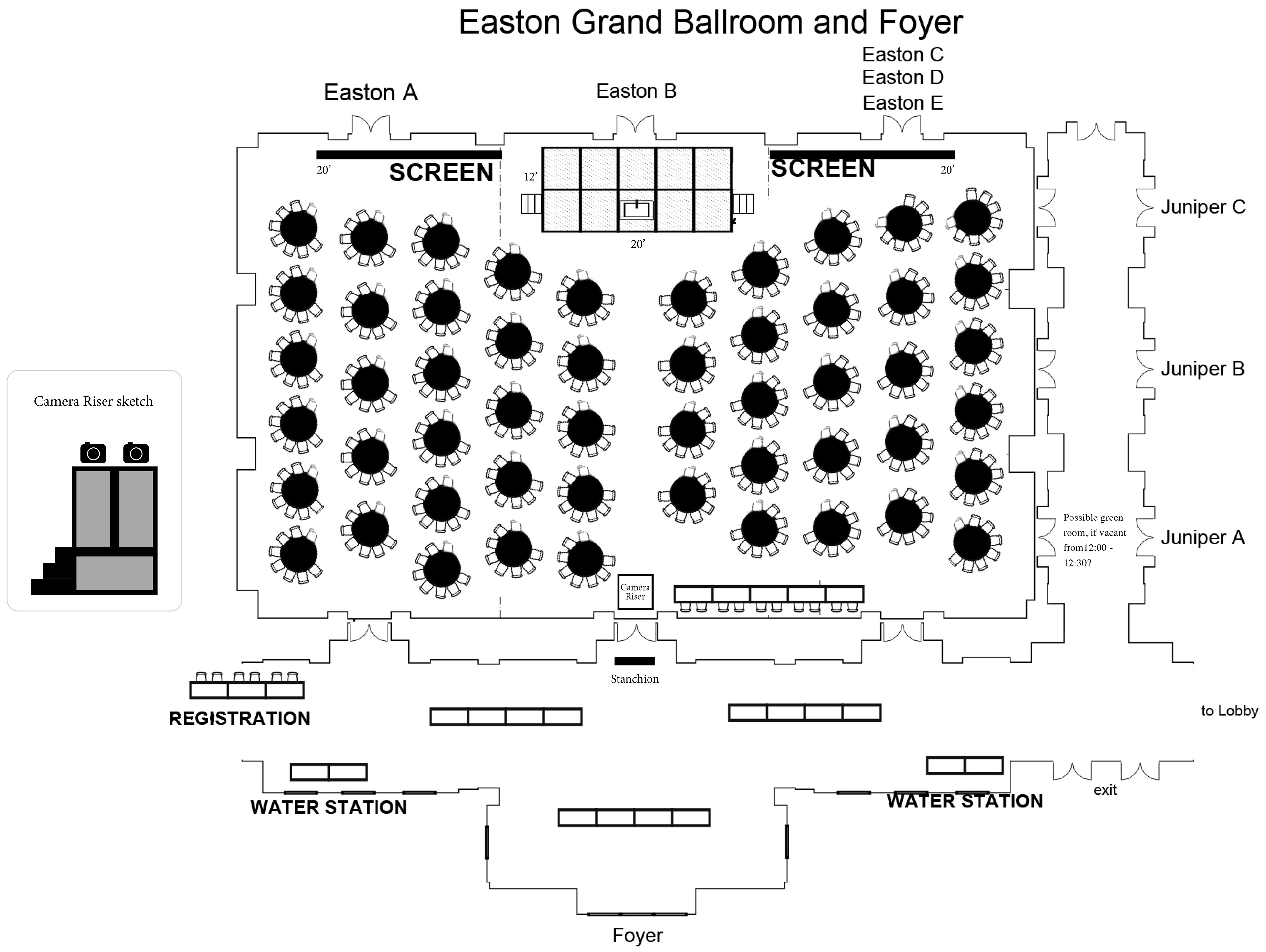
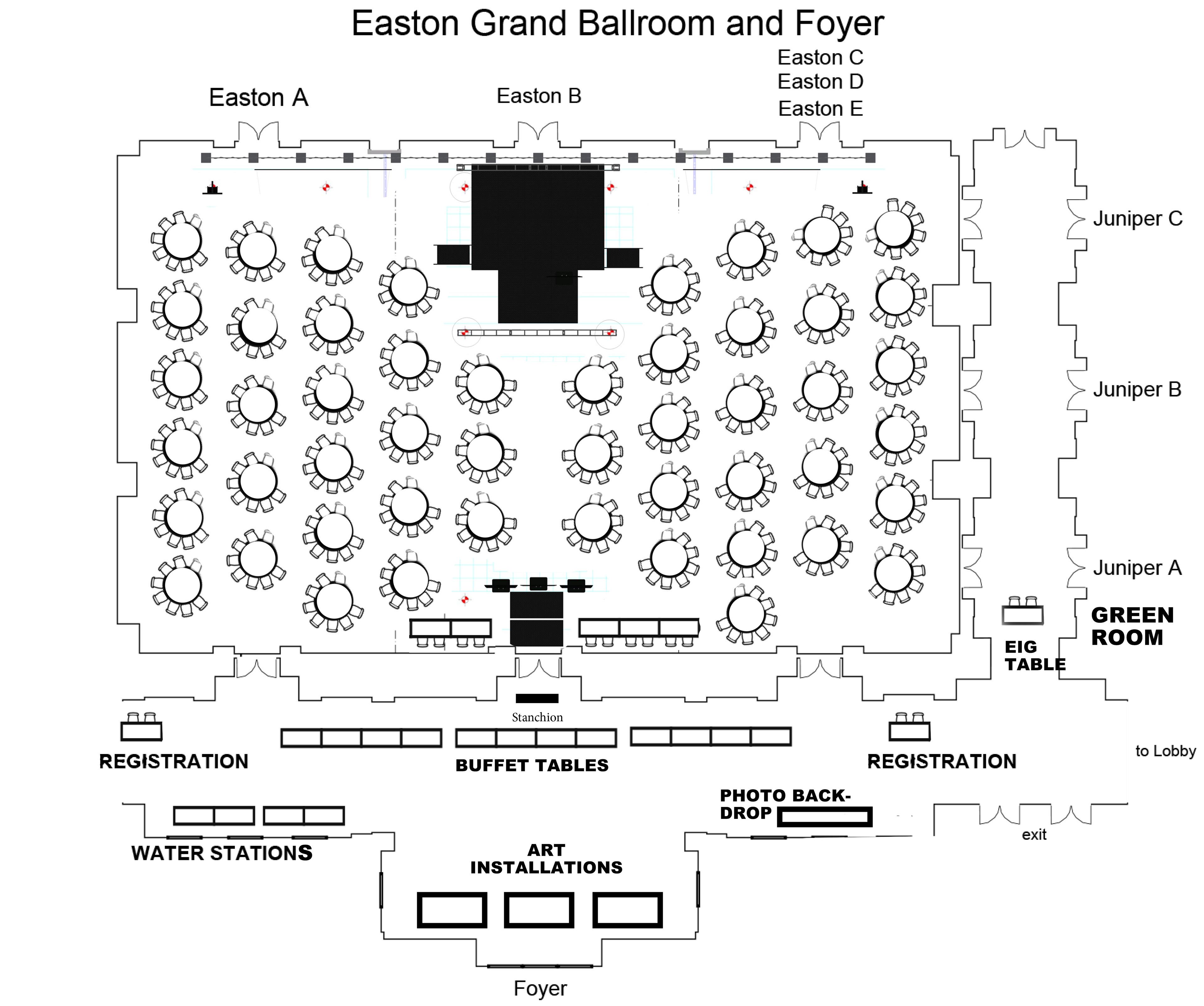
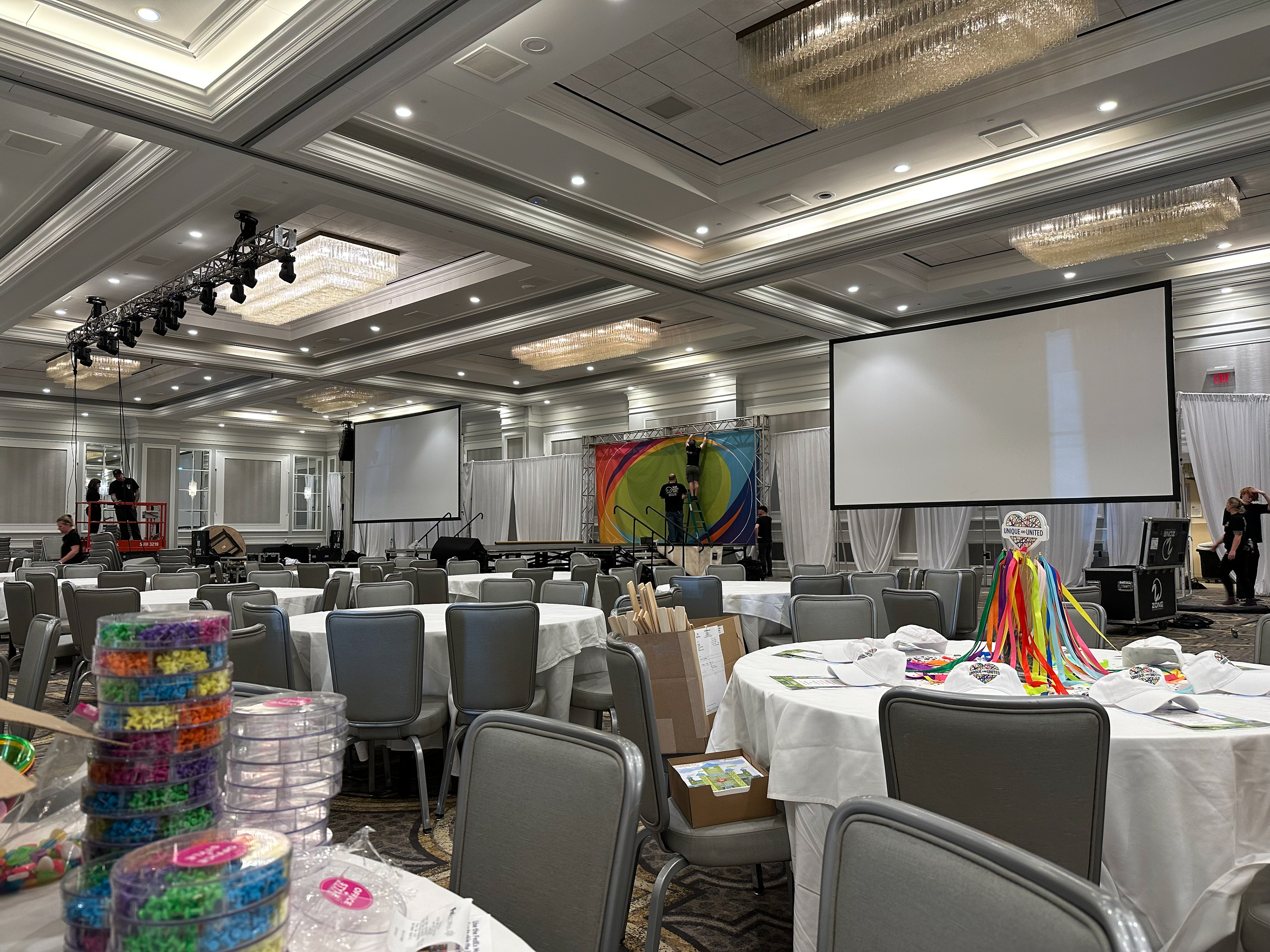
I collaborated with the AV team and venue to create a layout for the room to optimize the attendee's experience and make logistical sense for the show elements.
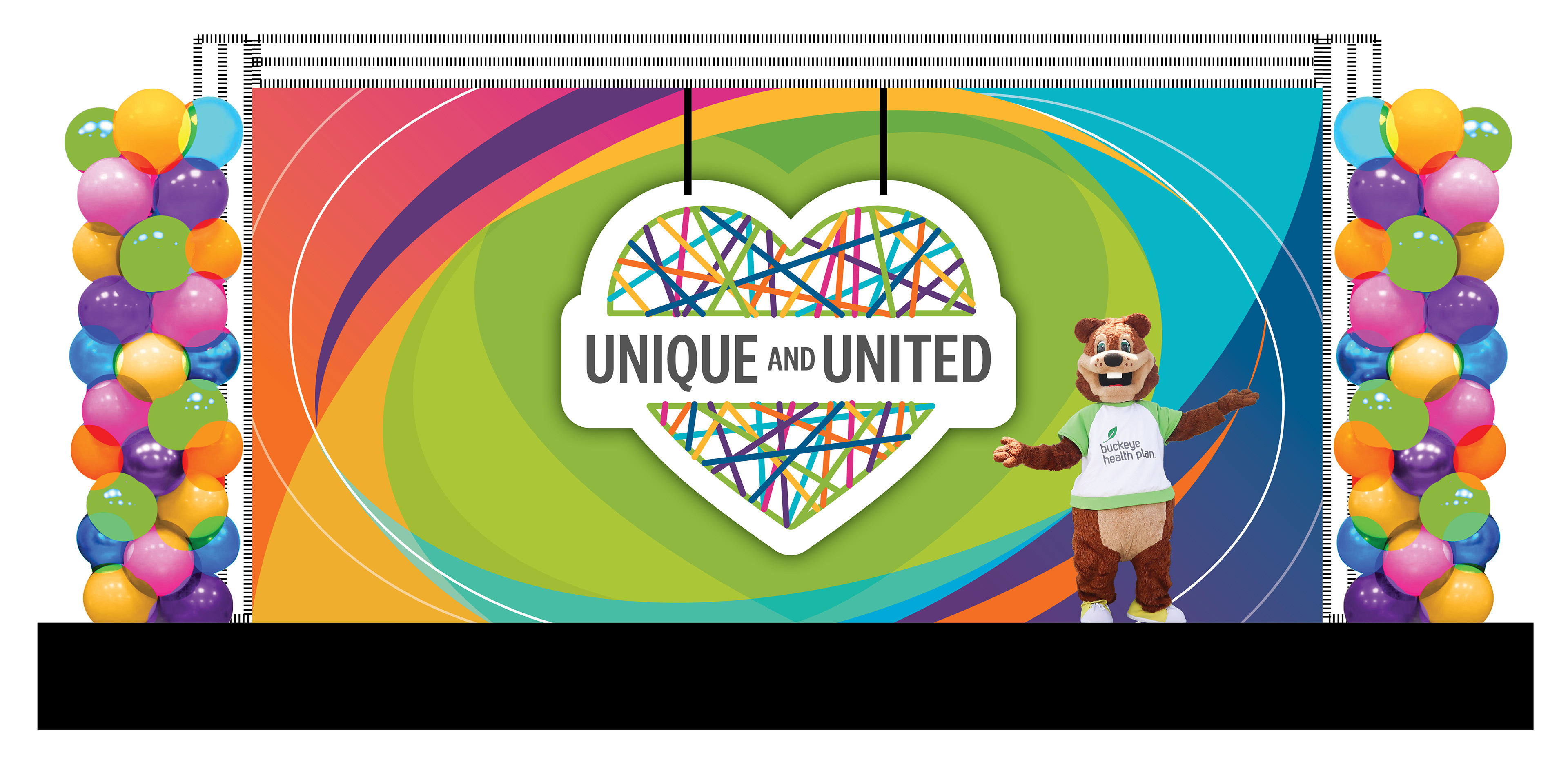
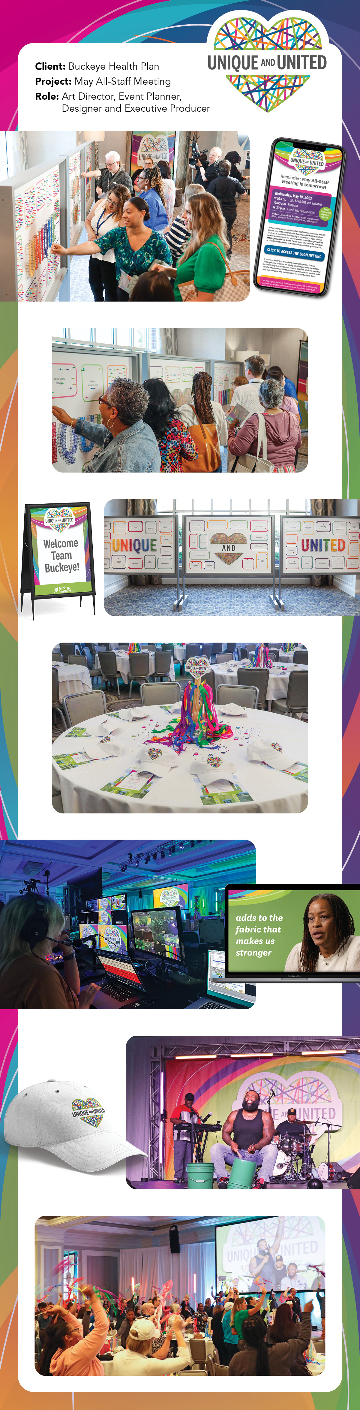
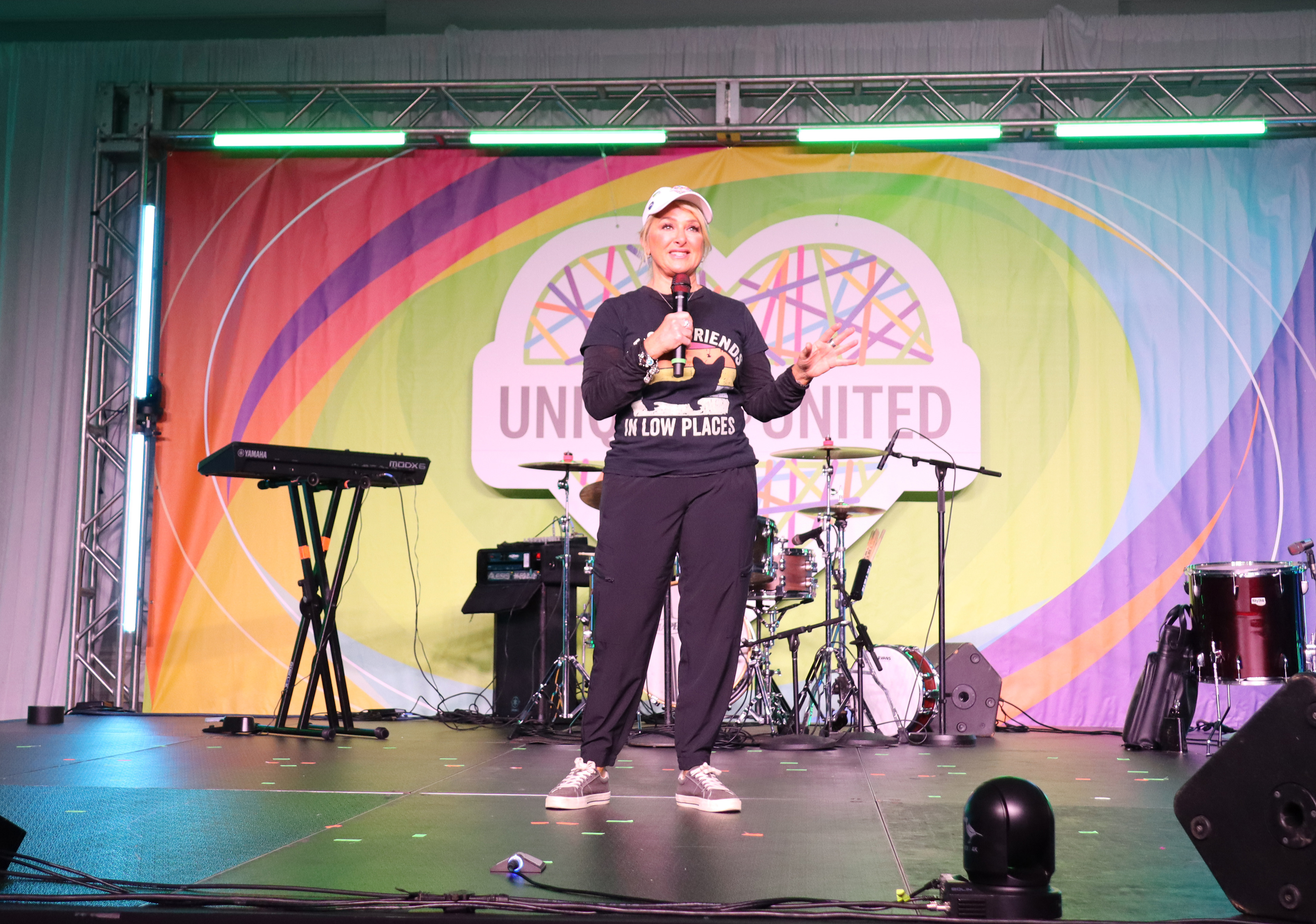
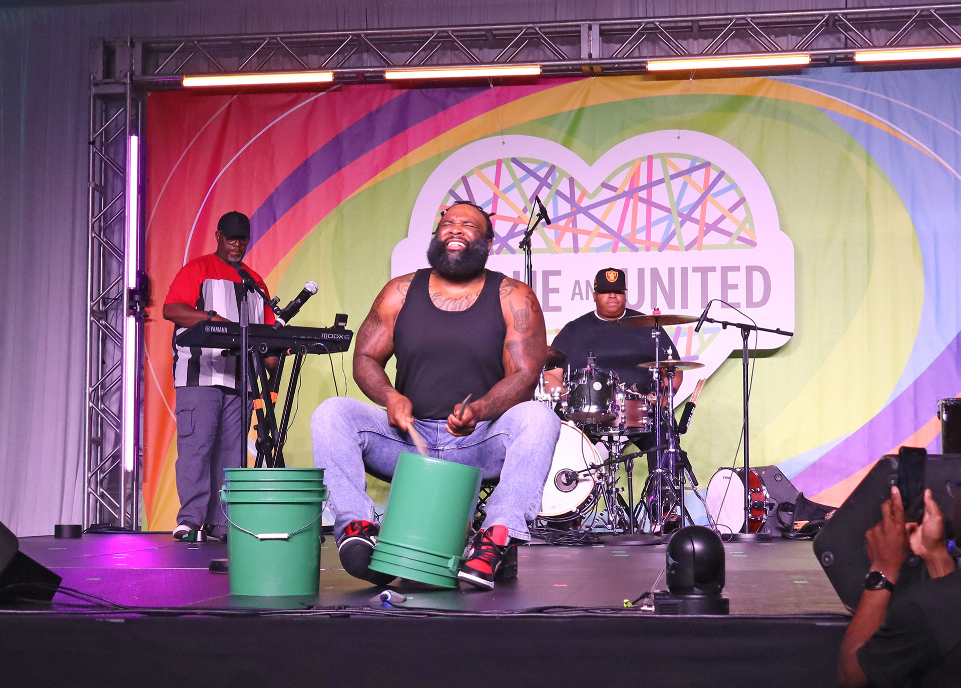
We collaborated on a cost-effective and engaging stage design, including a 3D logo, background banner, balloon truss covers, and a lobby vinyl banner. I also assisted with on-site oversight during stage construction and environmental graphic assembly.
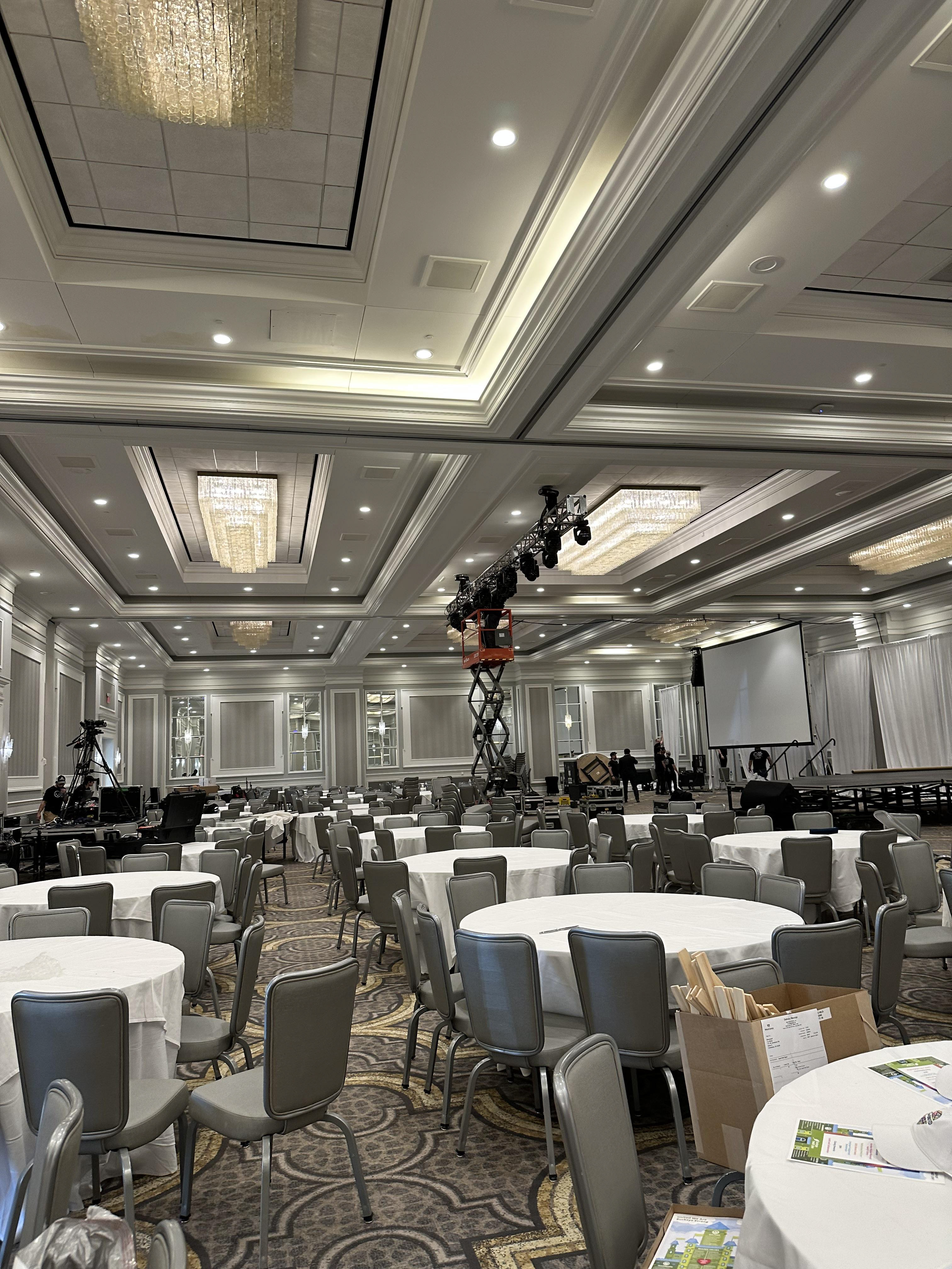
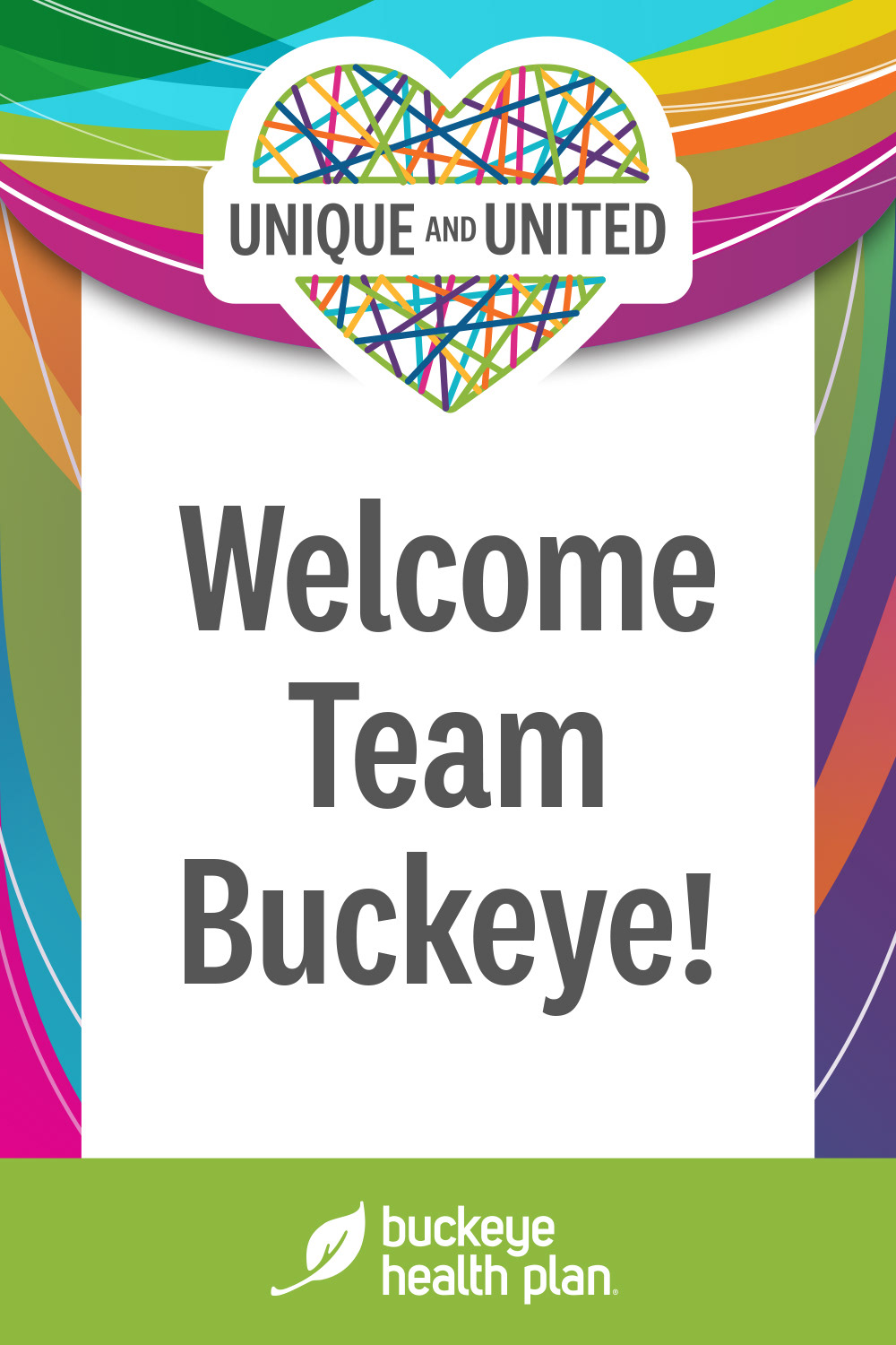
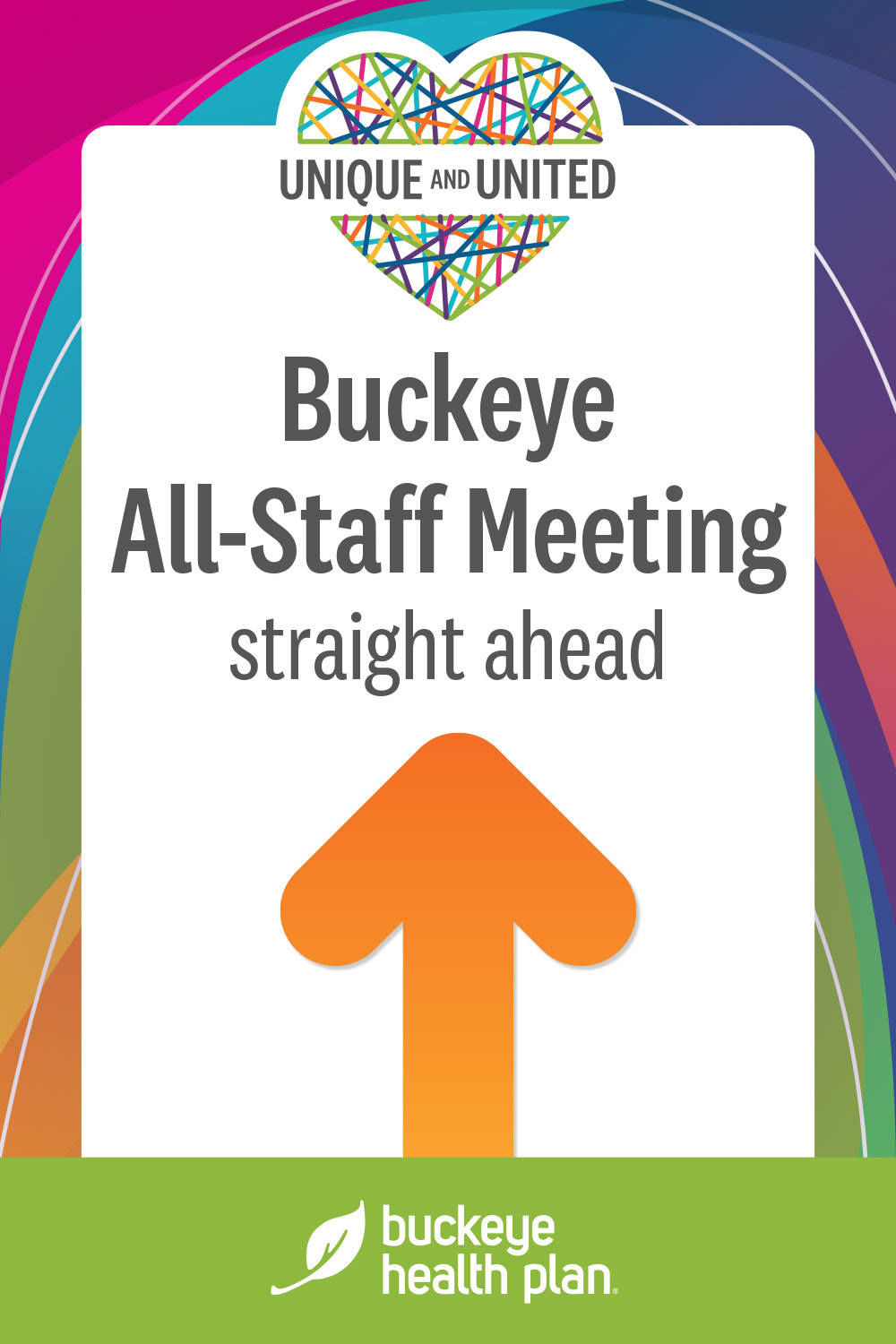
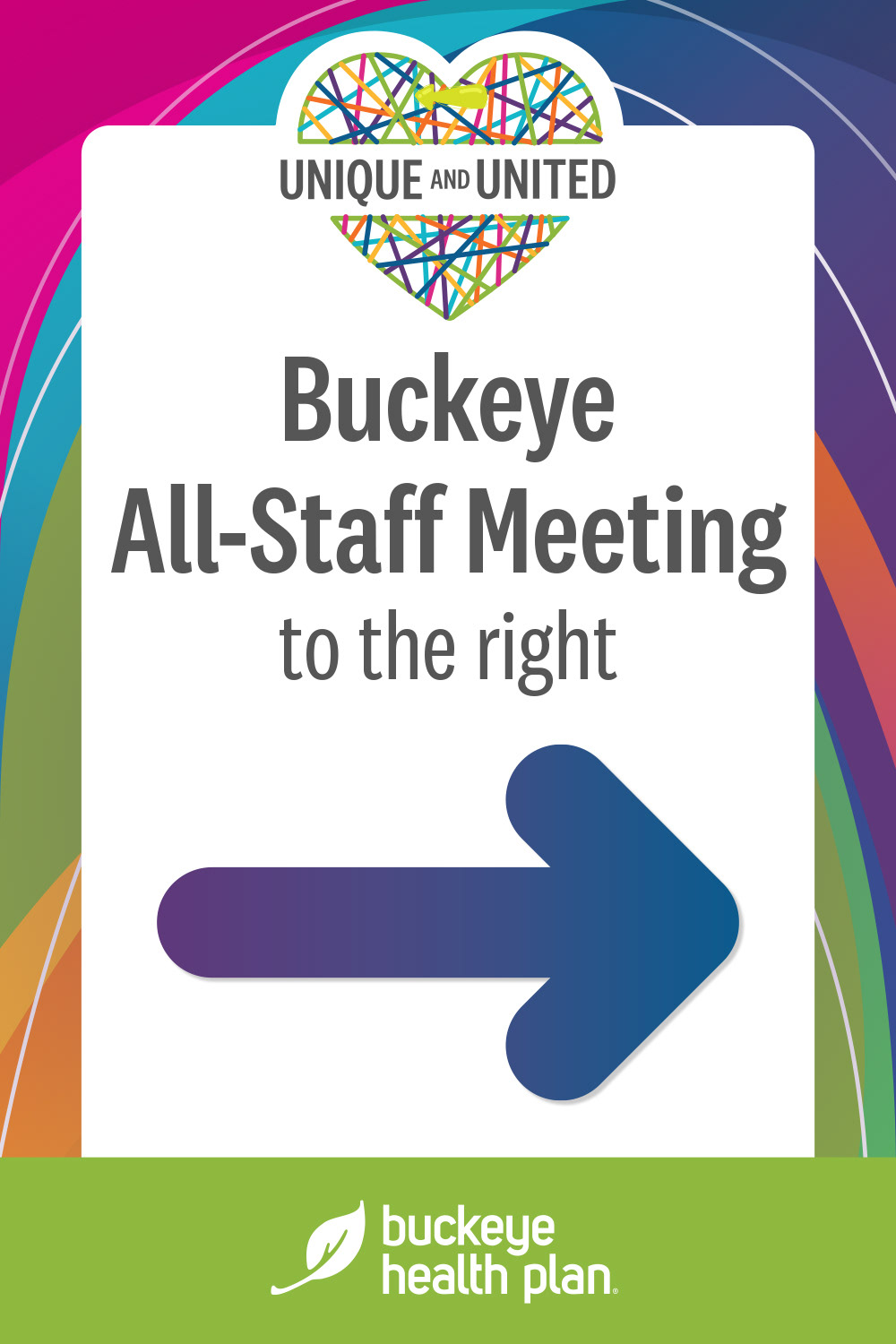
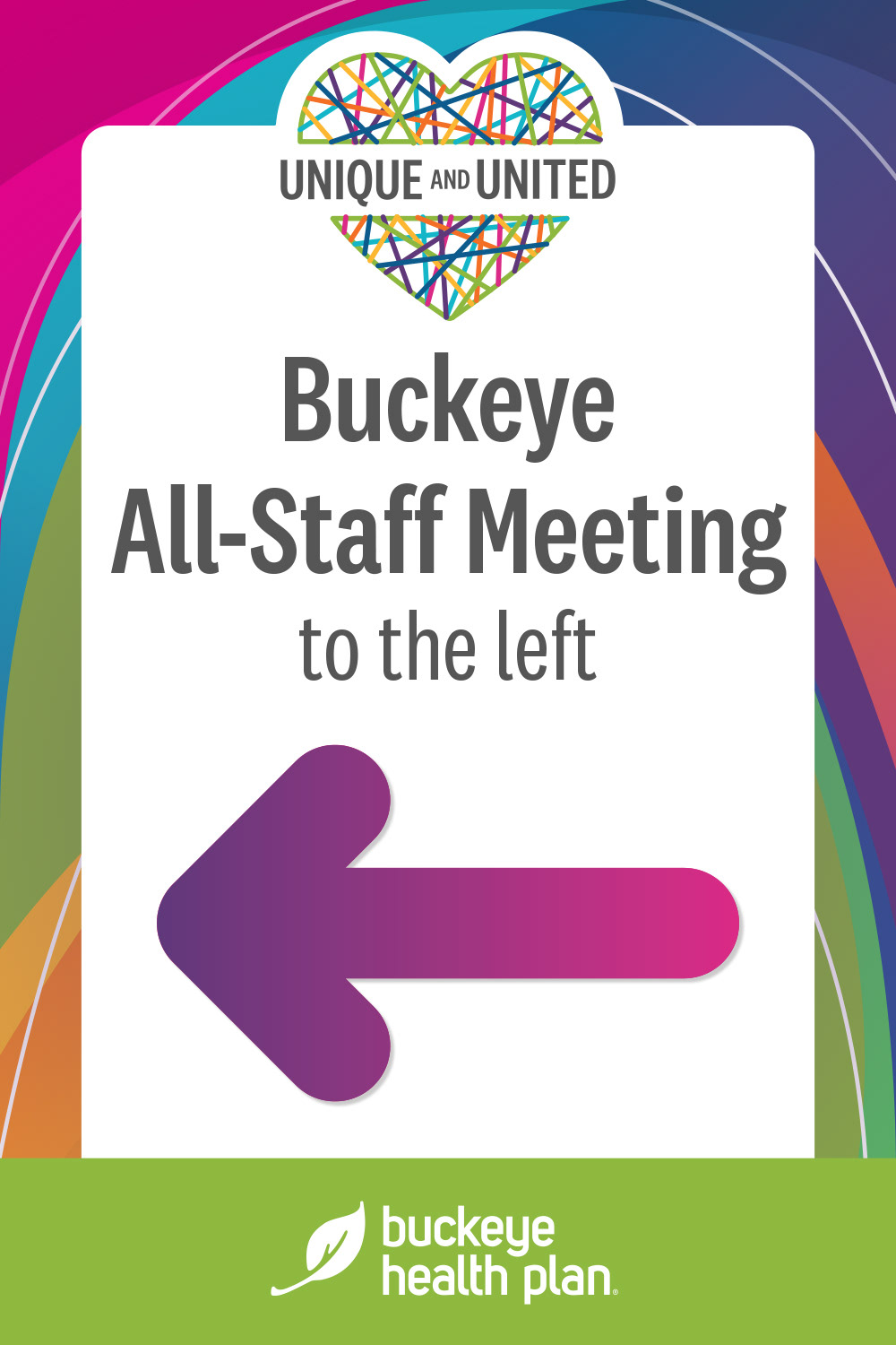
Considering the venue's size and multiple spaces, we implemented themed directional signage that was both eye-catching and informative, extending a welcoming feel to all attendees.
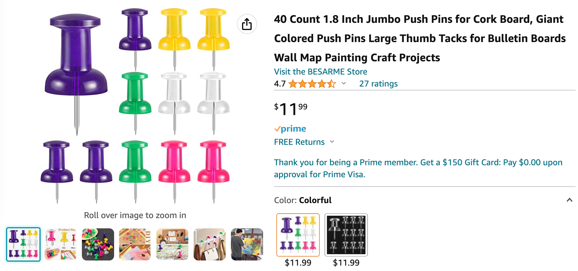
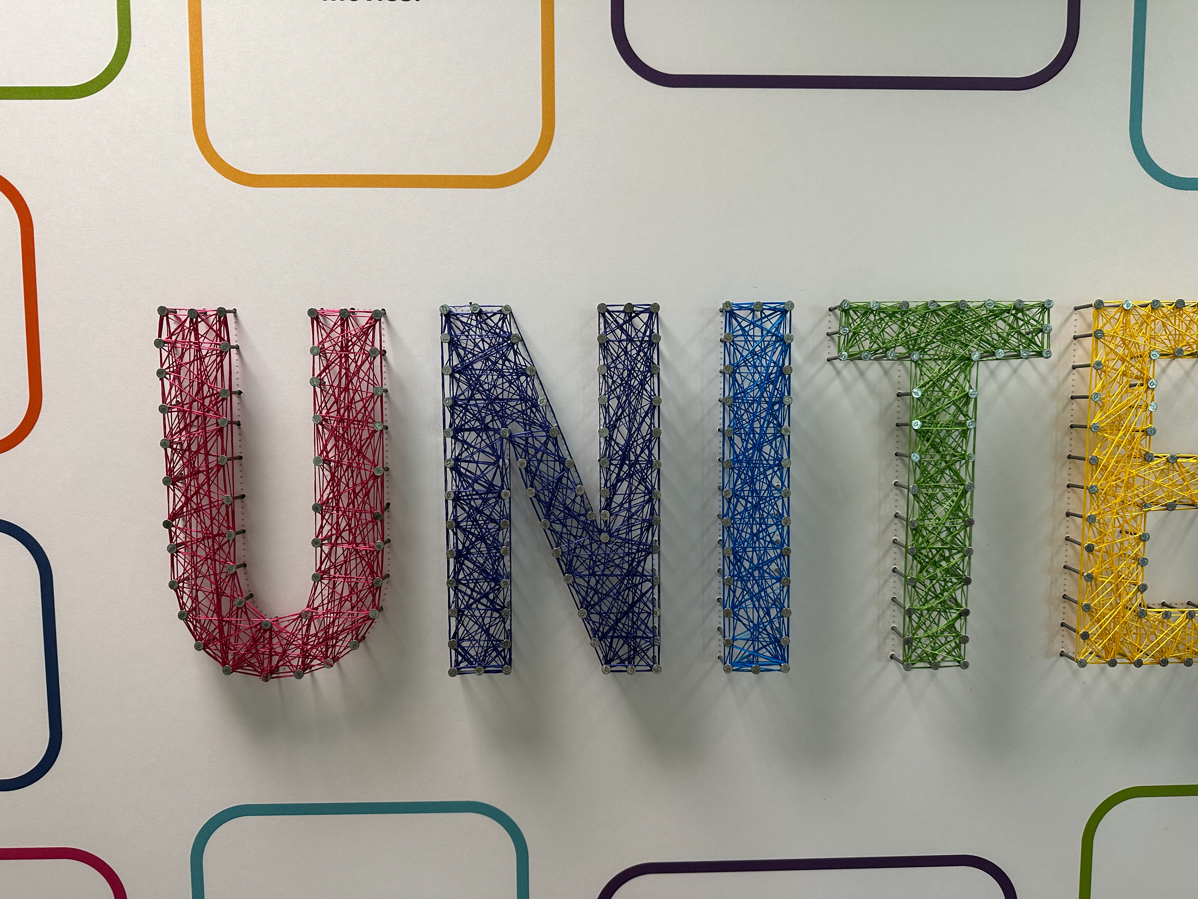
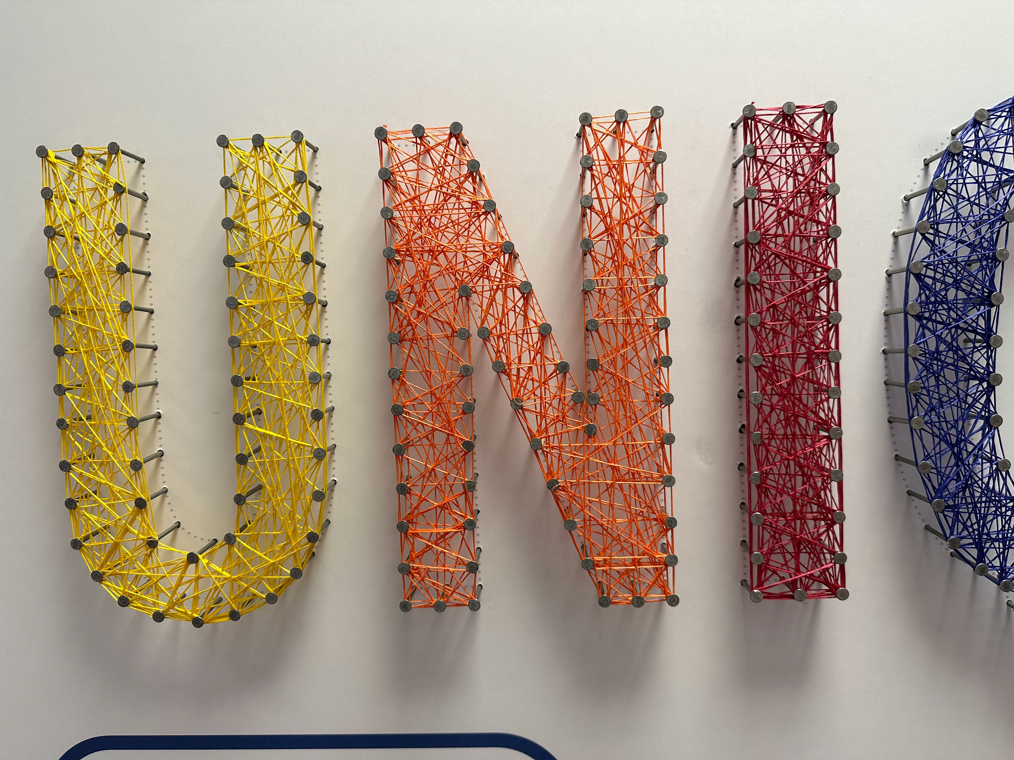
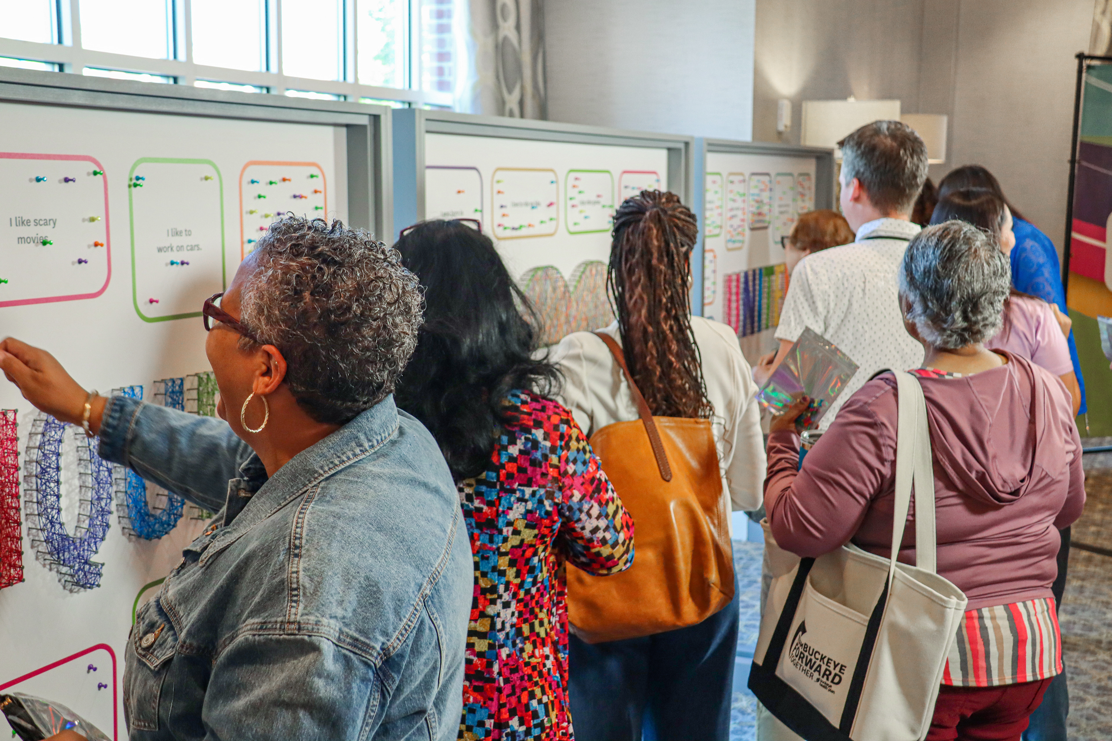
Due to a last-minute copyright issue with the interactive element, we needed a quick solution. Working with our Chief Strategy Officer and Chief Creative Officer, we devised an alternative method for attendees to engage with the wooden boards, involving push pins and boxes to demonstrate shared life experiences. I designed a layout that incorporated the "string art" concept and integrated our existing wooden boards.
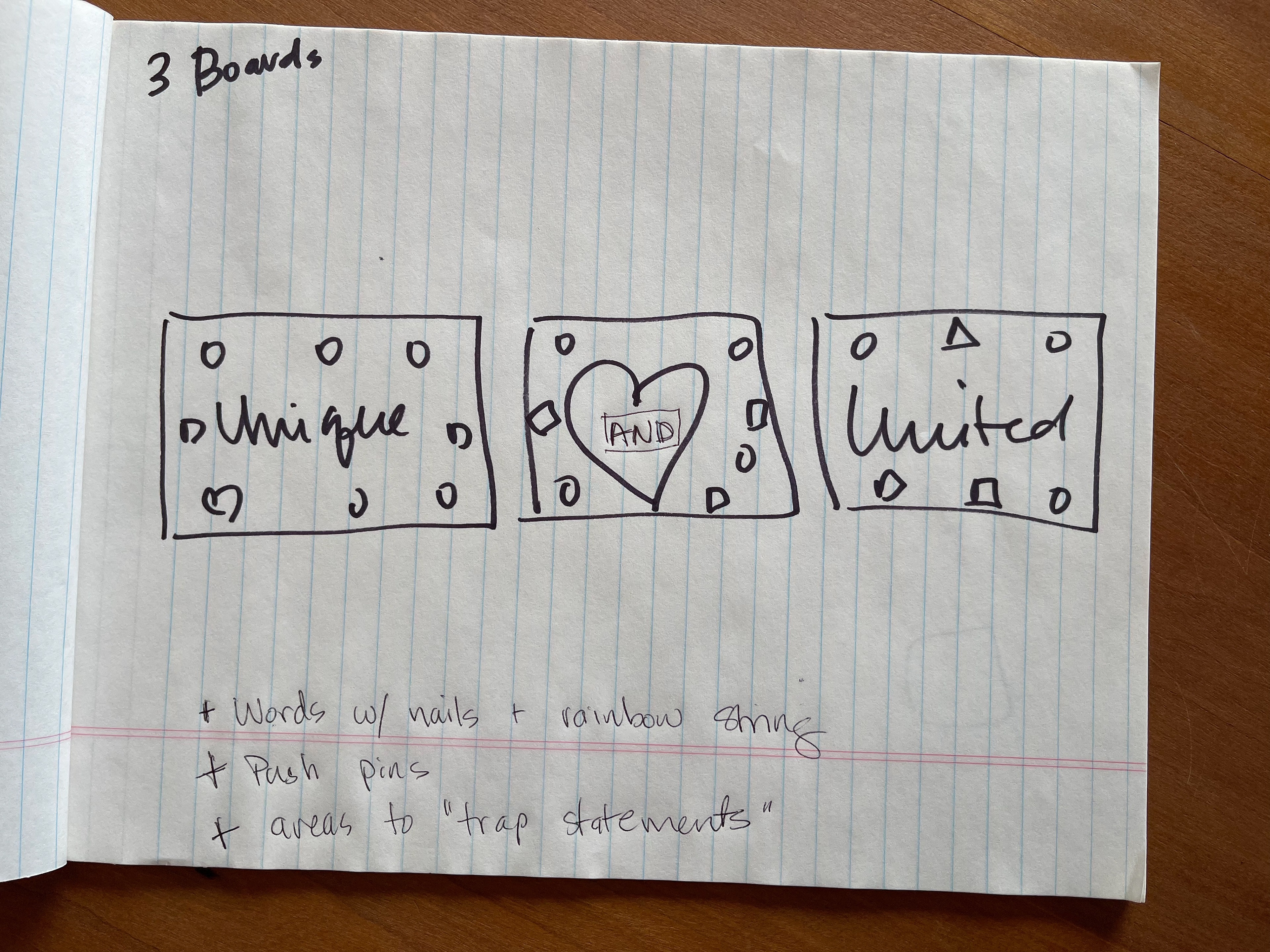
The Chief Strategy Officer's initial drawing for the pivot.
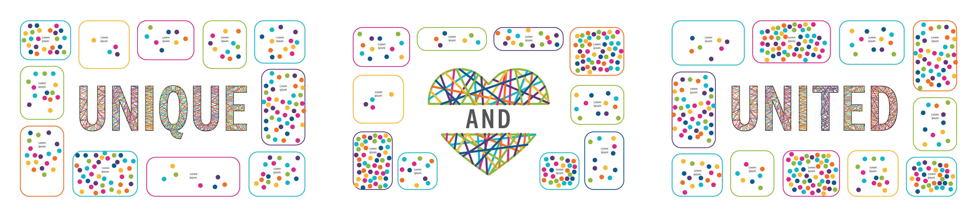
And the final design for the boards.
Upon client approval, I coordinated logistics with various vendors to initiate production. The design was printed on foam core and affixed to the wooden boards, which were delivered to our office for us to add nails and multicolored string.
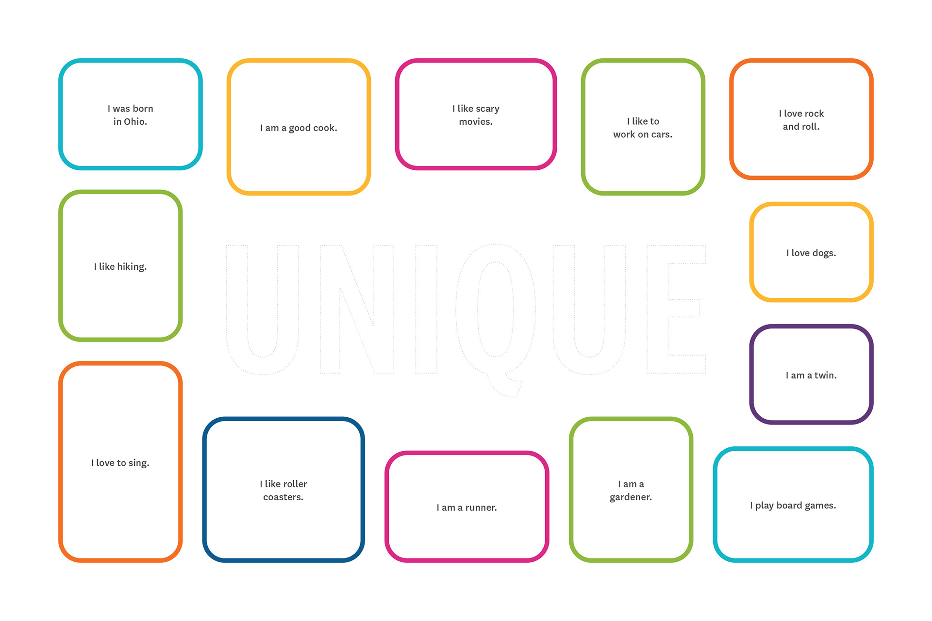
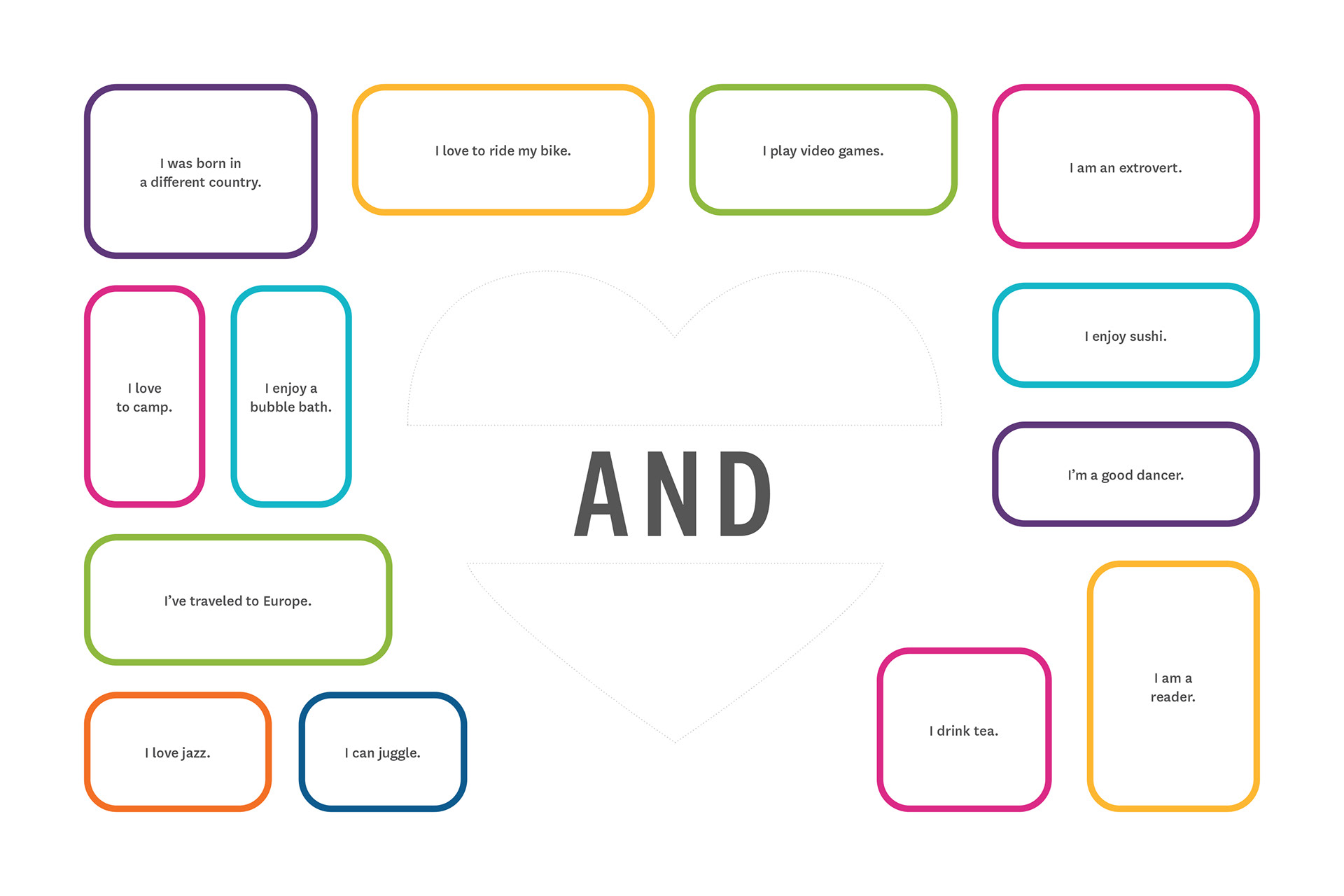
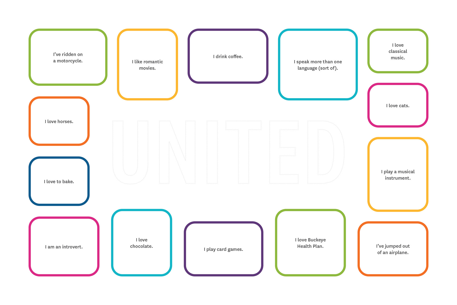
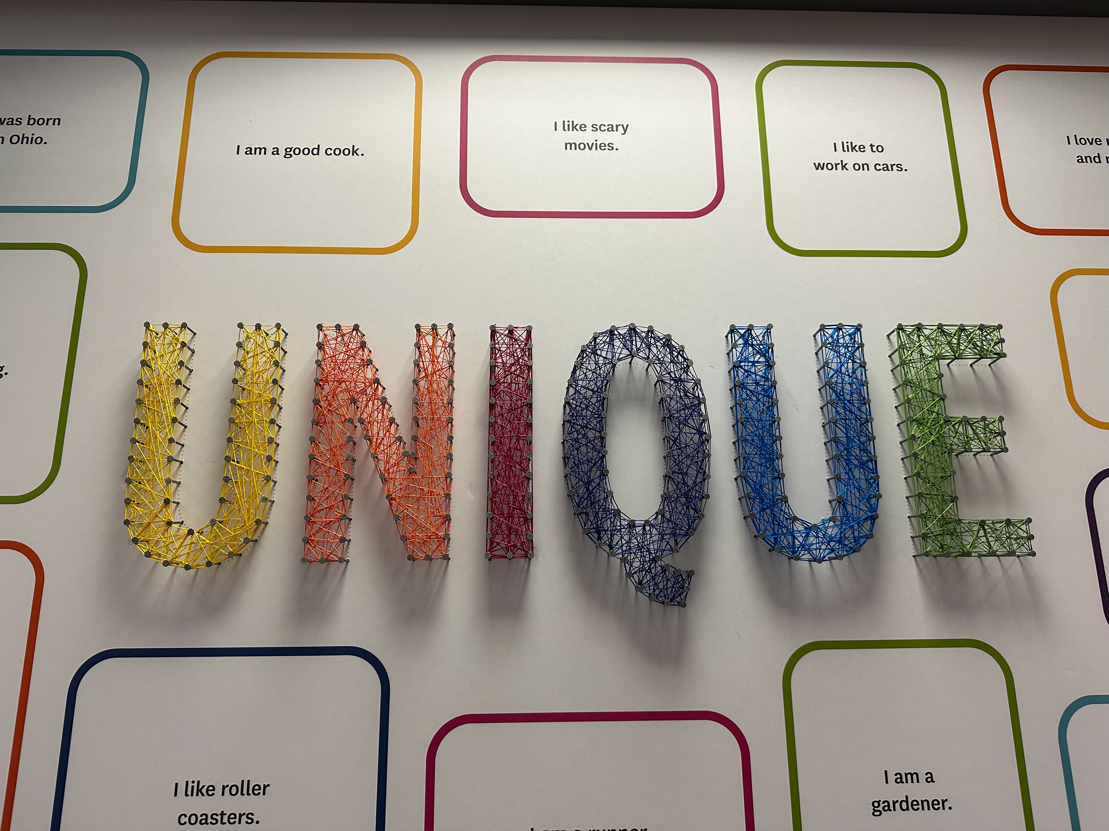
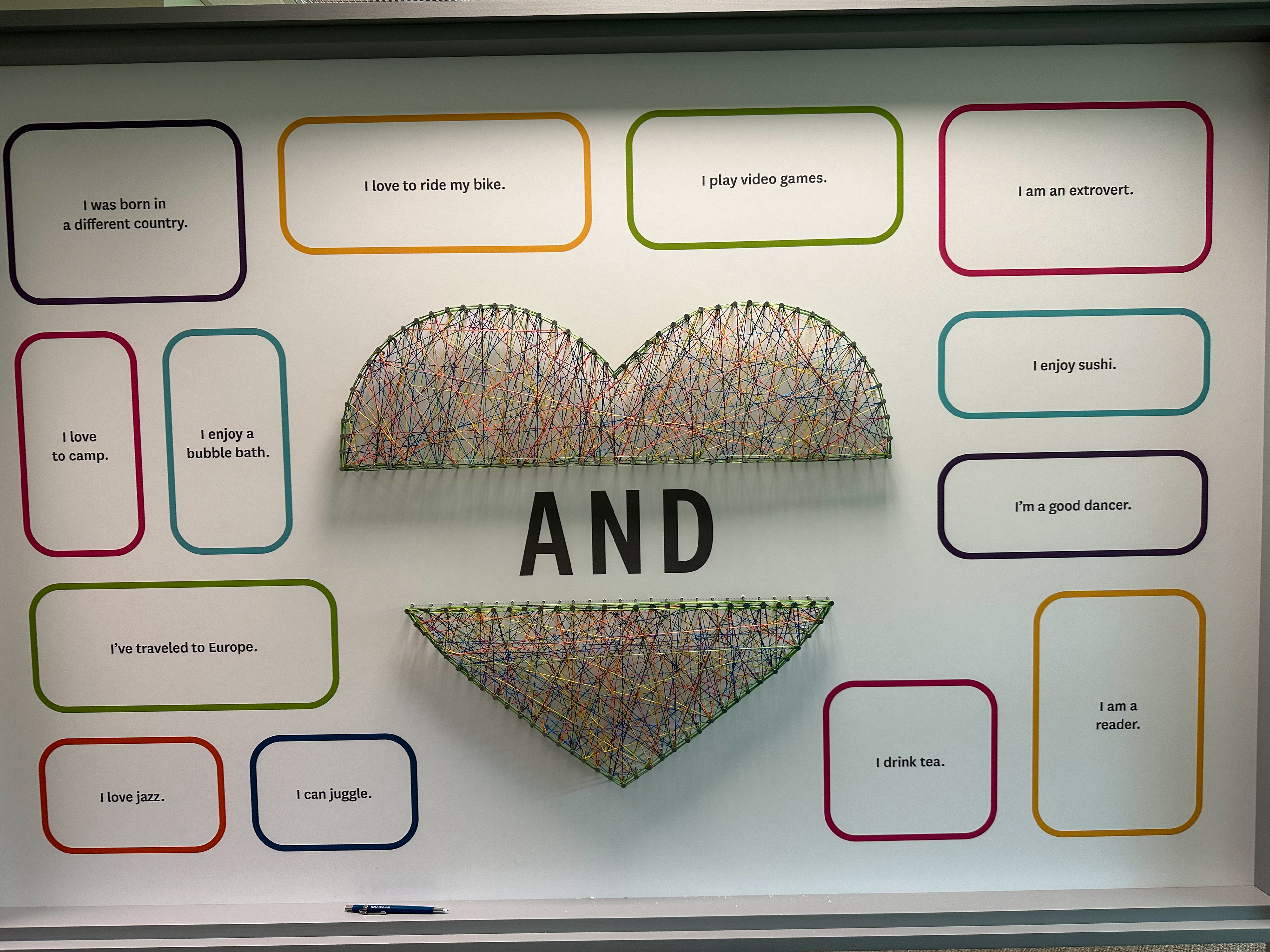
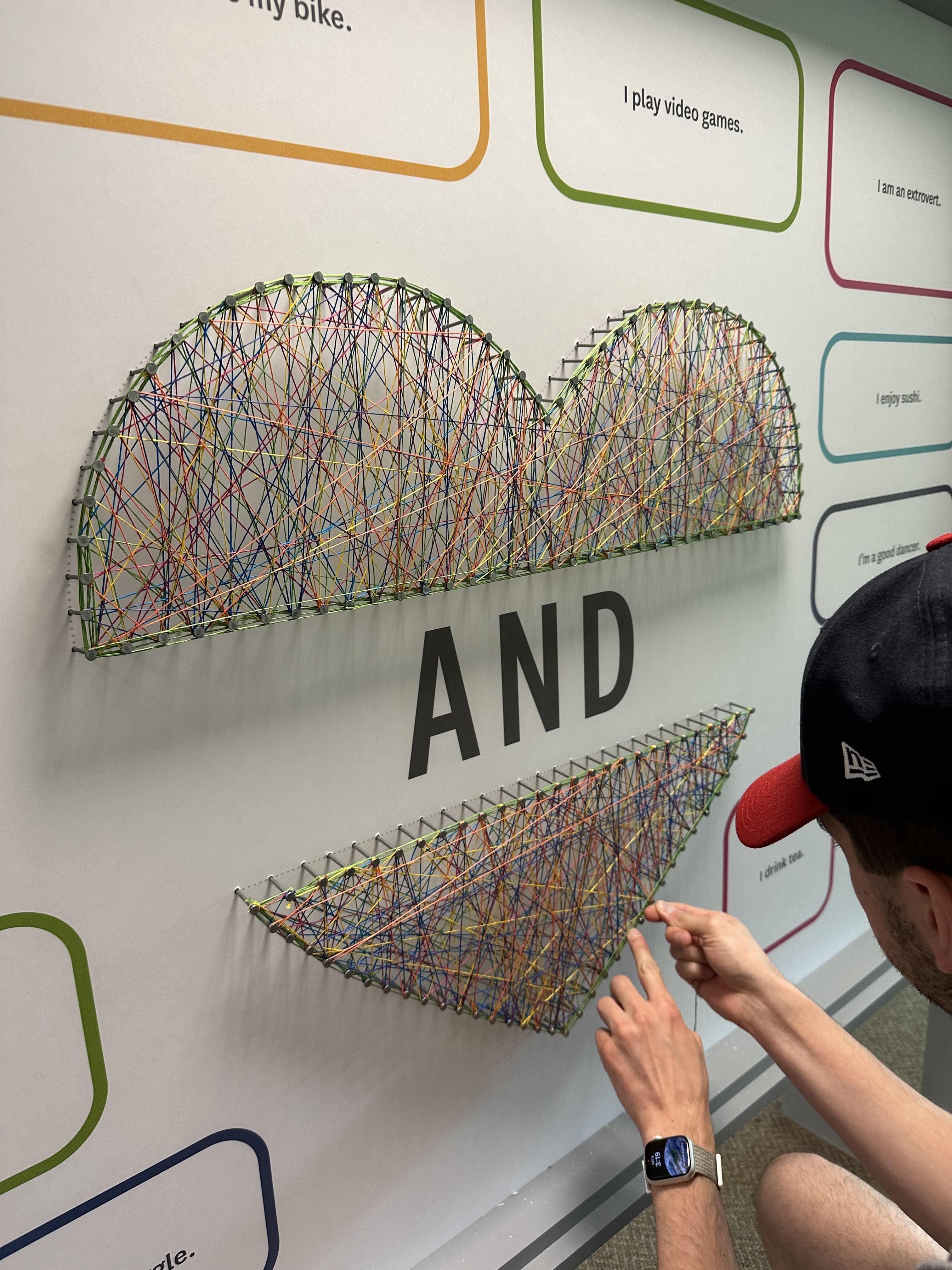
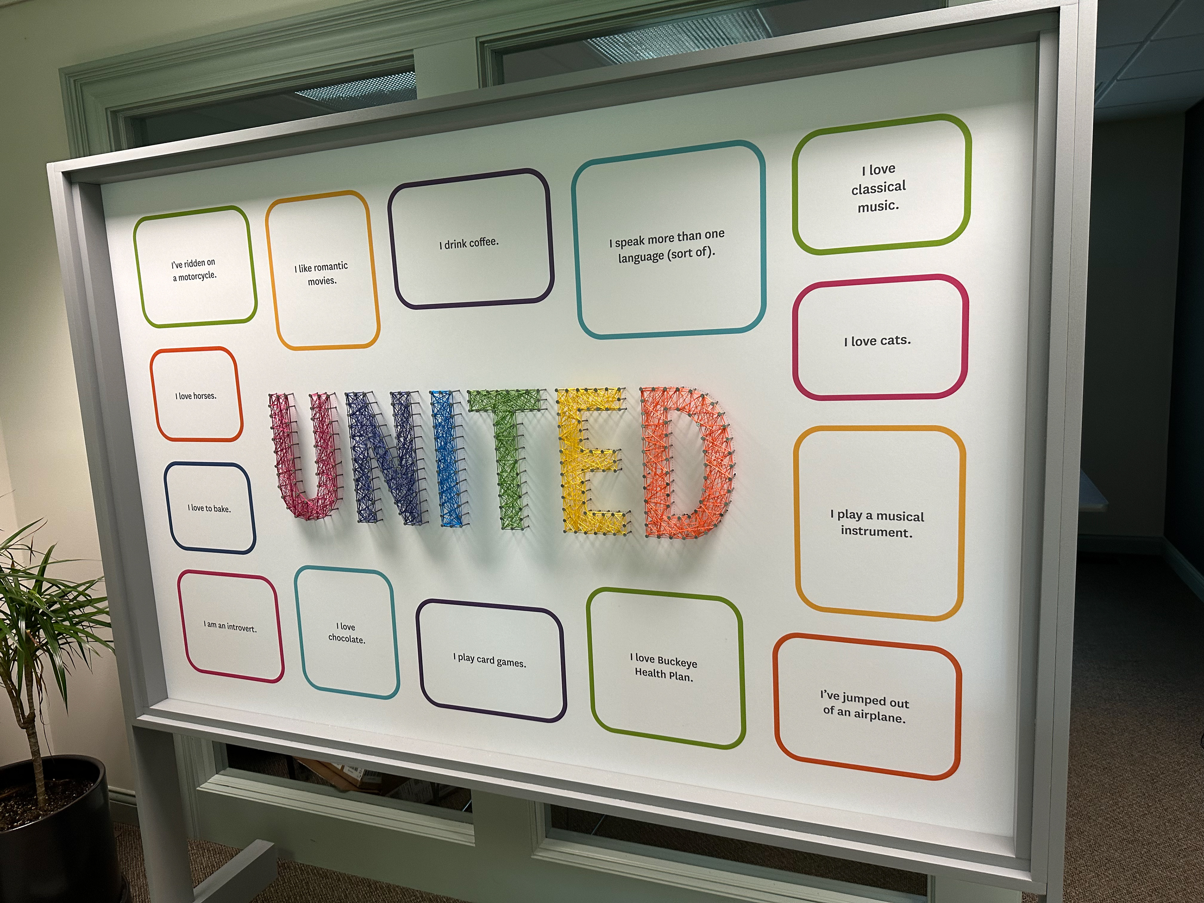
The interactive element was highly successful. Attendees picked up push pin packets at registration and actively engaged with the installation. It was gratifying to observe how many participants contributed to the display, revealing the unique yet shared life experiences of our employees.
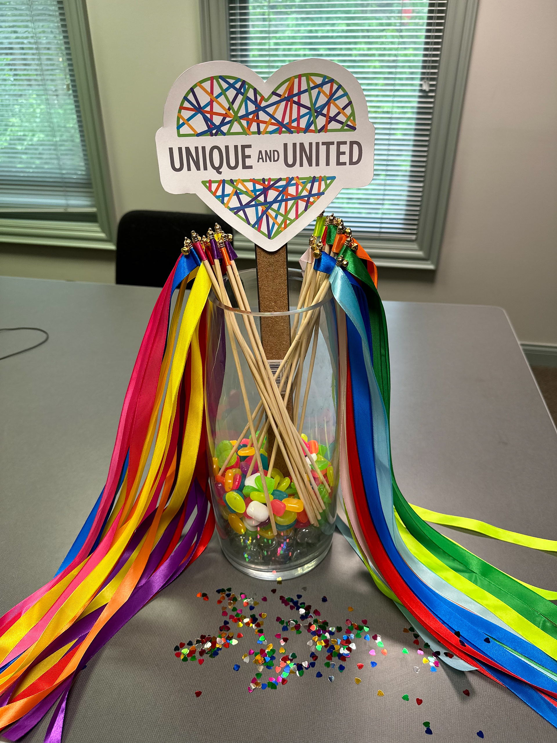
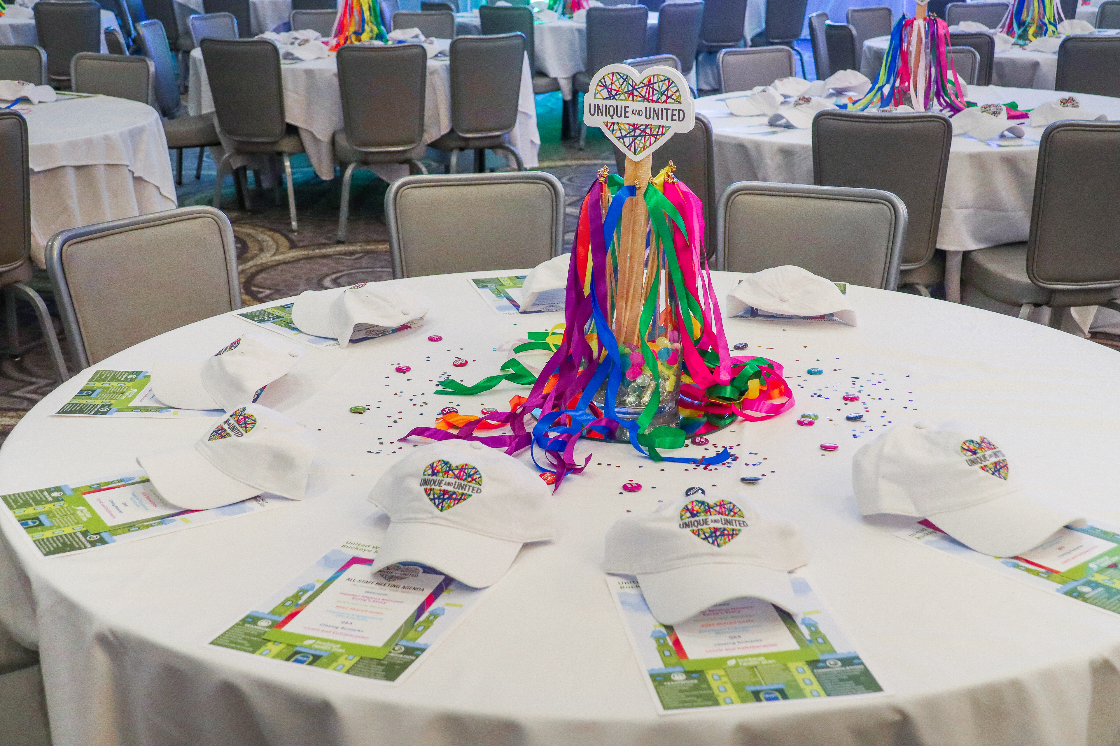
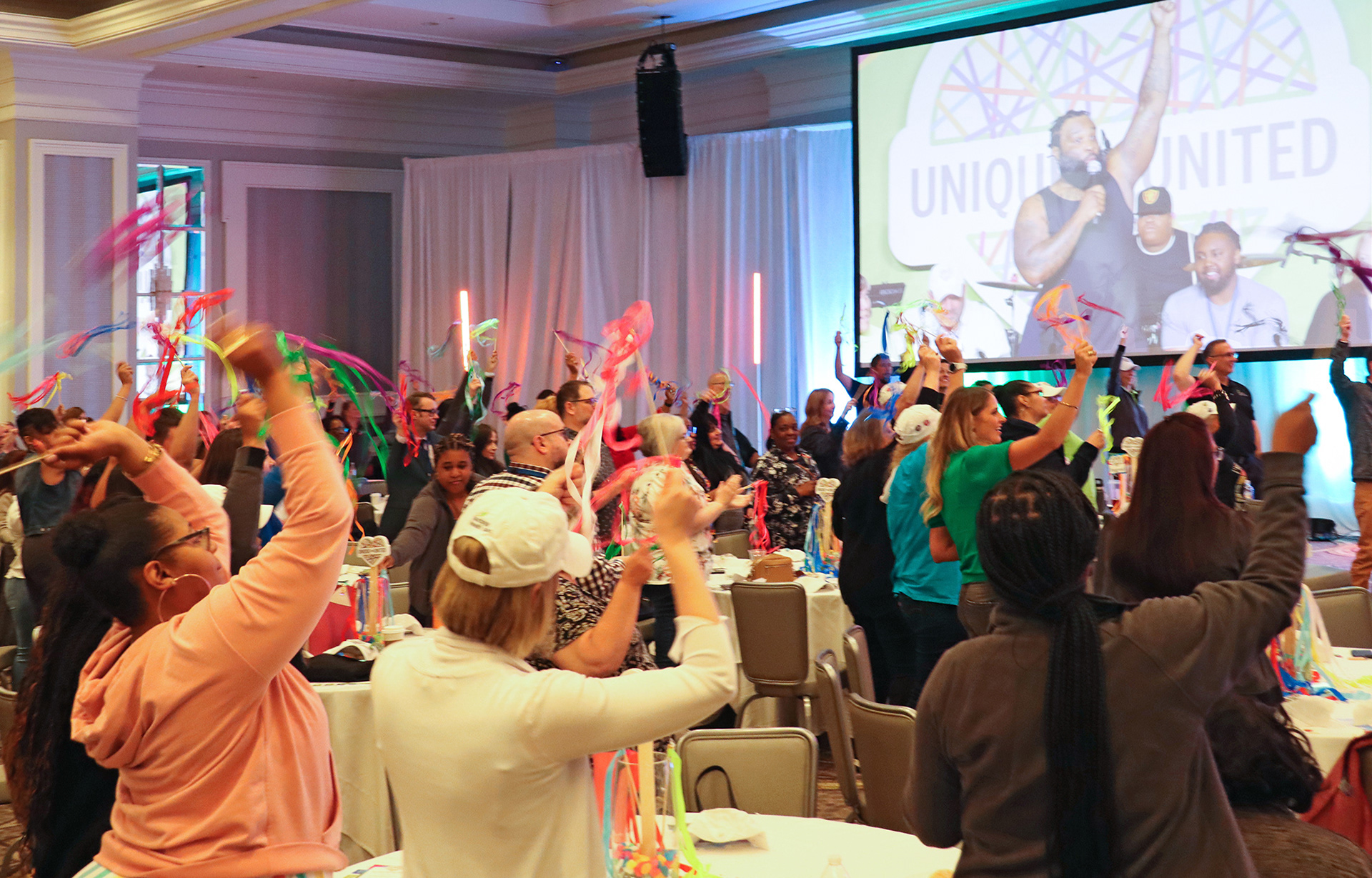
Ensuring that table centerpieces didn't obstruct views was vital. I researched options aligning with theme, budget, time constraints, and aesthetics, which we reviewed with the client. We opted for table scapes including meeting agendas, staff giveaways, rainbow heart confetti, glass cylinders borrowed from the venue filled with multicolored rocks and ribbon sticks, and a large foam core logo in the center—doubling as an interactive element for the finale.
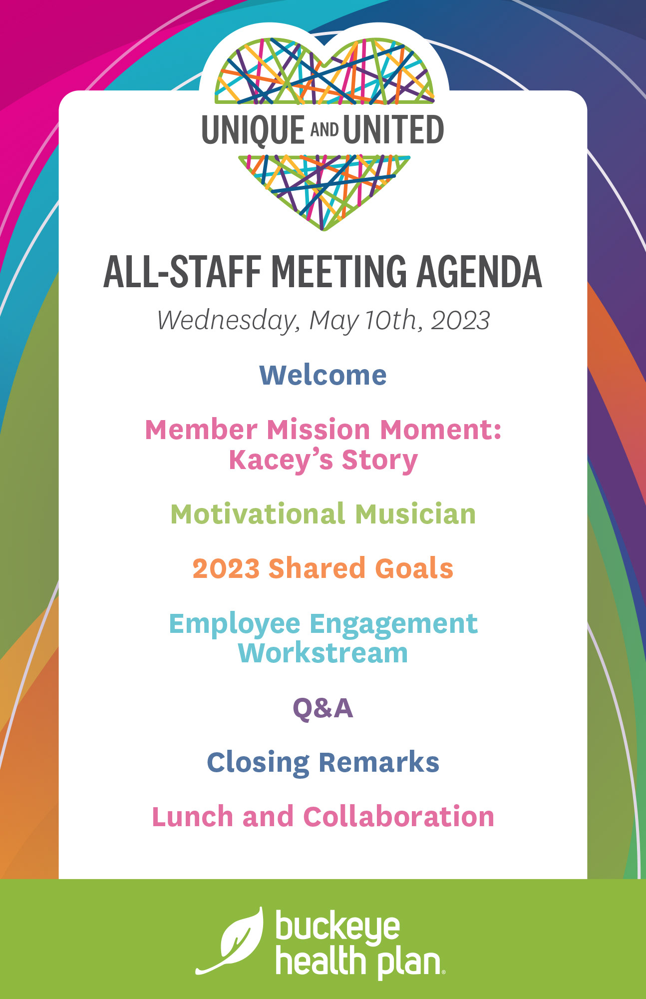
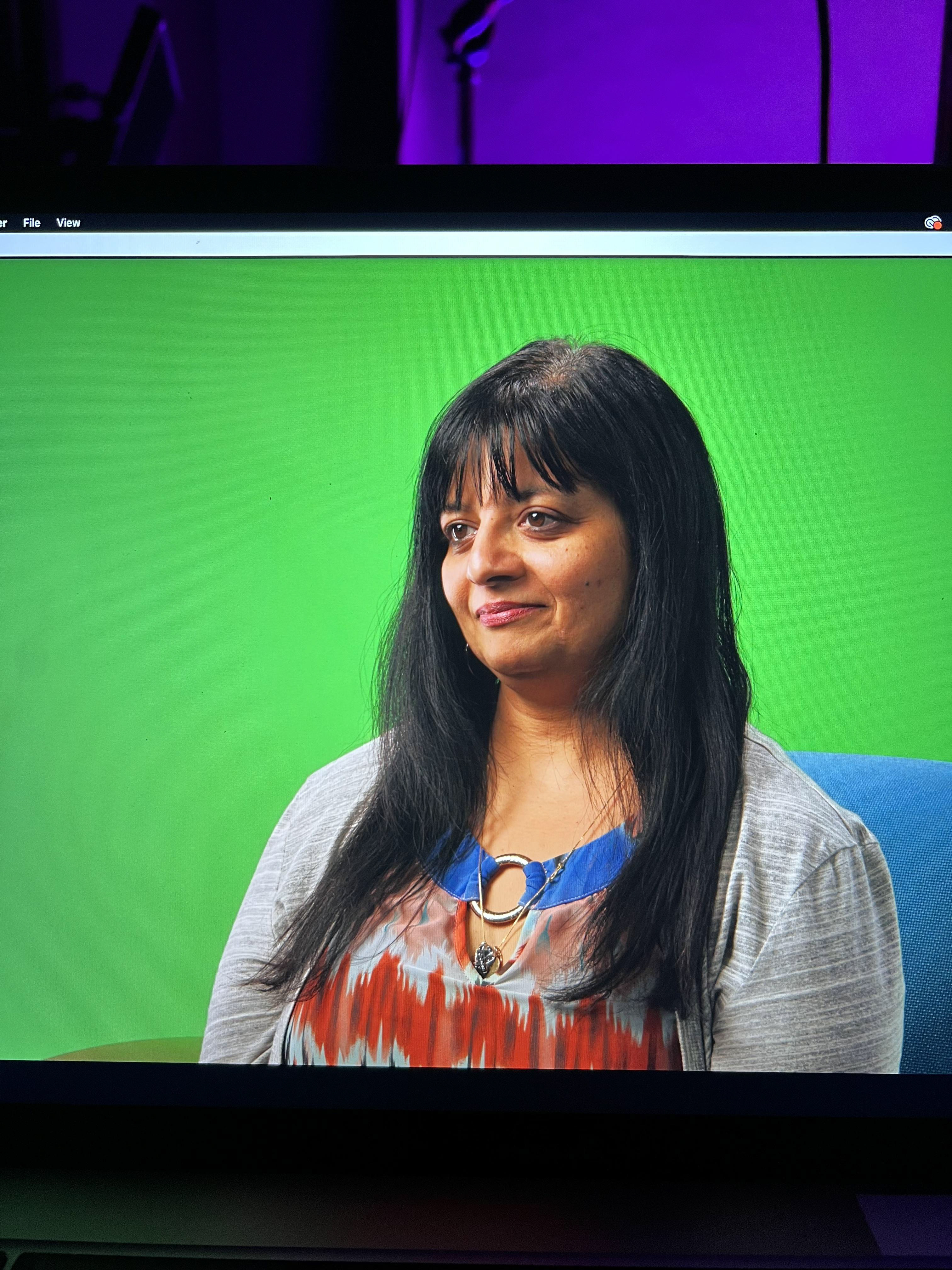
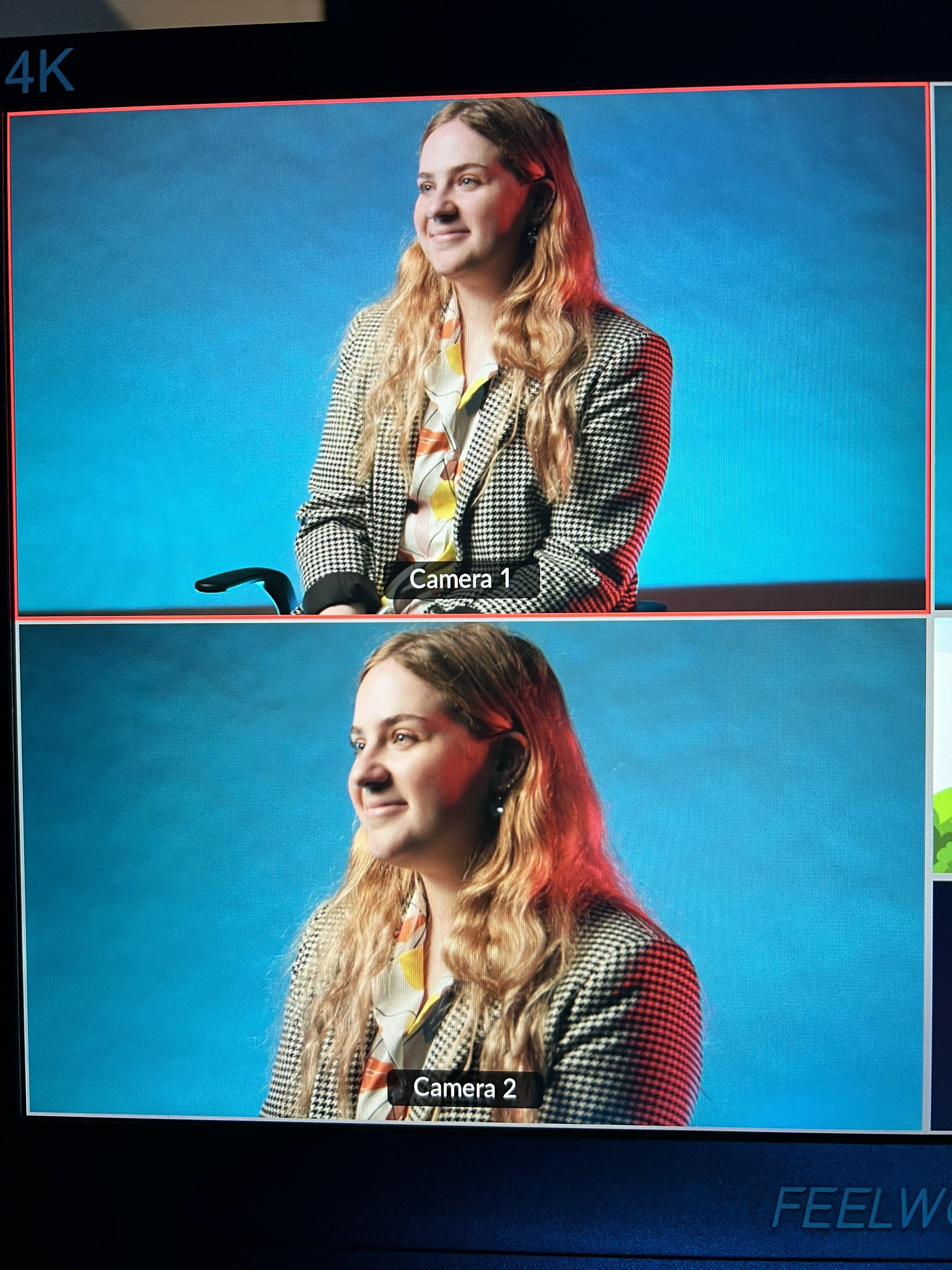
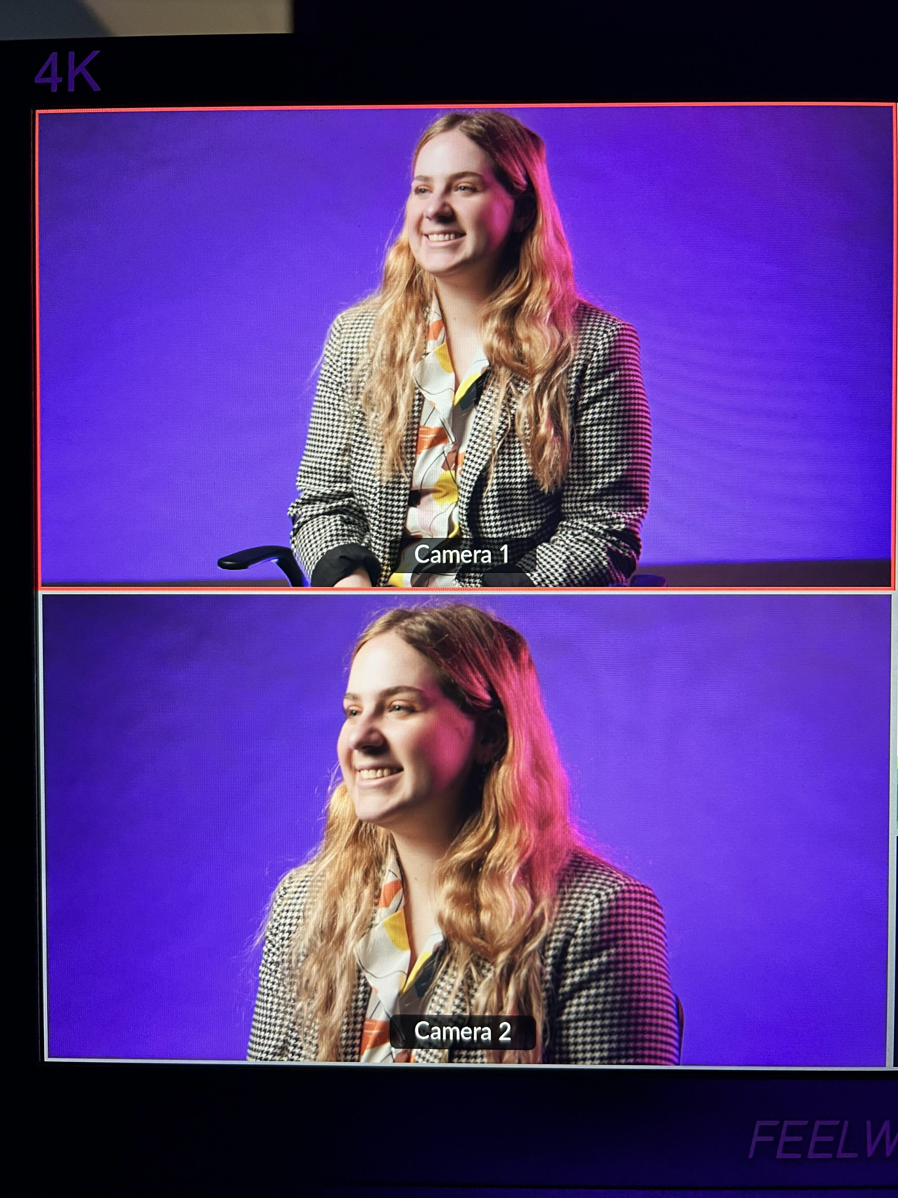
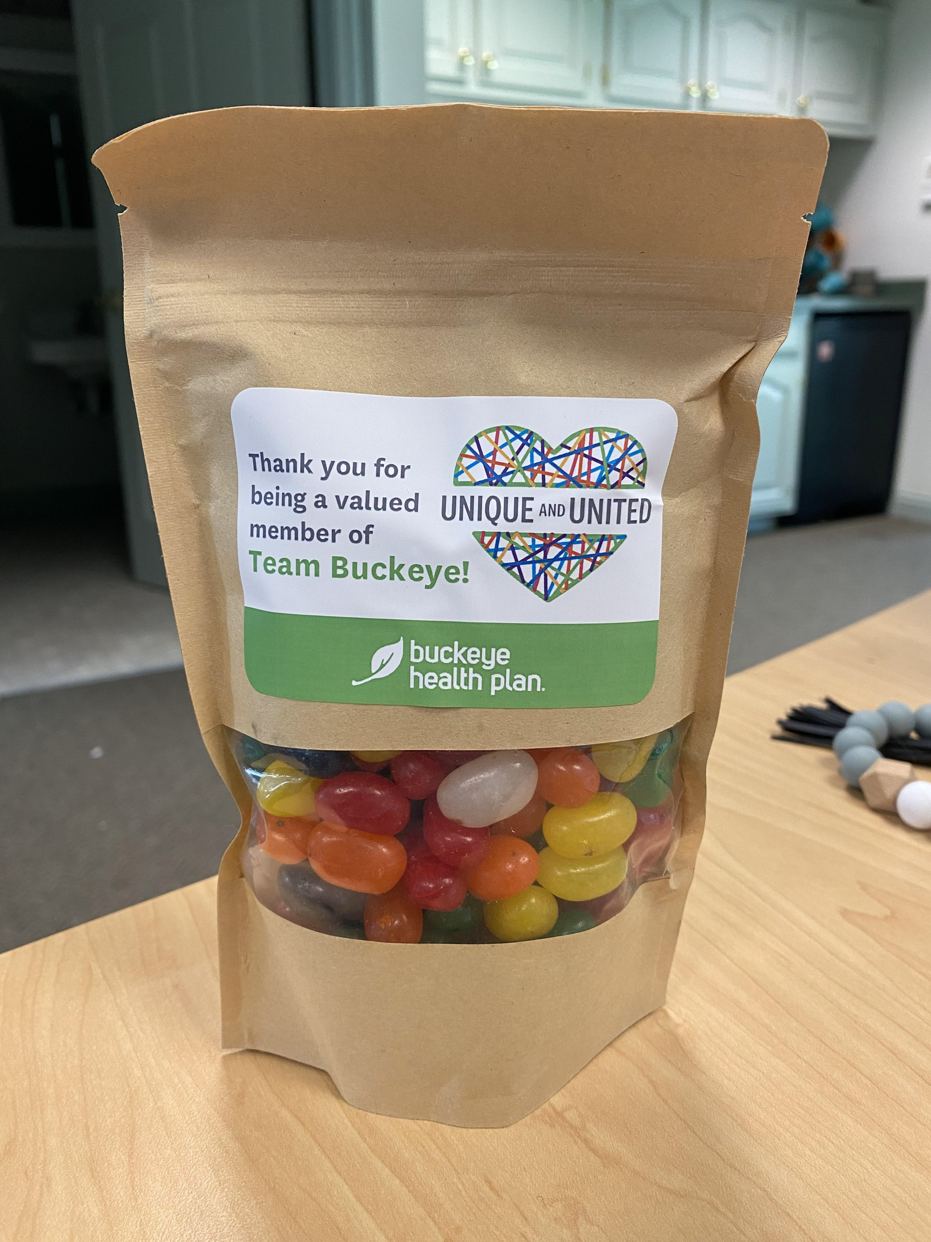
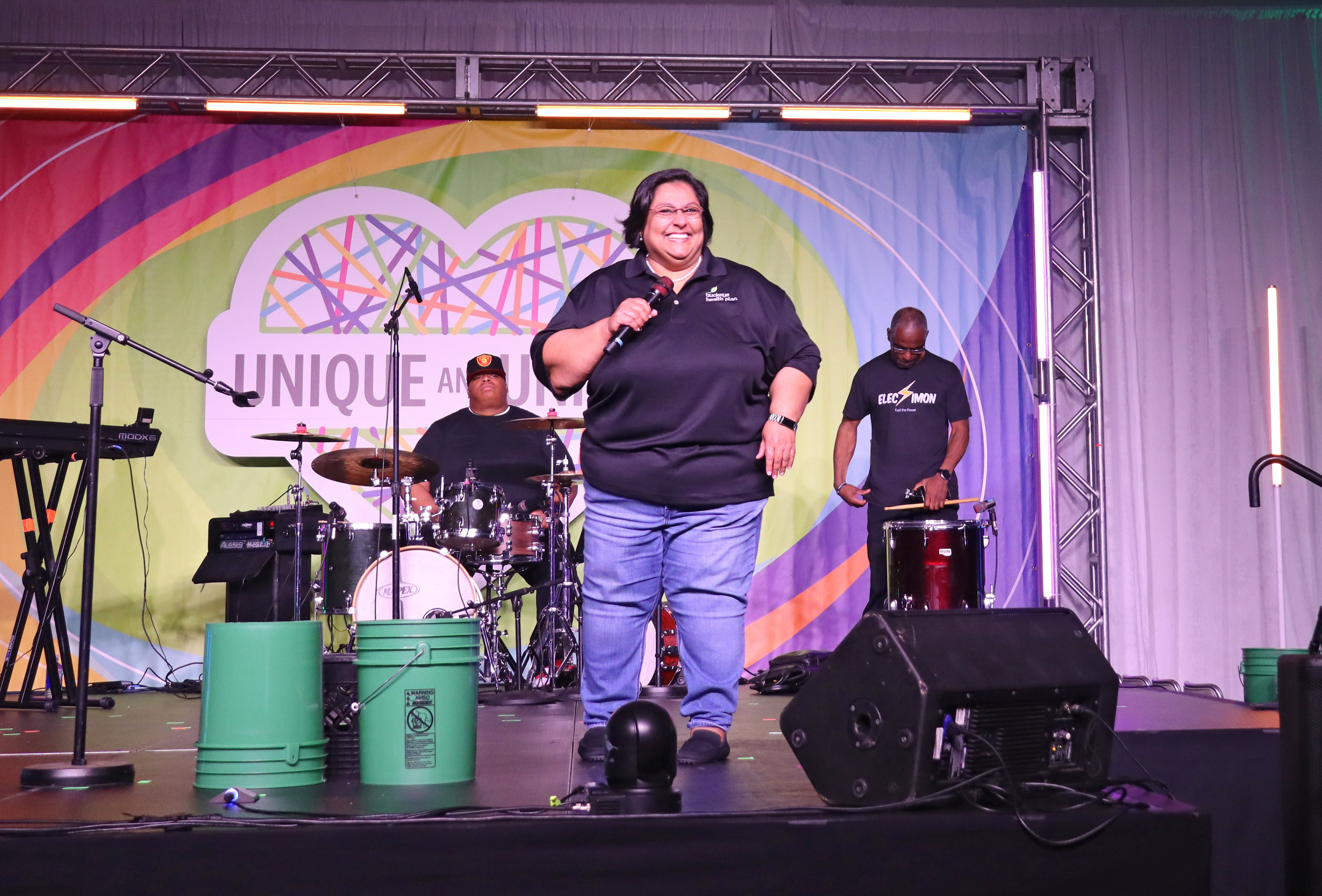
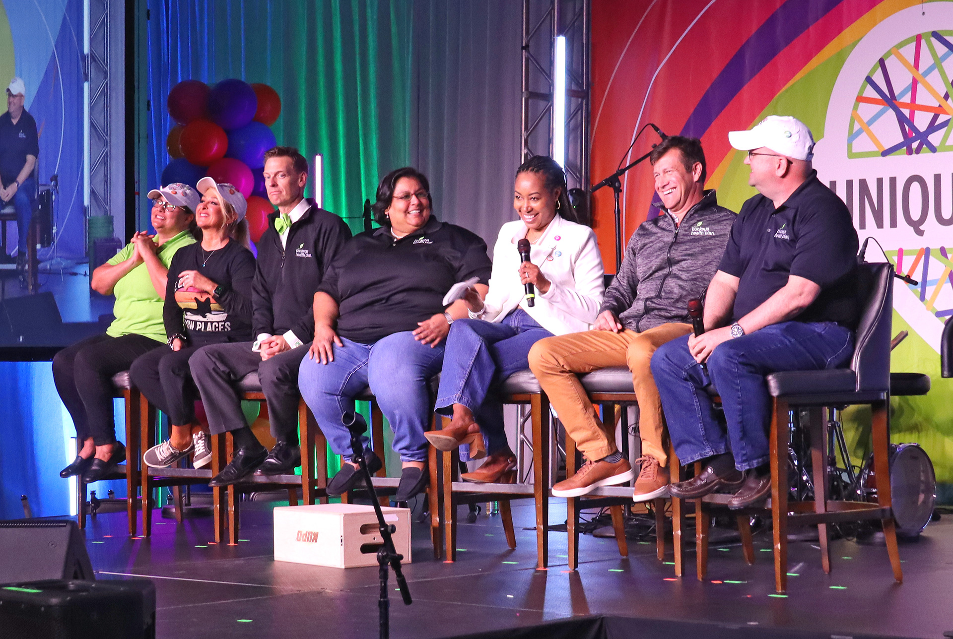
As the executive producer, I meticulously curated the run of show to ensure thematic and logistical cohesion. I introduced a series of chapter videos within the event, featuring Buckeye employees and their unique attributes. These videos not only addressed transitions but also incorporated key staff members. I collaborated with a videographer to art direct and conduct 12 separate interviews, and provided each staff member with branded "diversity beans" as a thematic reward. I also helped to provide creative direction and input to the editing and messaging of these chapter videos to our videographer.
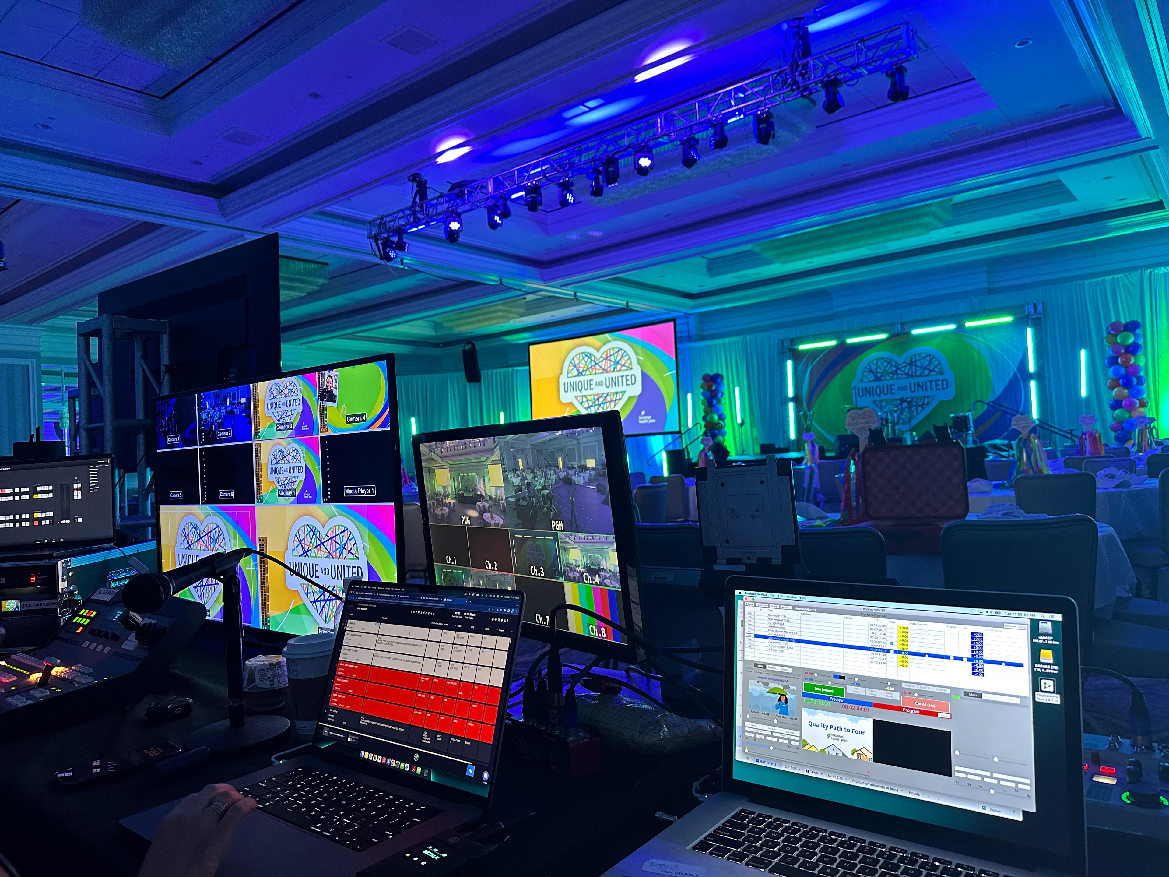
On the day of the event, I served as the liaison between the client team and the AV team, sitting at the back of house, and providing direction on cues, timing and slide switching, where needed.
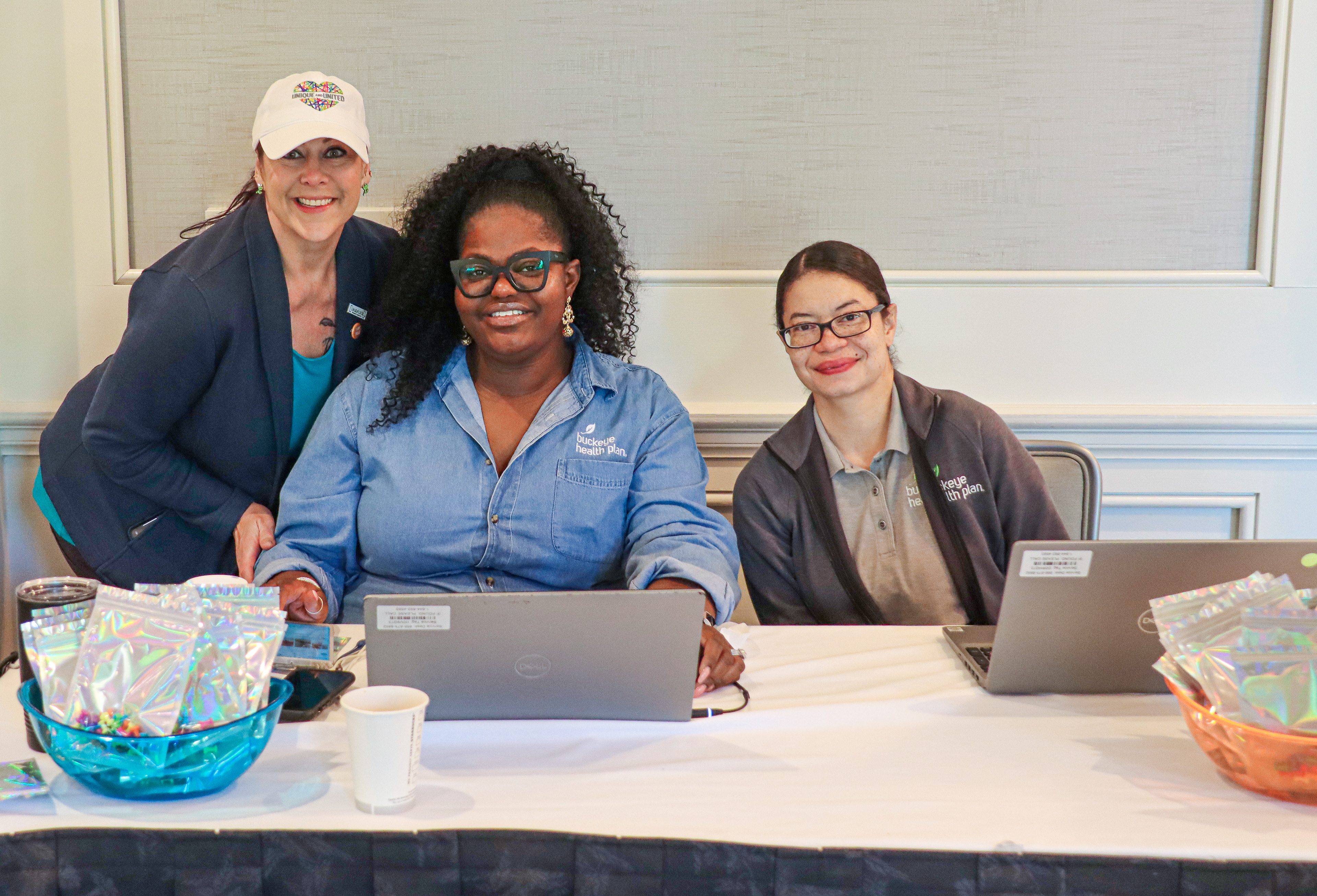
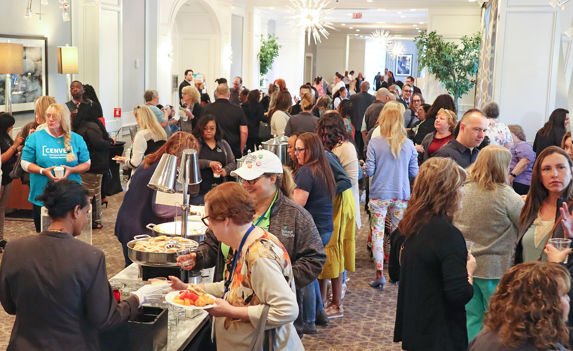
Nearly 900 Buckeye employees attended the meeting in-person and online. Post-event, I wrote a survey to distribute to employees, and used their feedback to create a recap report to present to the client. The findings were extremely positive, with some employees writing:
"I thought this was one of the best all staff meetings we have had in a very long time."
"This meeting proved that at Buckeye, diversity isn't just a catchy buzzword."
"This was a great experience as a newer employee to Buckeye. I walked away feeling like I mattered to leadership and the company."
"It was a really wonderful event, definitely one of the best in person events I have attended. Thank you for making each of us feel Unique and United!"
Team
Client: Buckeye Health Plan
Agency: BrandWell Solutions
Chief Strategy Officer/Supervising Producer: Stephanie Cotts
Chief Creative Officer/Photographer: Rob Candor
Senior Art Director/Executive Producer: Liz White
AV/Technical Production: Badass Meetings
Carpentry: Brian Altiere
Video: Sequenced Productions
Large-Scale Graphics: WestCamp, Digico Imaging
Printing: Baesman