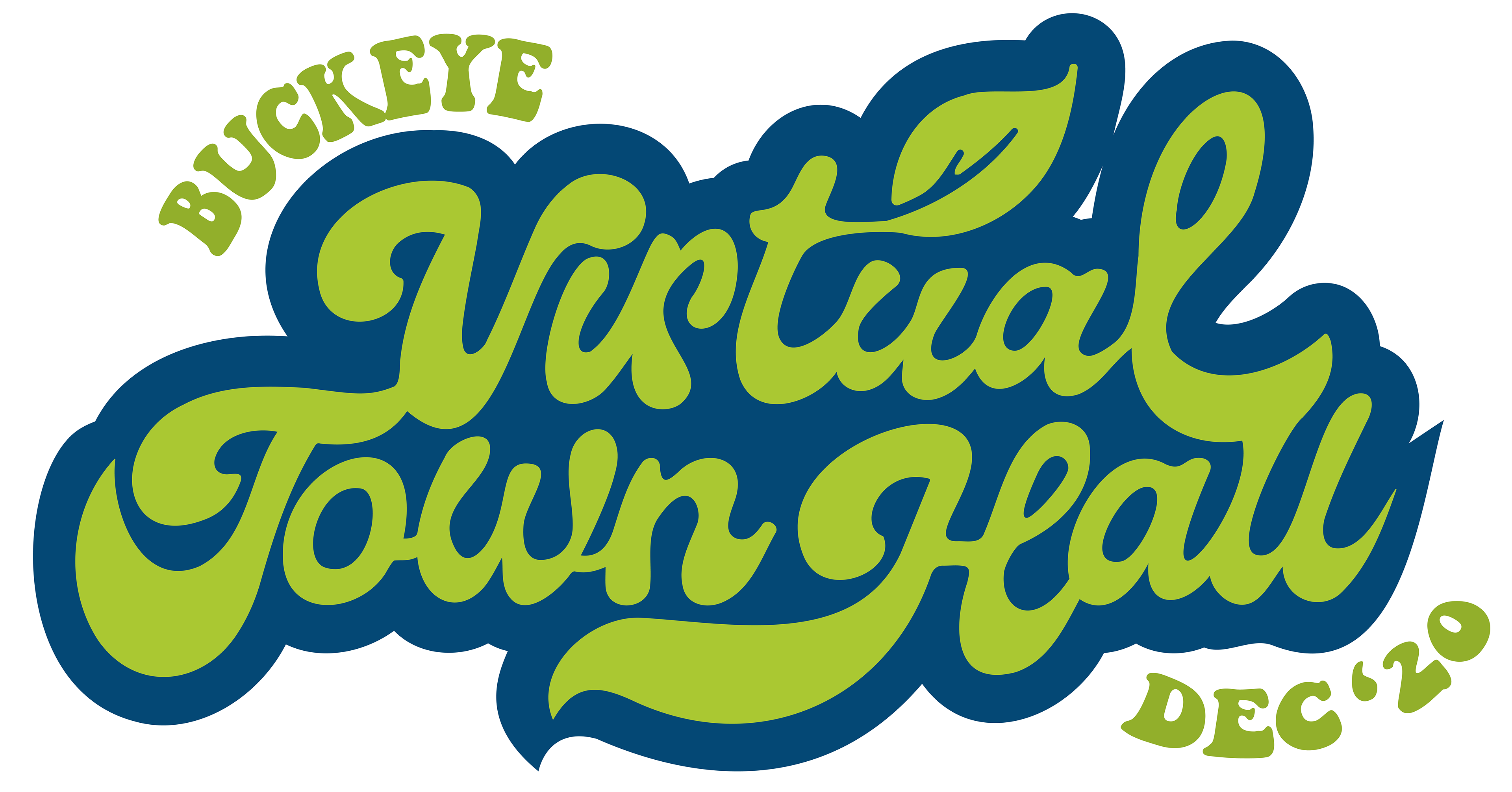
Originally planned to have a 60's theme, I did several logo concepts and presented to the client for review. Because this is an internal event, the branding has a little more wiggle room; I could add in a blue accent color, and some fun 60's-inspired fonts. Here are the rejects...

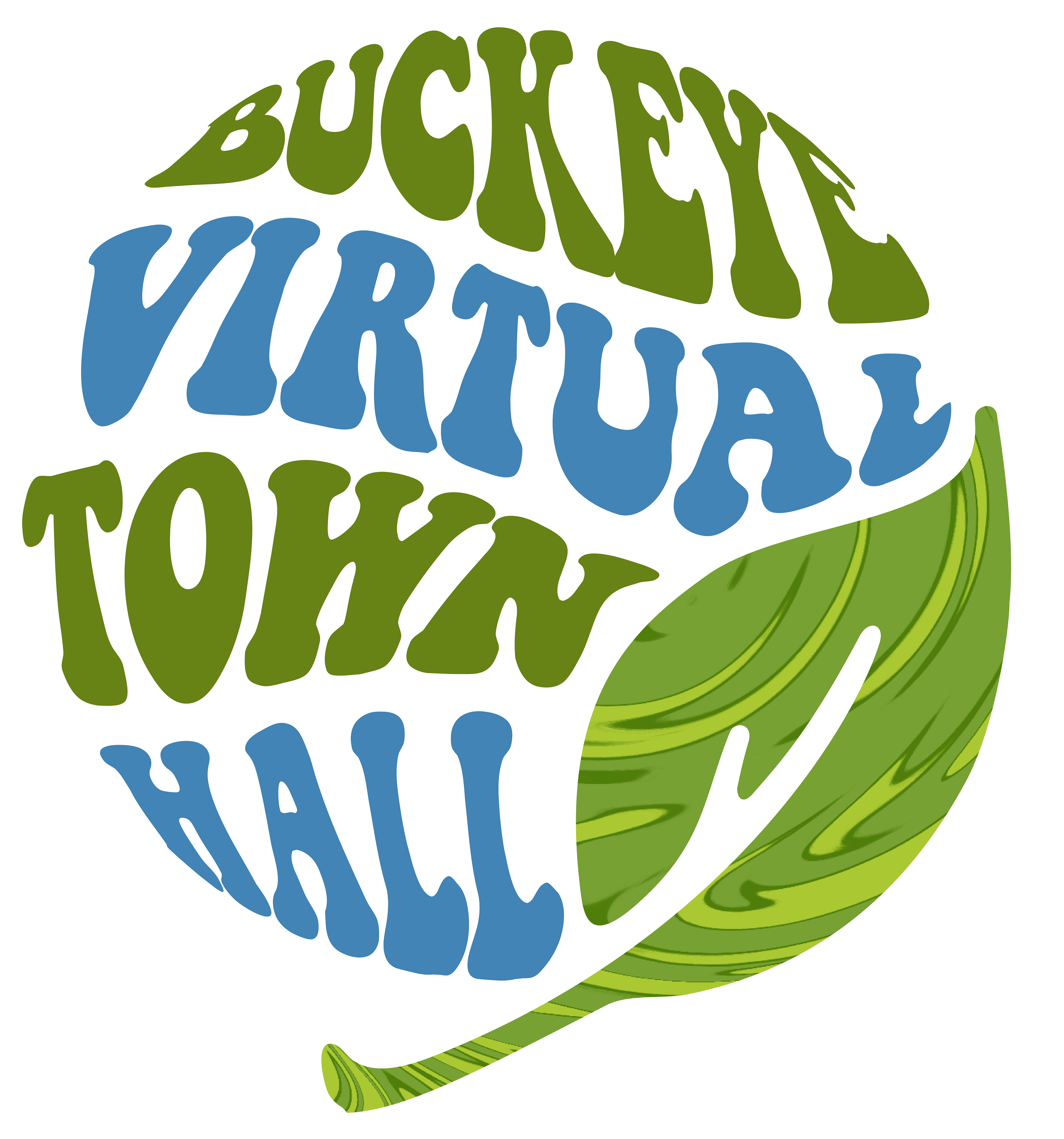
...And the winning logo, done with custom hand lettering. The client loved the other options as well, choosing the Volkswagen Van as a secondary element.

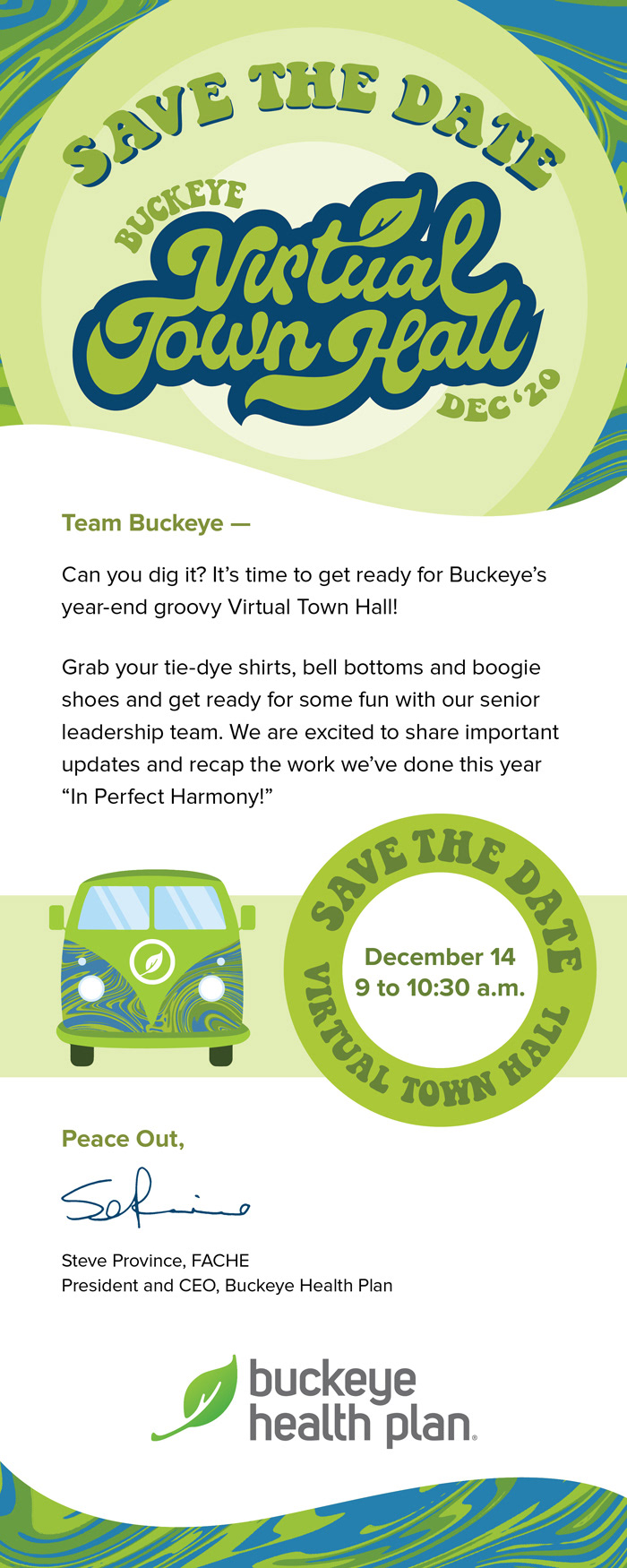
I then got started on other collateral for the event: a Powerpoint template, including title, chapter, and text slides, an email invitation, and t-shirt design for staff to wear. This was an exciting project to work on, and each element was a joy to complete.


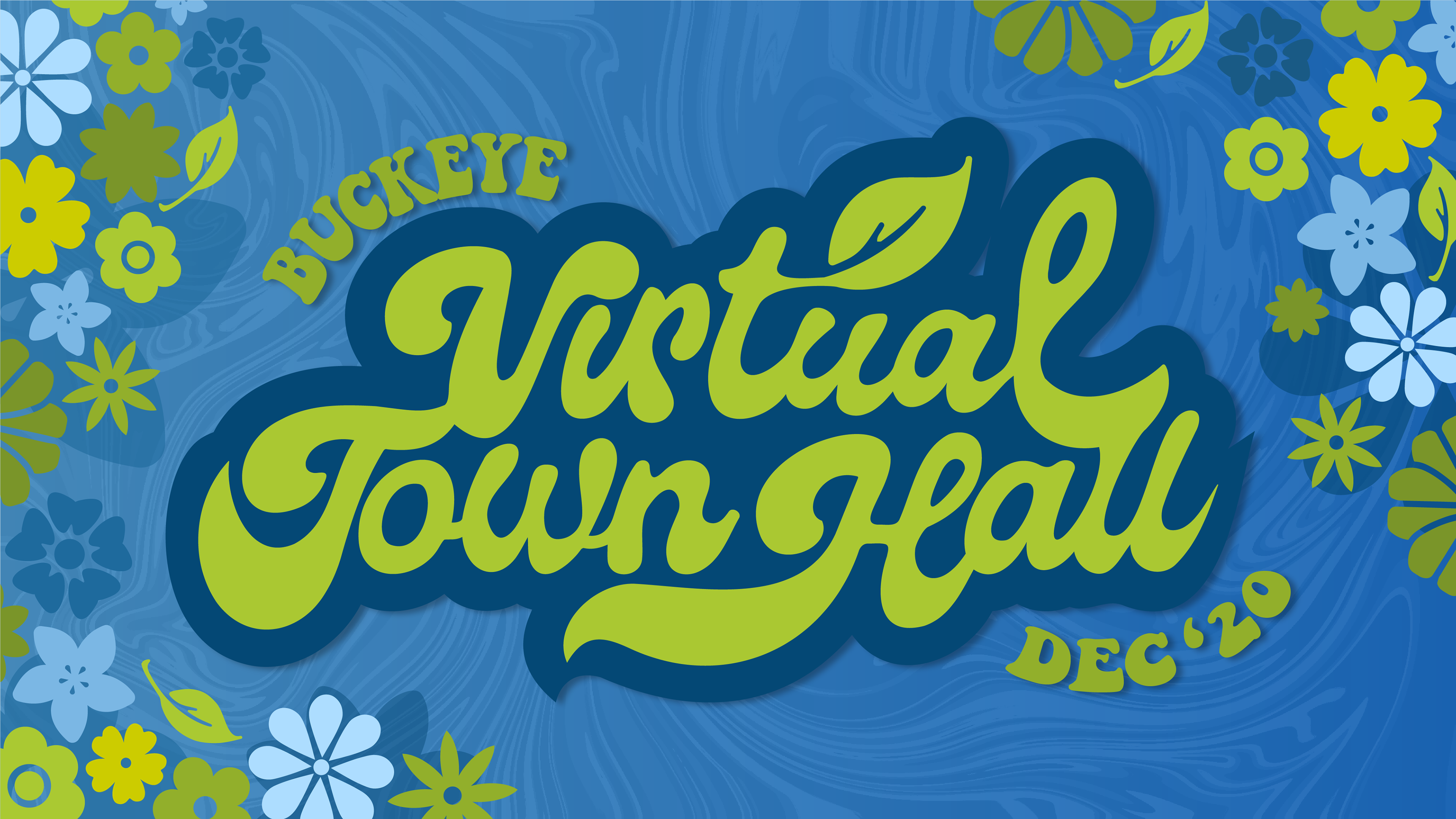
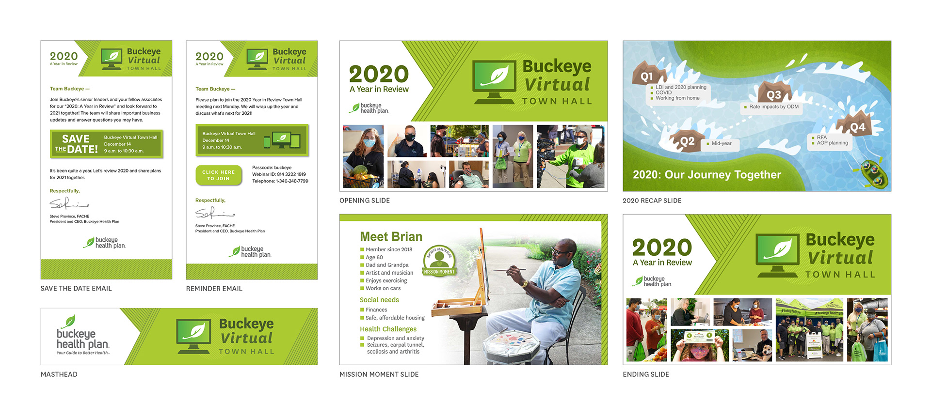
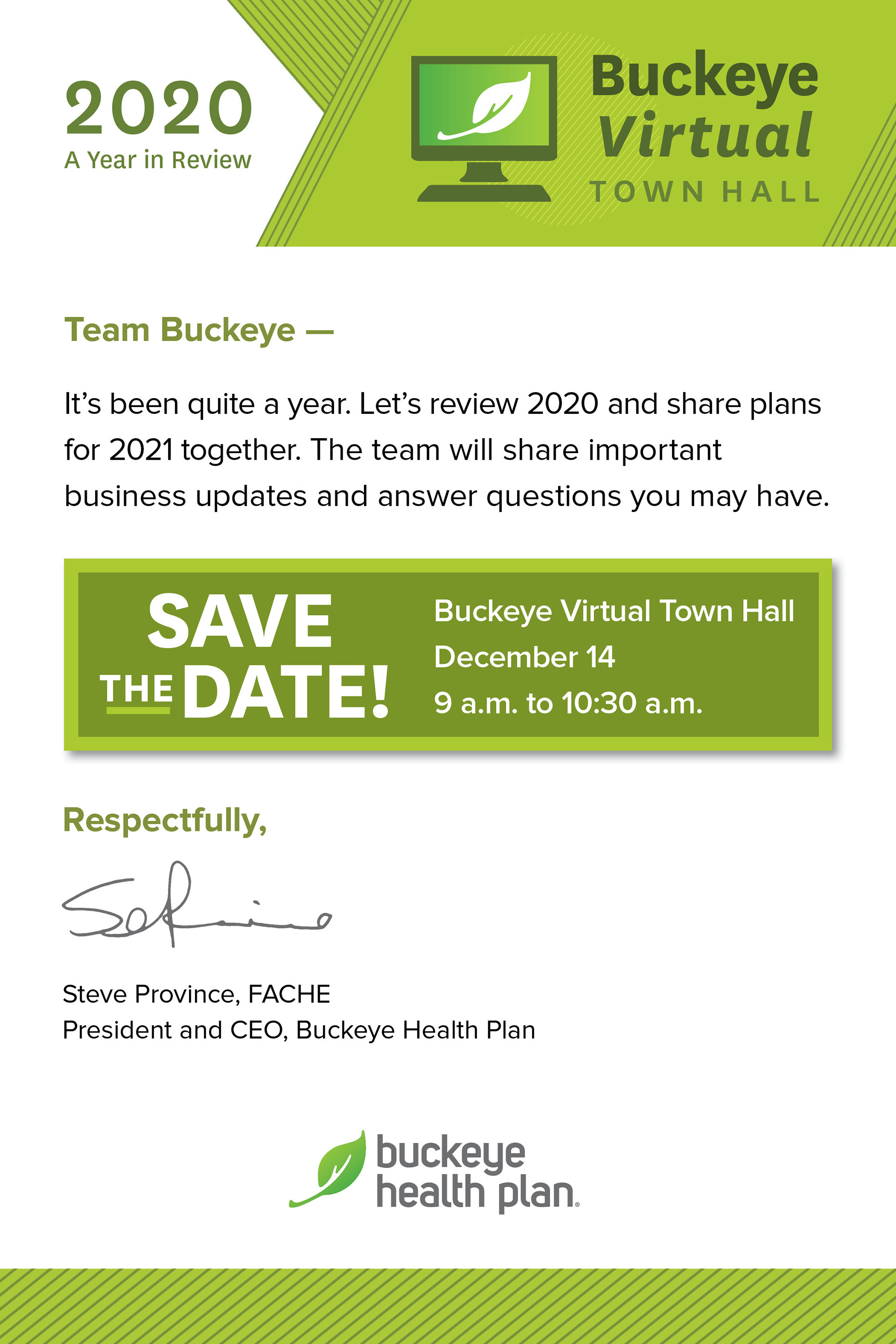
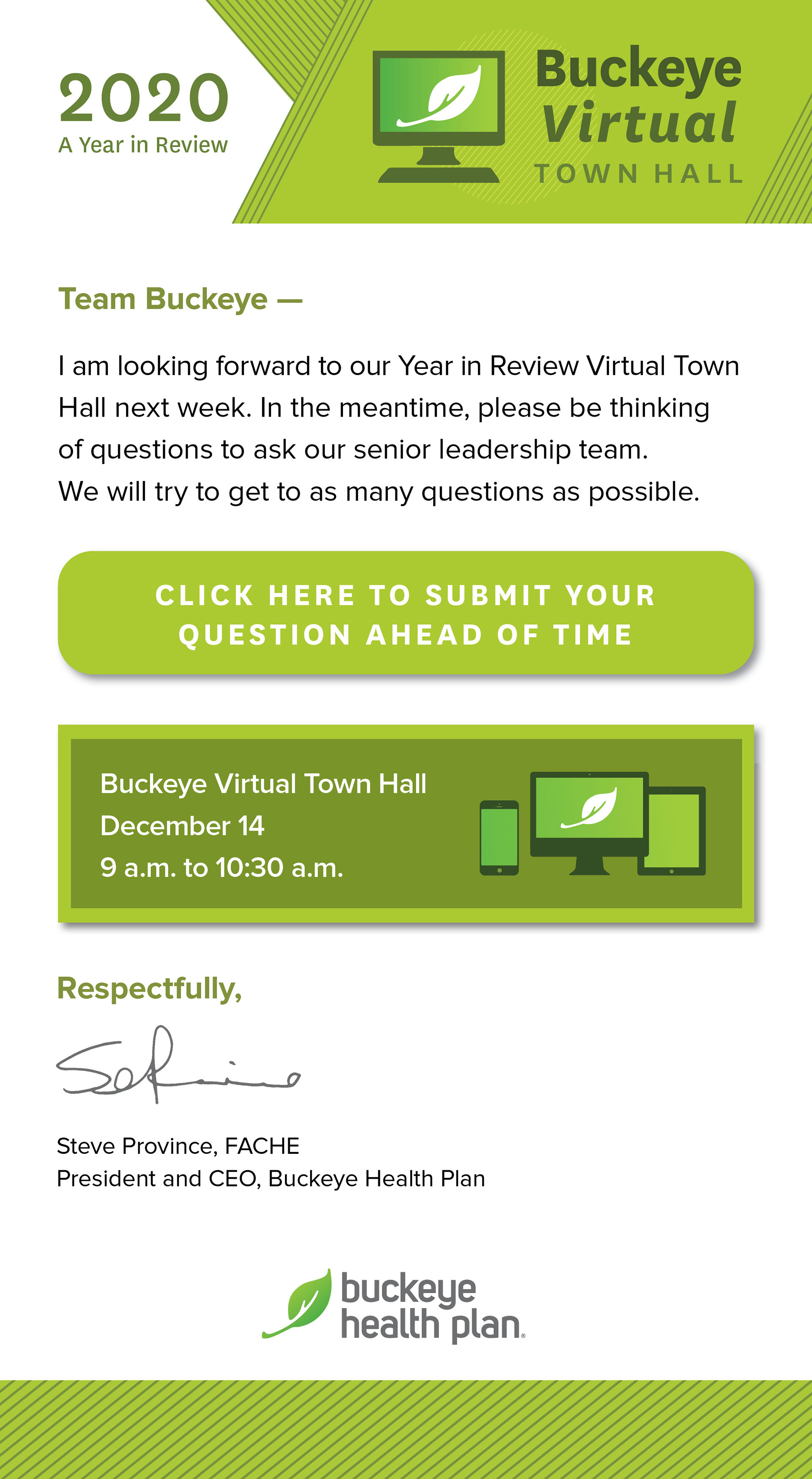
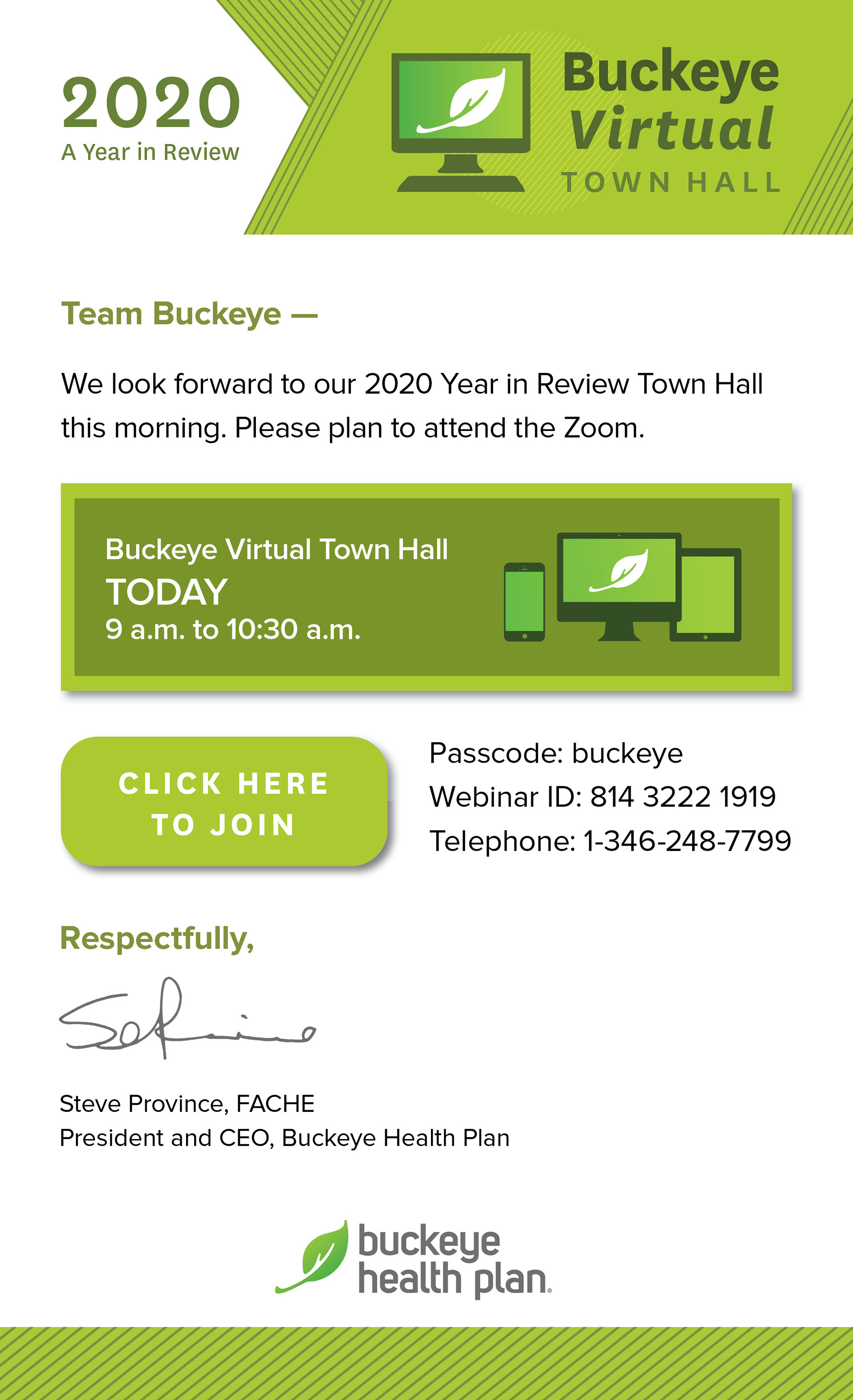
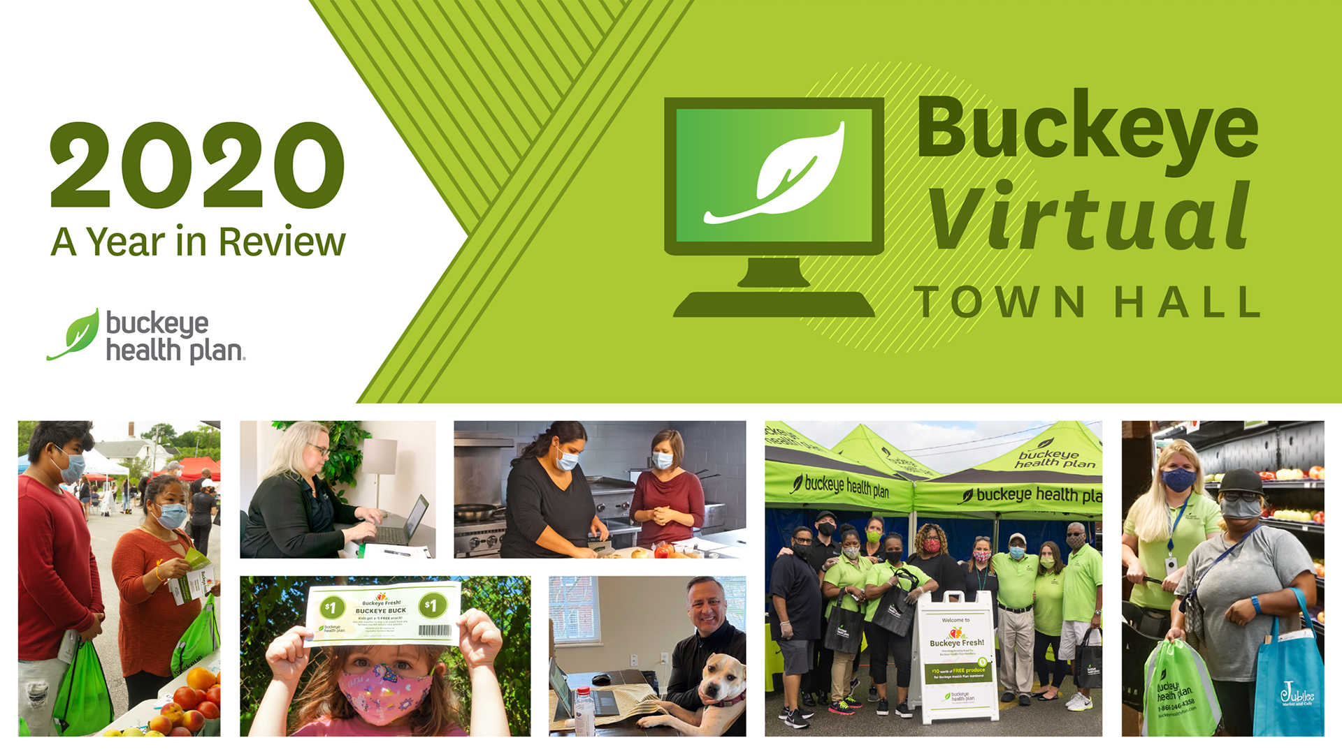
It was two weeks until the event when the CEO of Buckeye decided that it wasn't the right time to hold a 60's themed Town Hall. We had to quickly pivot into a more subdued, strictly branded theme, and redesign all of the elements for the event. This began with a new logo and masthead, which would direct the rest of the look and feel for the event.
Email invitation and reminders followed, which updated staff about the event in different phases: Save the Date, Call for Questions, and Day-of Email.
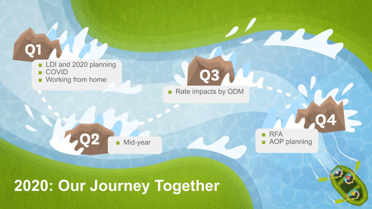
Powerpoint template for the event's presentation. Rather than keep it stark and simple, I included photos of Buckeye members and employees adapting to the difficult year. Images of members in masks at events, and employees working from home were included on the title and ending slides.
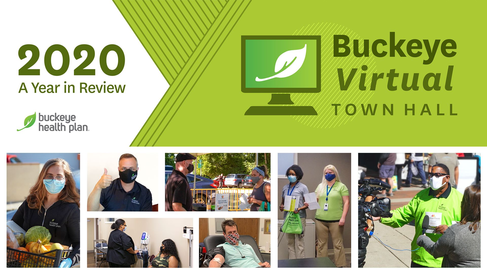


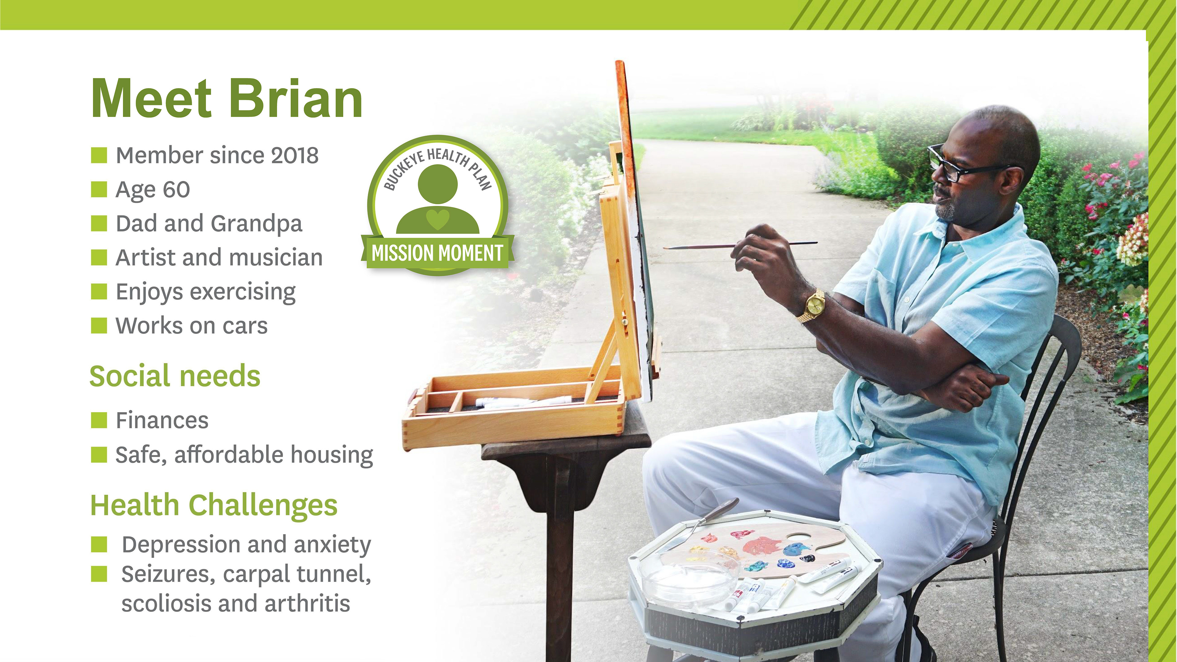
Included are some sample slides from the presentation: a 2020 recap graphic and a Member Mission Moment.