I've been involved in the design and creative direction of the annual Community Impact Report since 2020. Each year, the cover highlights Buckeye's community efforts, whether through their employees or members. In 2022, the client sought a cleaner, more photo-based design, deviating from the previous graphic-oriented approach. My design process commenced with a thorough review of past work, aligning it with the new direction.
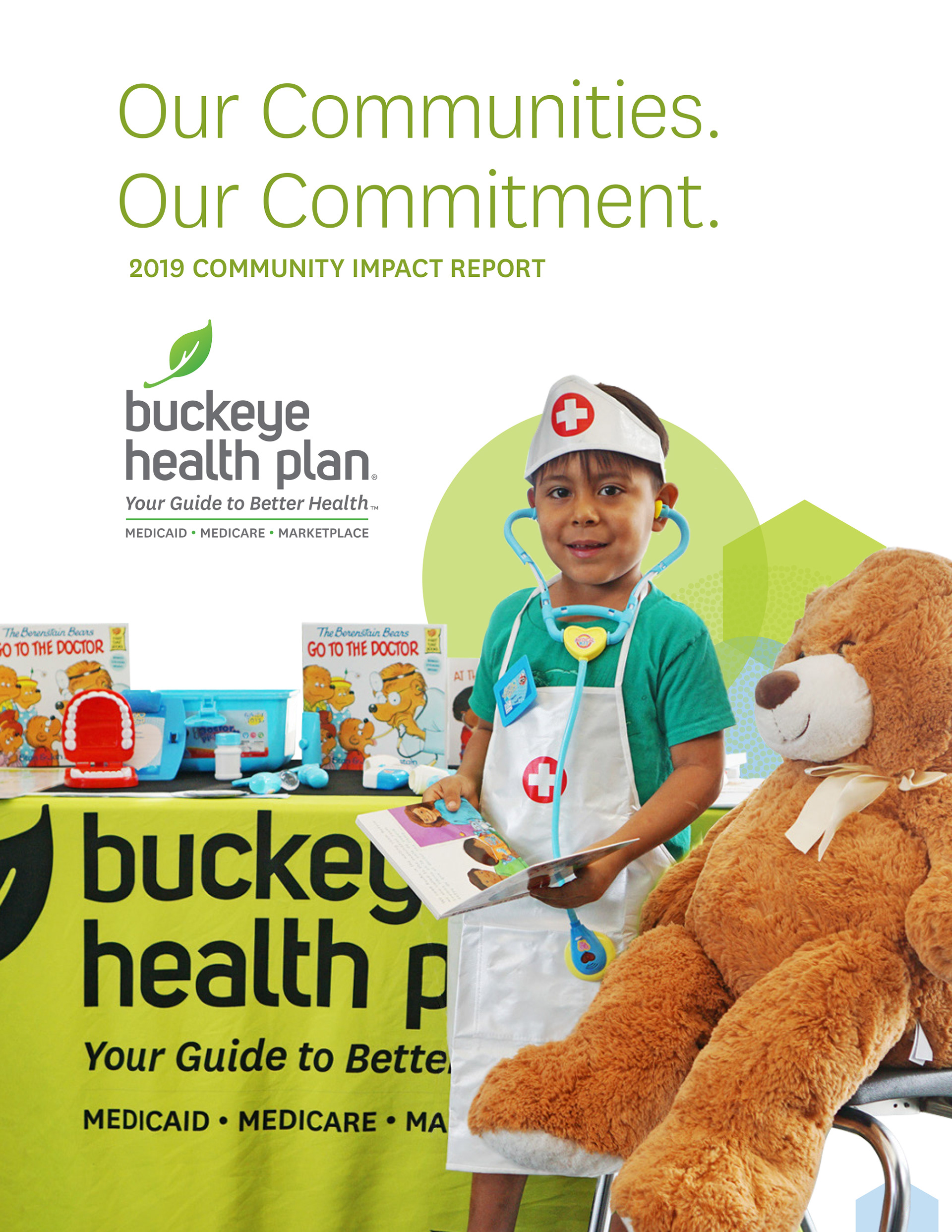
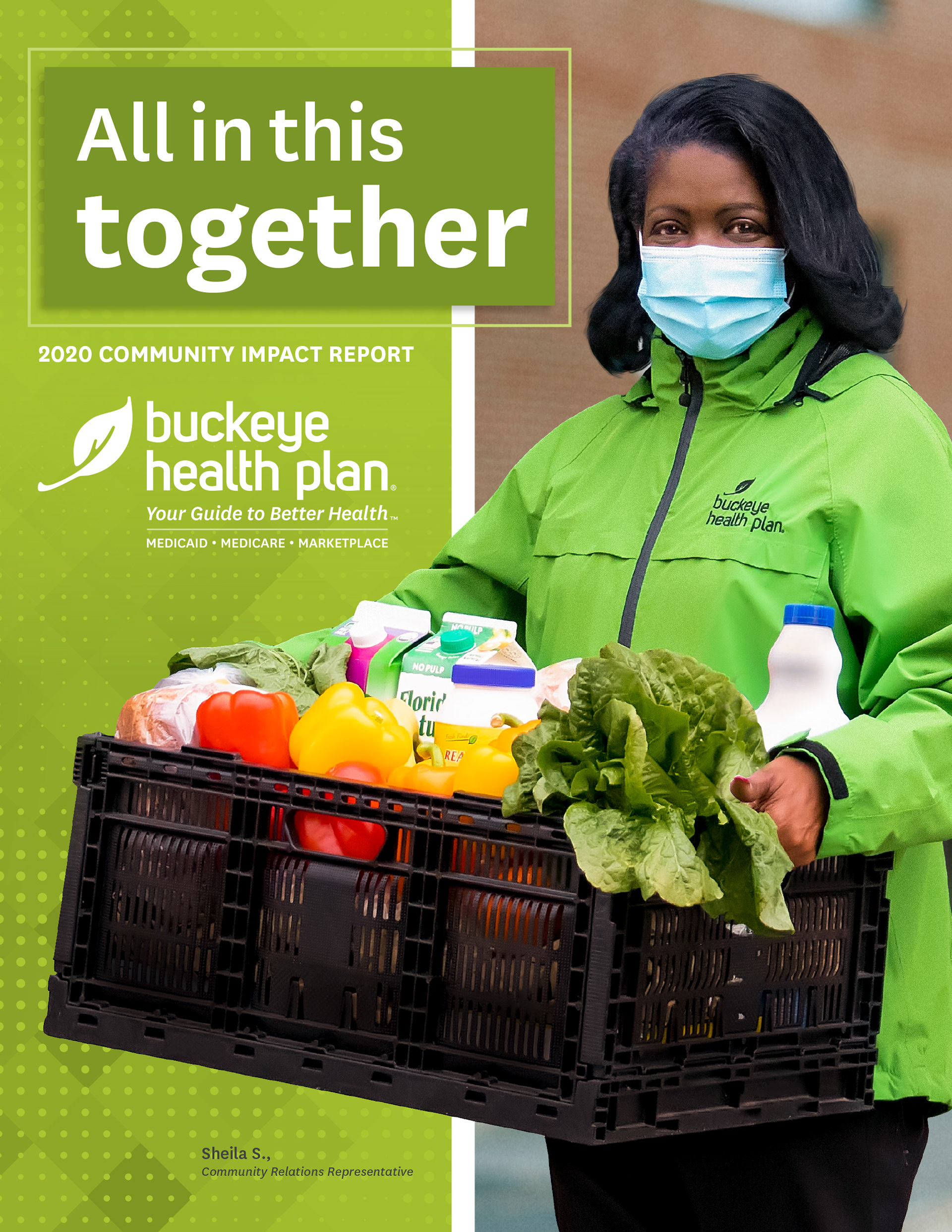
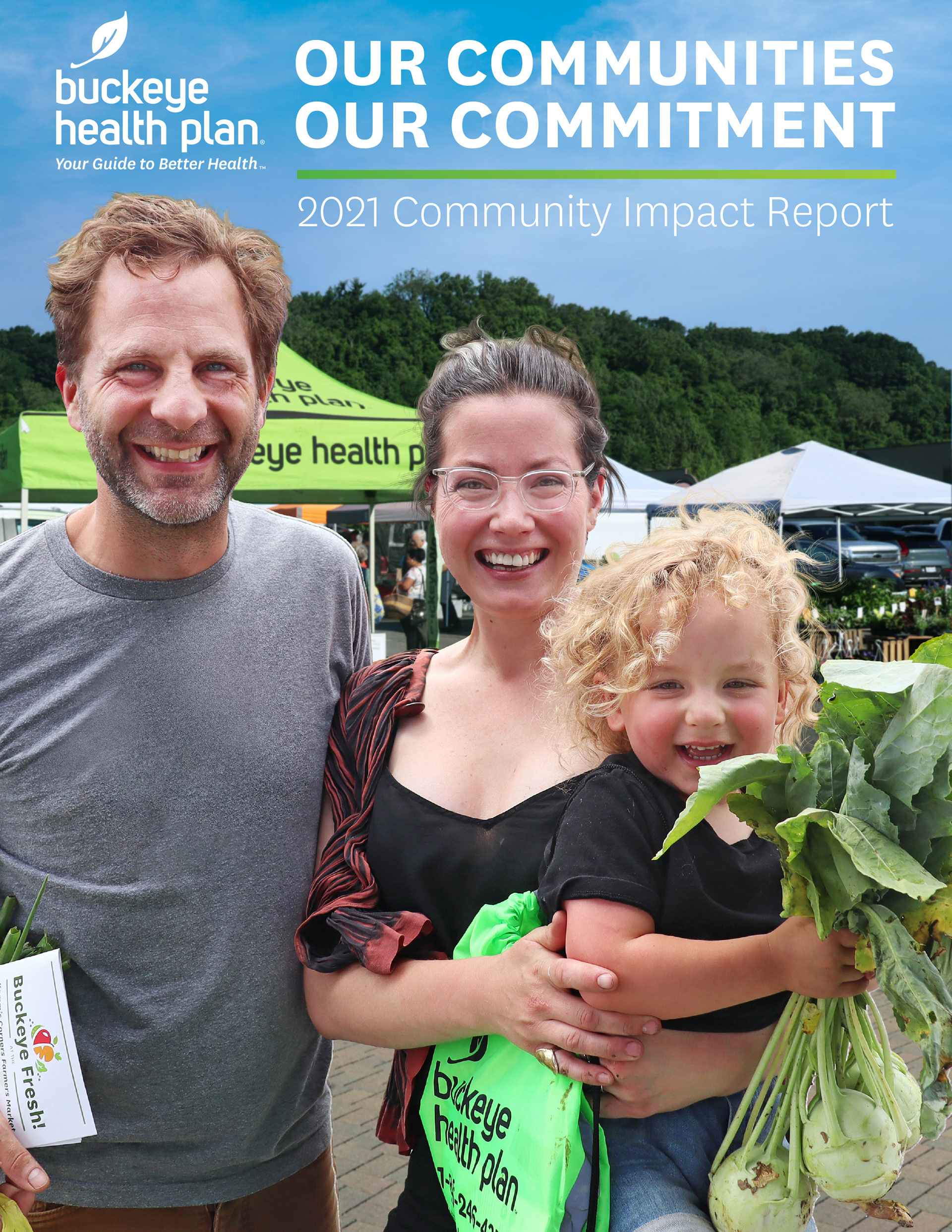
I sought inspiration in clean and modern print designs. It's crucial to stay client-focused when seeking inspiration, ensuring that trends align with logistics and brand appropriateness.
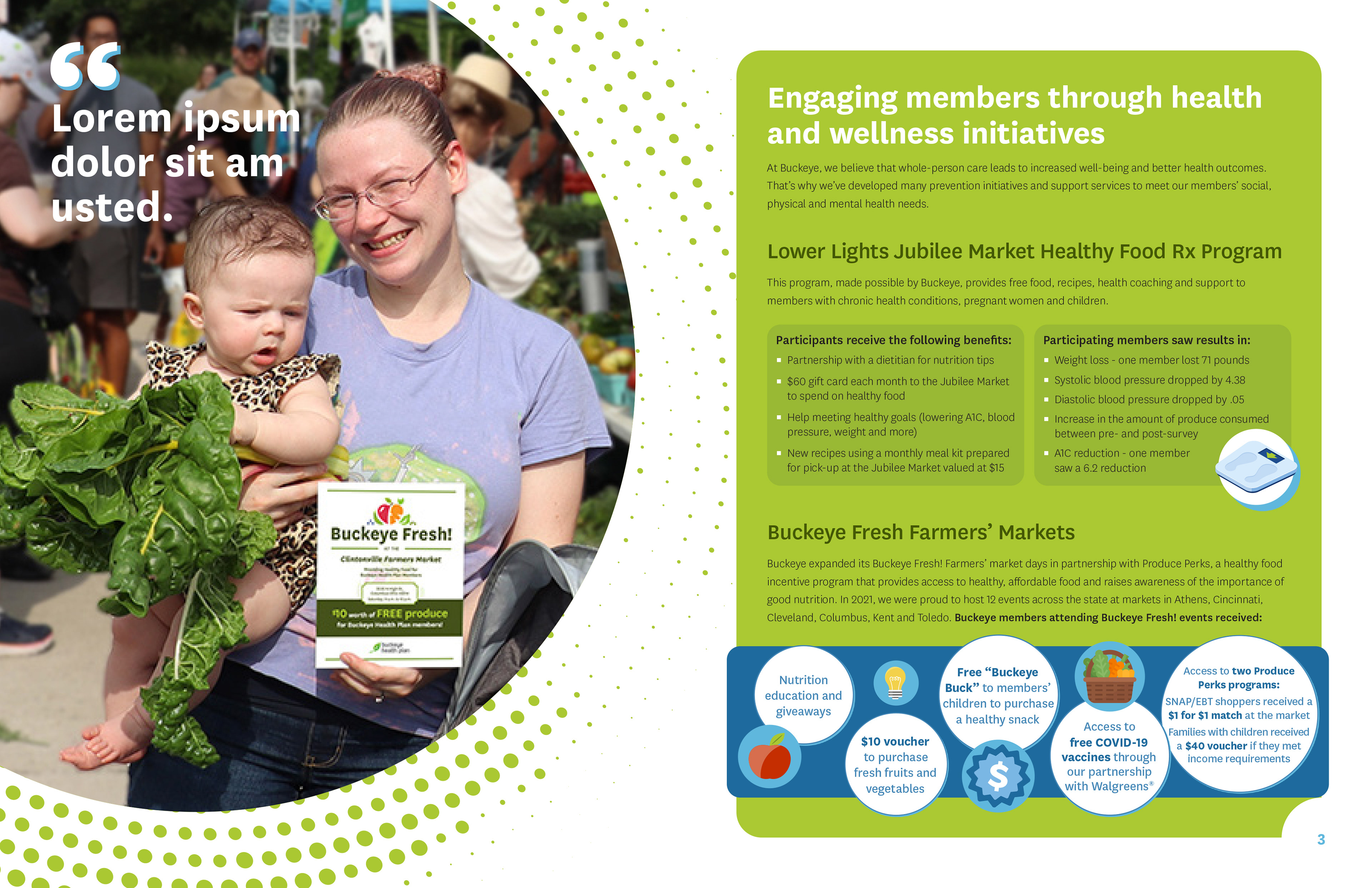
Early drafts of the design were clean, but lacked the unique character that Buckeye’s typical collateral brought to its readers. Considering this, I revisited past reports and identified a recurring design motif that added character and consistency. I continued my search for inspiration, focusing on distinctive shapes and photo treatments.
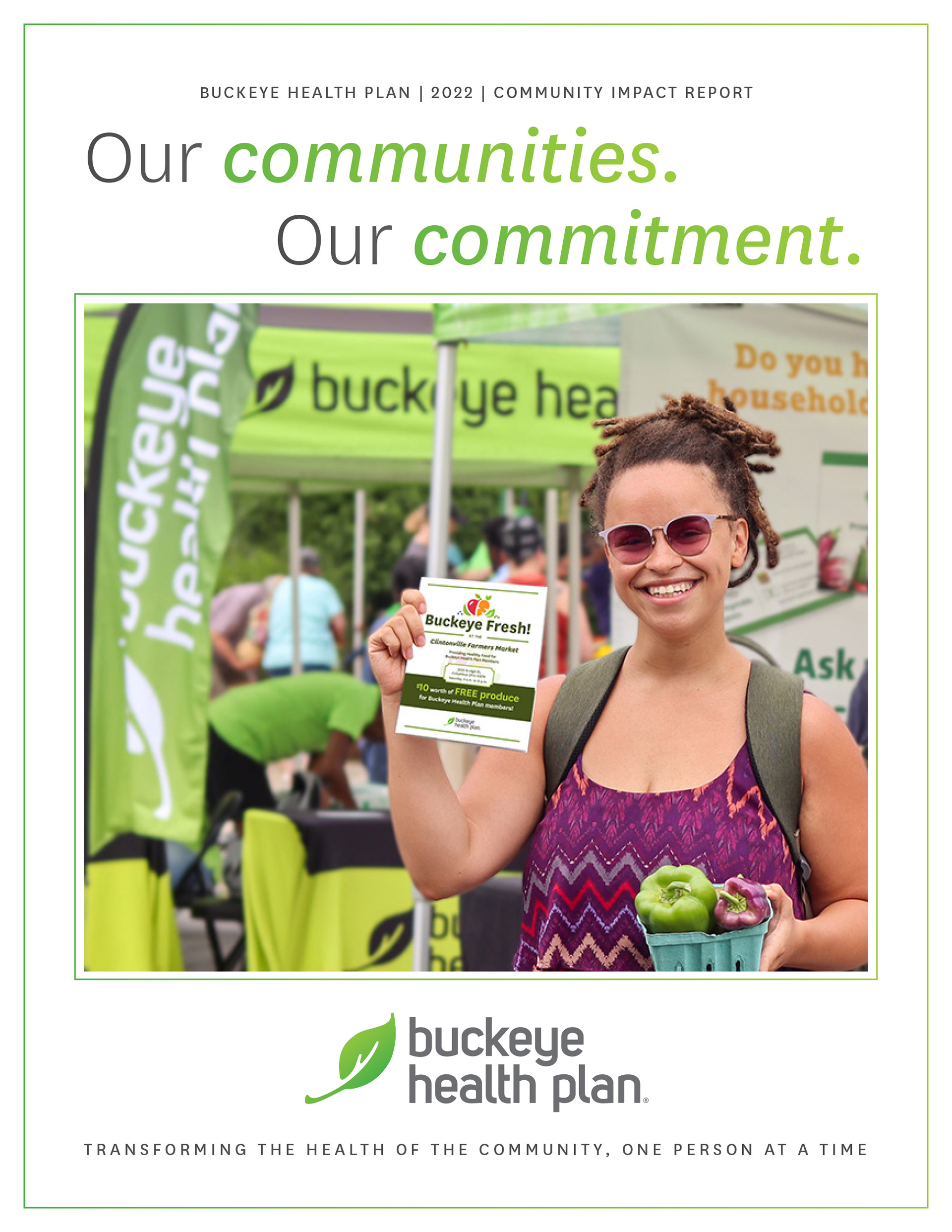
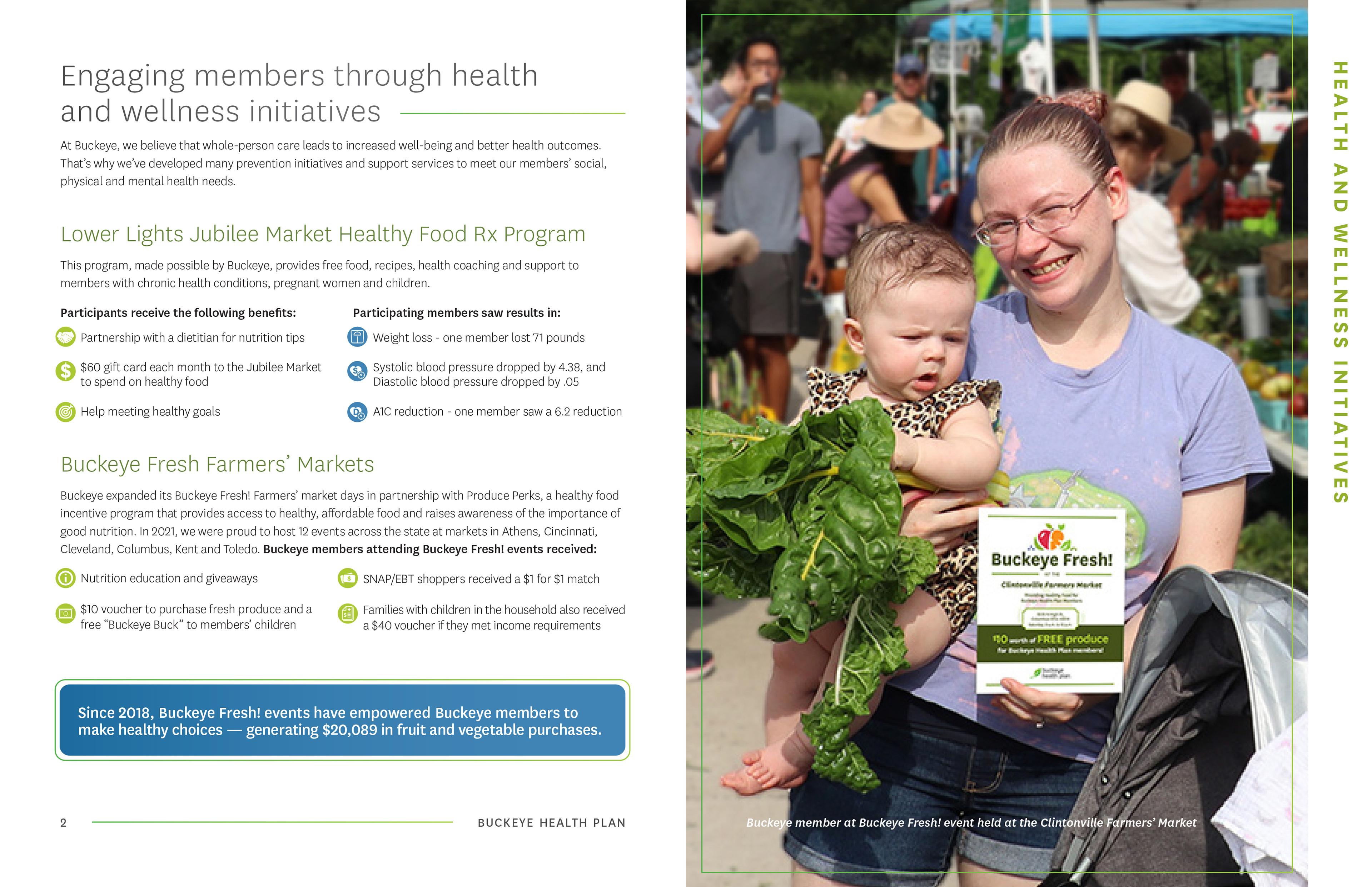
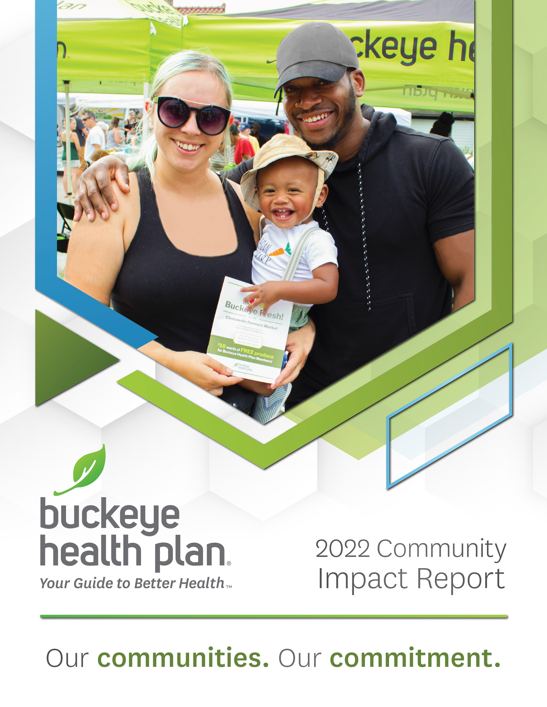
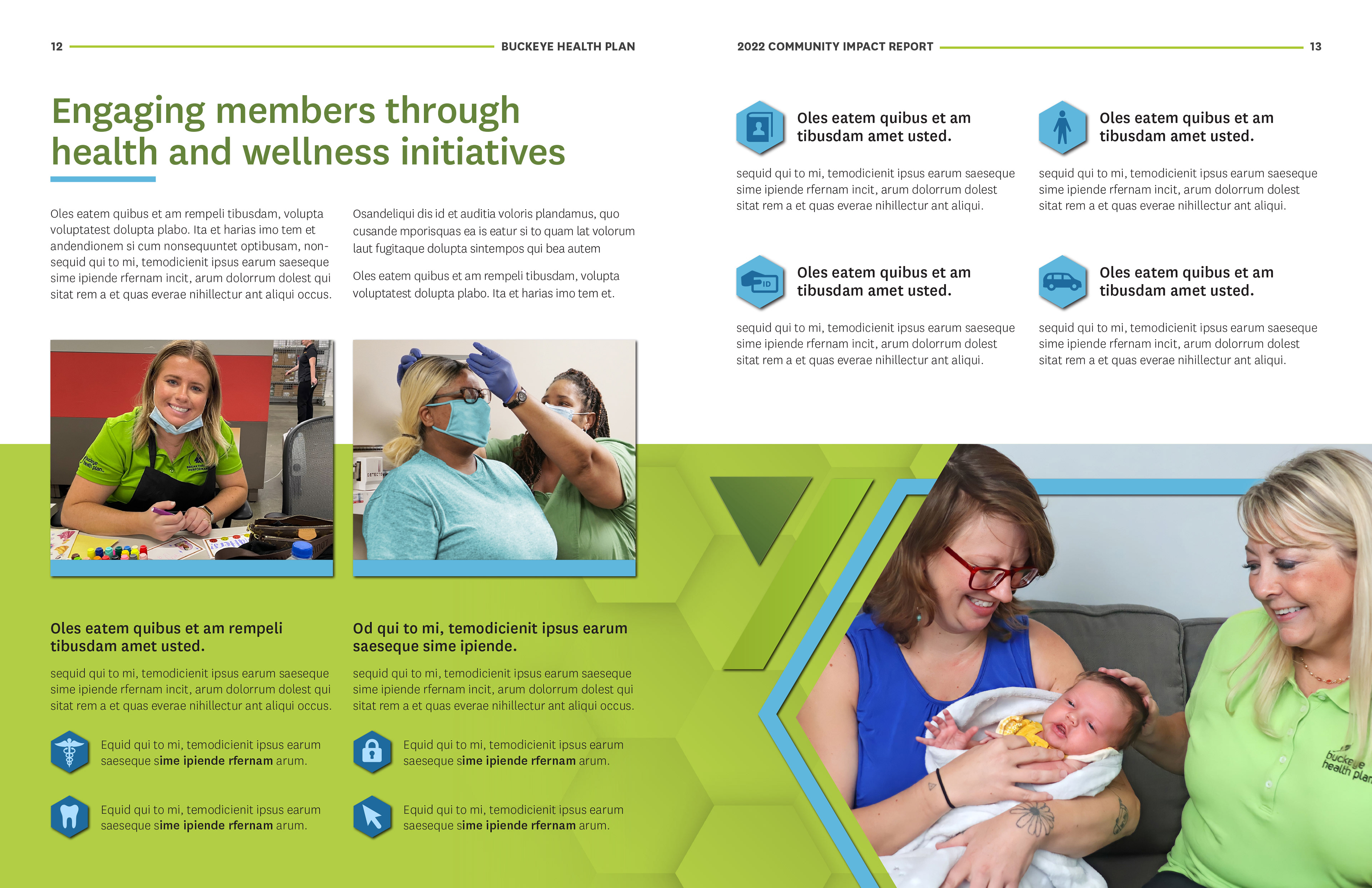
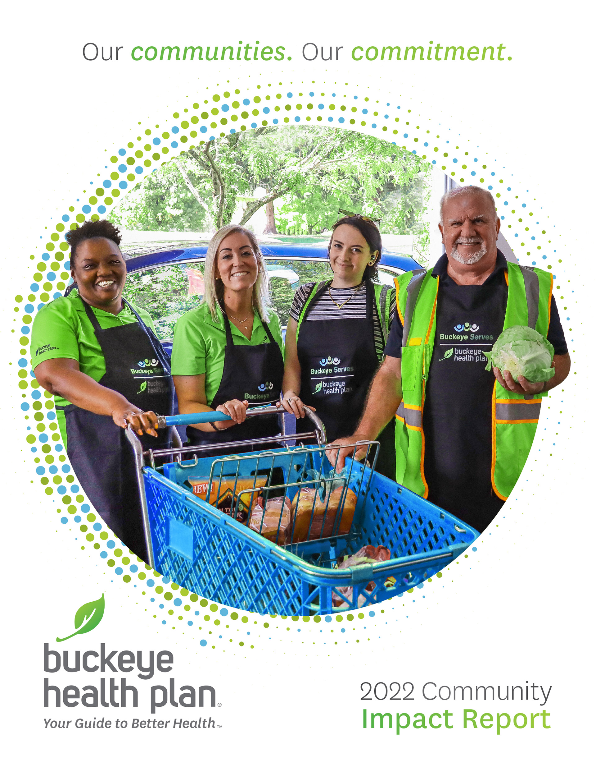
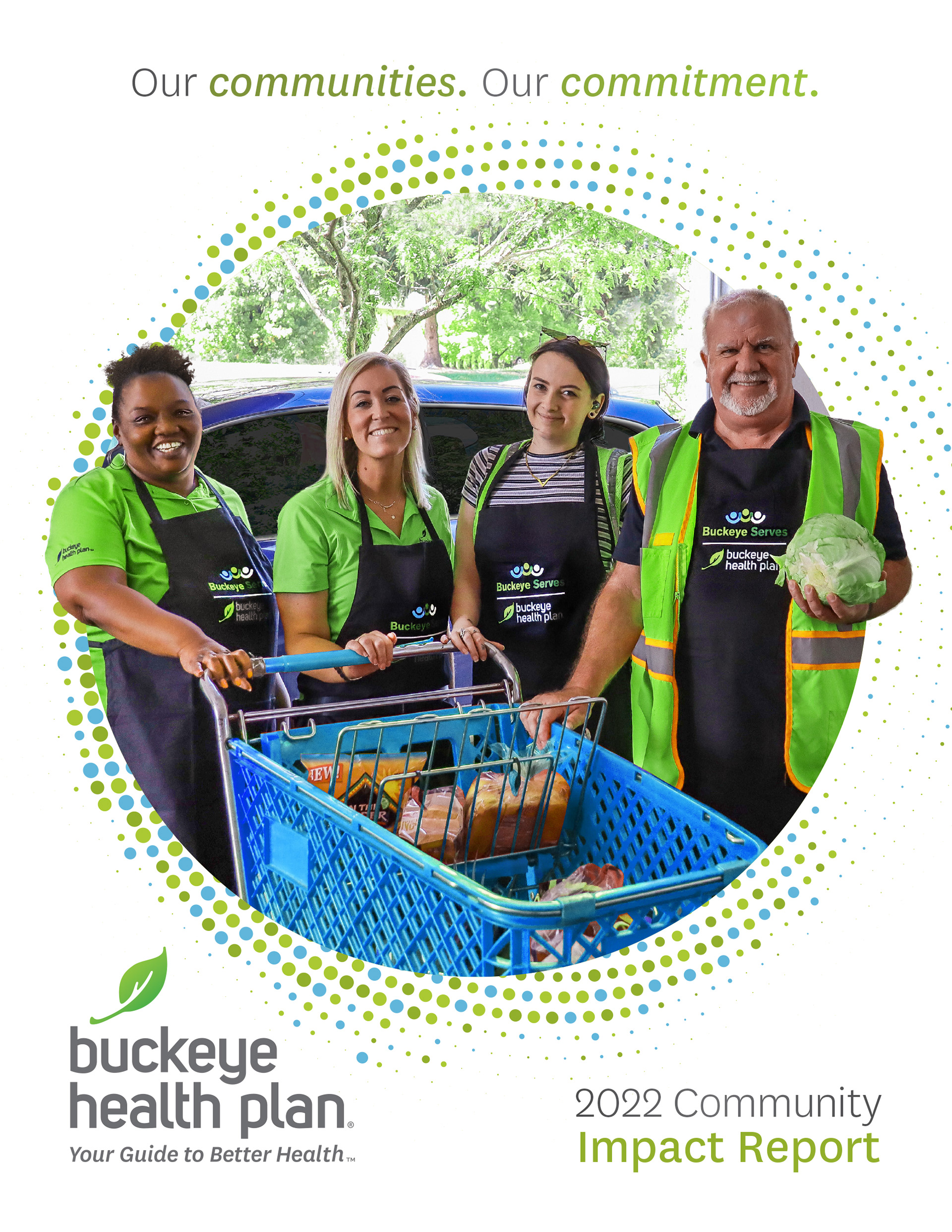
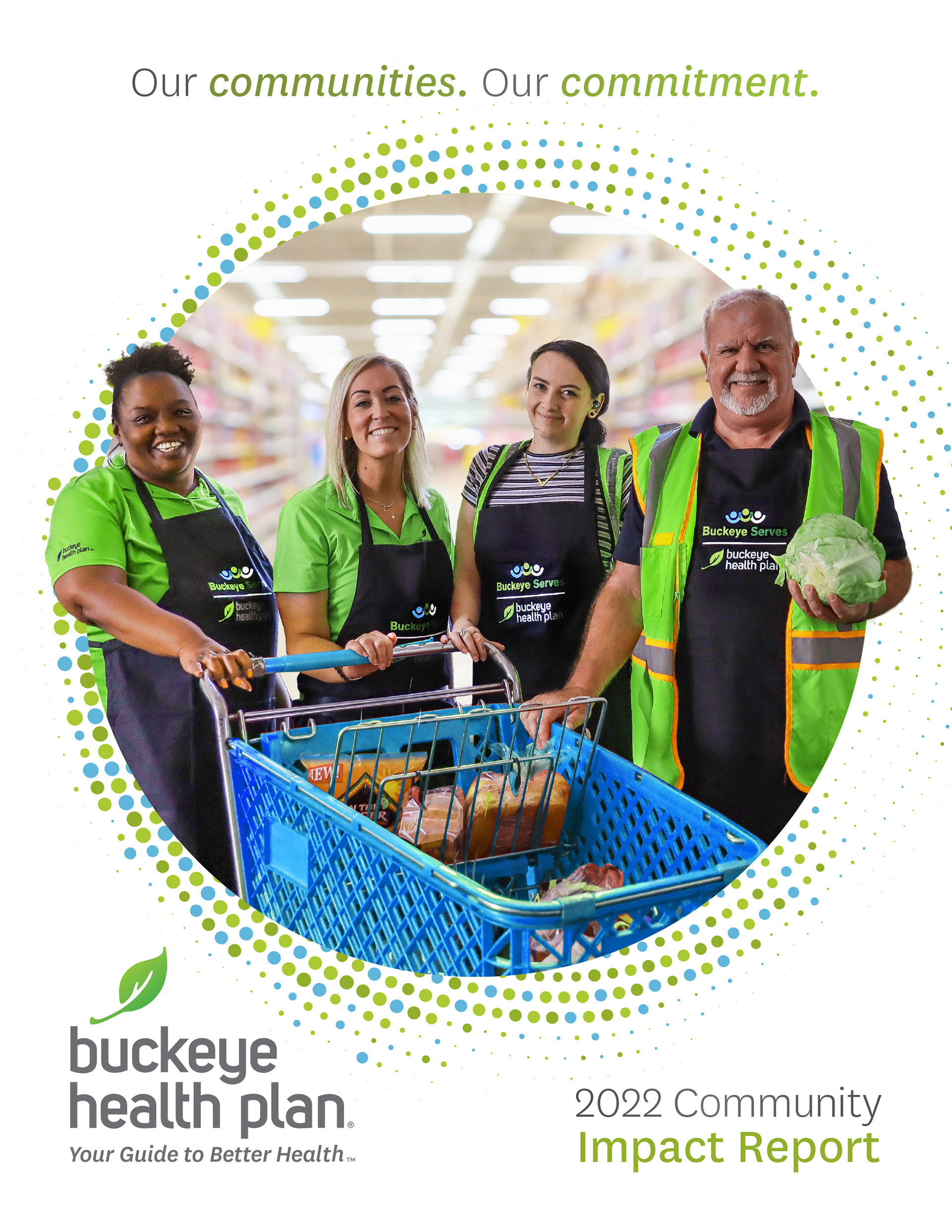
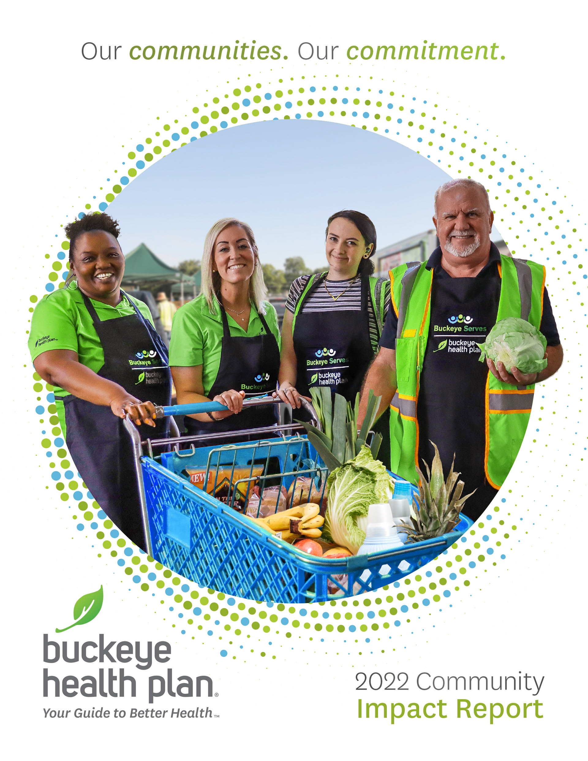
Eventually landing on this cover page and design. However, the client preferred a single powerful photo for the report's cover, favoring this over a collage.
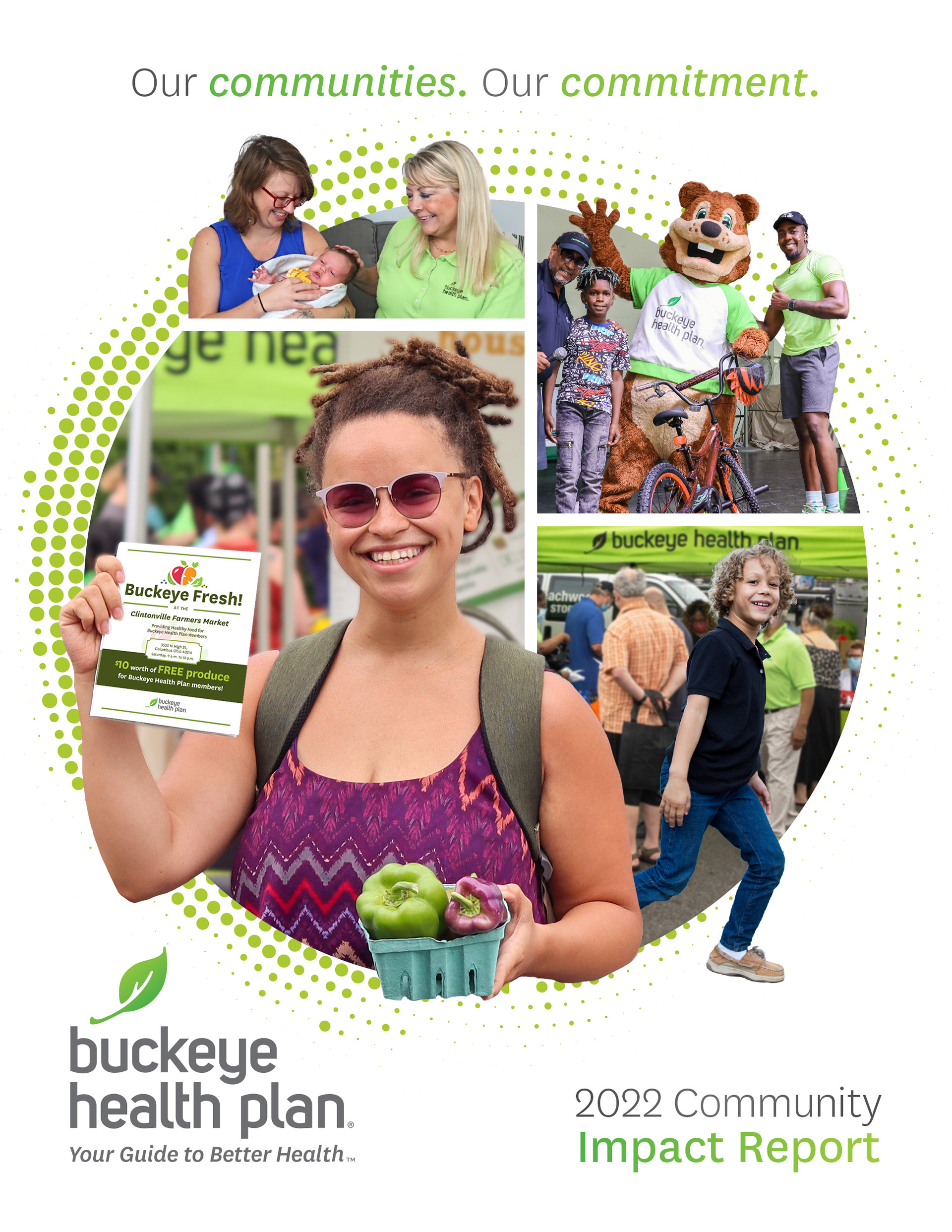
This photo of Buckeye employees volunteering at a local food bank, like previous report covers, highlighted Buckeye's community service efforts. It influenced a simplified cover design and prompted a fresh approach to the interior pages. After initial adjustments to the photo, I proceeded with the rest of the design.
Team
Client: Buckeye Health Plan
Agency: BrandWell Solutions
Chief Strategy Officer: Stephanie Cotts
Chief Creative Officer: Rob Candor
Senior Art Director/Designer: Liz White
Designer: Katie Walker
Account Manager/Copywriter: Halie Schmoll
Printing: Baesman
