

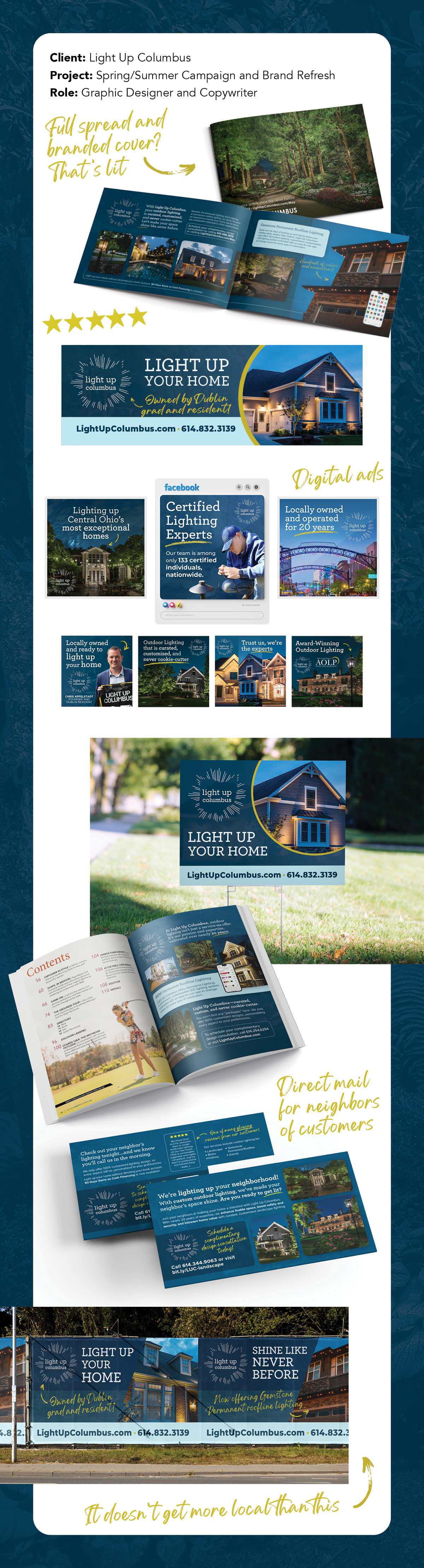
At the beginning of our partnership, the client provided me with existing assets to give me an idea of the look and feel of the brand. These assets, including a business card and their large, multipage brochure, reflected the simplicity and austerity of their early small business identity. In getting started with this campaign, they requested I give the brand a bit of a refresh, making it more visually appealing to their audience.
Front side of their existing business card.
Back side of their existing business card.
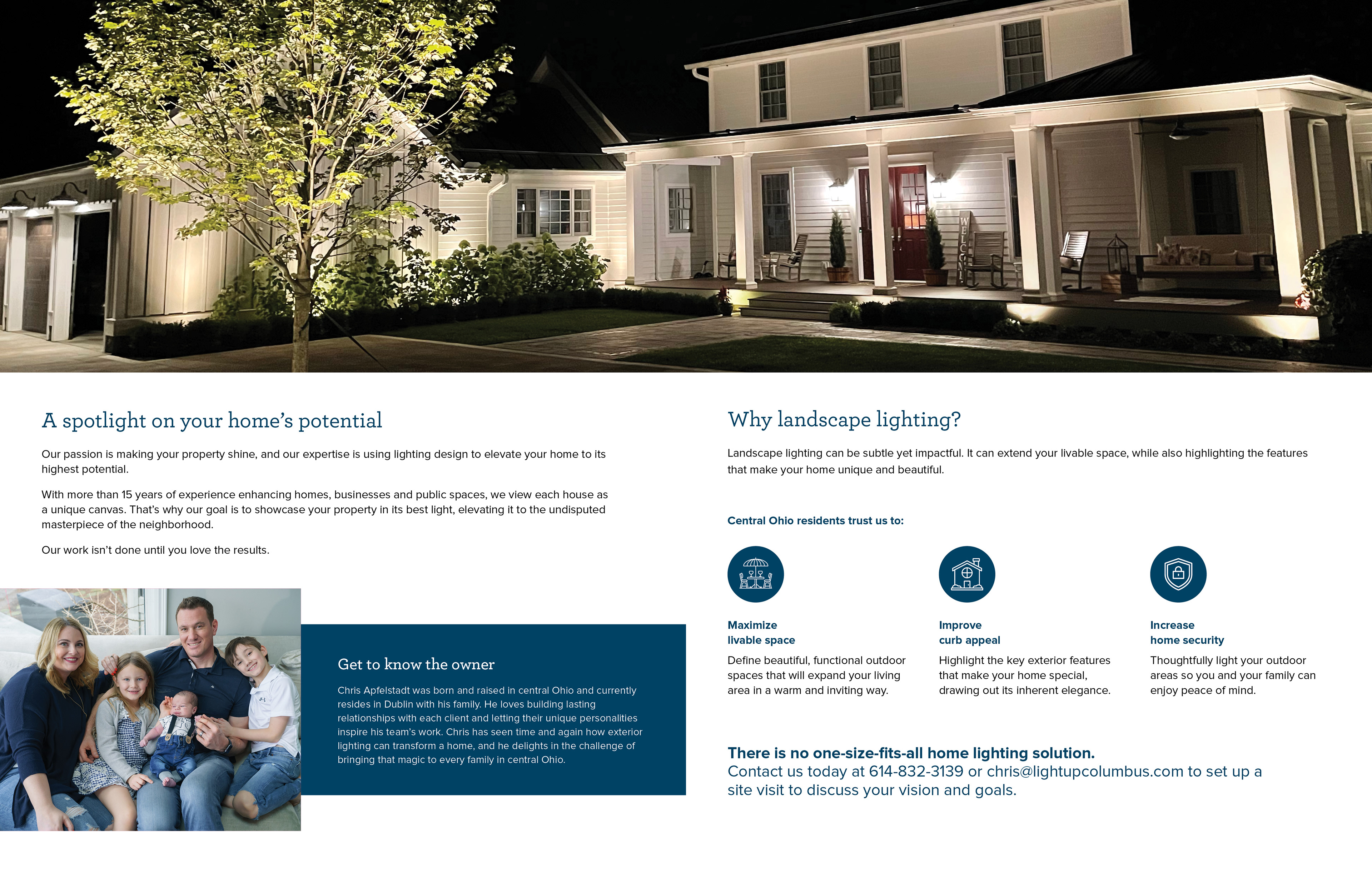
Sample spread from their existing multipage brochure.
We kicked off the campaign with a placement in a local publication, which included a full-page spread and branded cover. This allowed plenty of room for content and exploration of new style elements. The end result included several selections of highest quality photography, edited for dimension and color; variation of text styles, tint and weight; rounded corners; and the addition of a handwritten-style font and graphic elements to add a fluid, human element to the structural, landscape-heavy visuals.
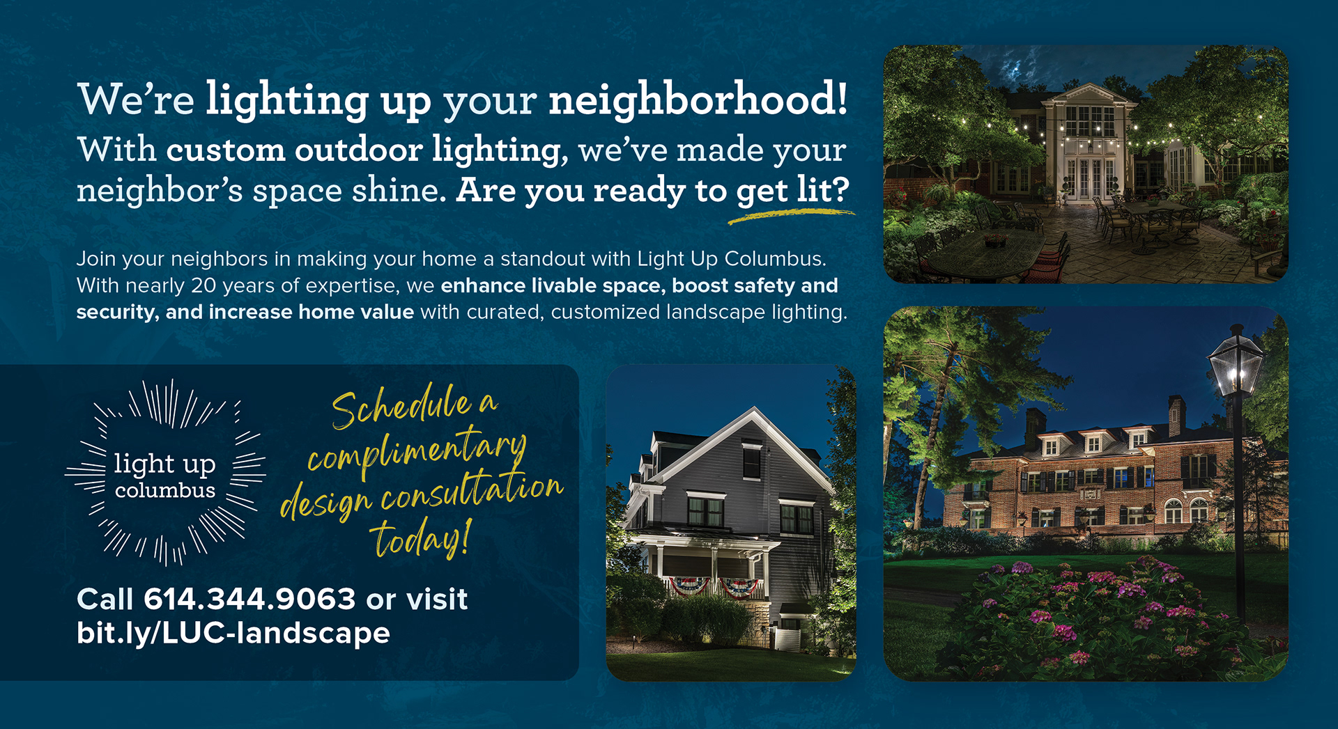
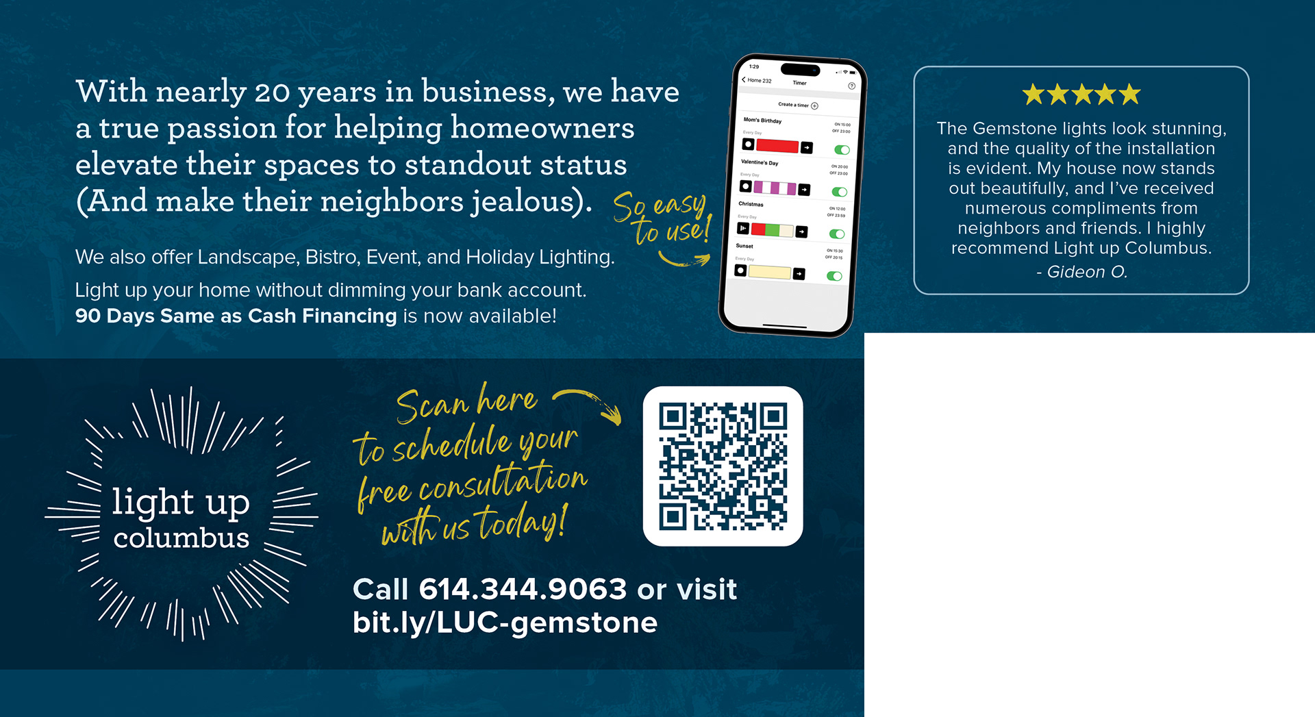
From there, I used those elements to build a revamped brand identity, which served as a guide for all deliverables moving forward... including these direct mail pieces. Sent to targeted zip codes as well as neighbors of existing customers, this mail series took finessing to fit a ton of information, strategically drawing the eye to what is most important to the audience.
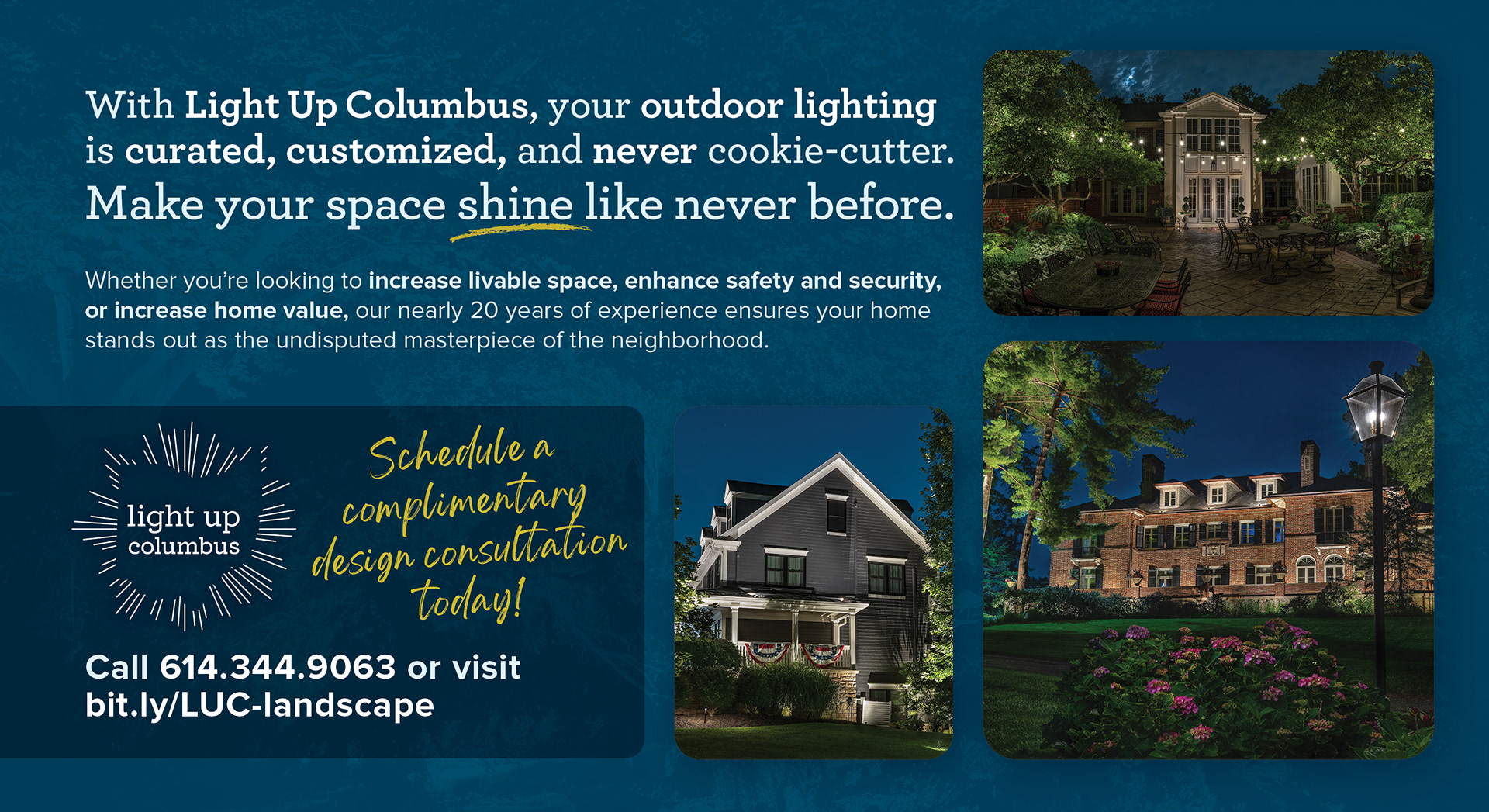
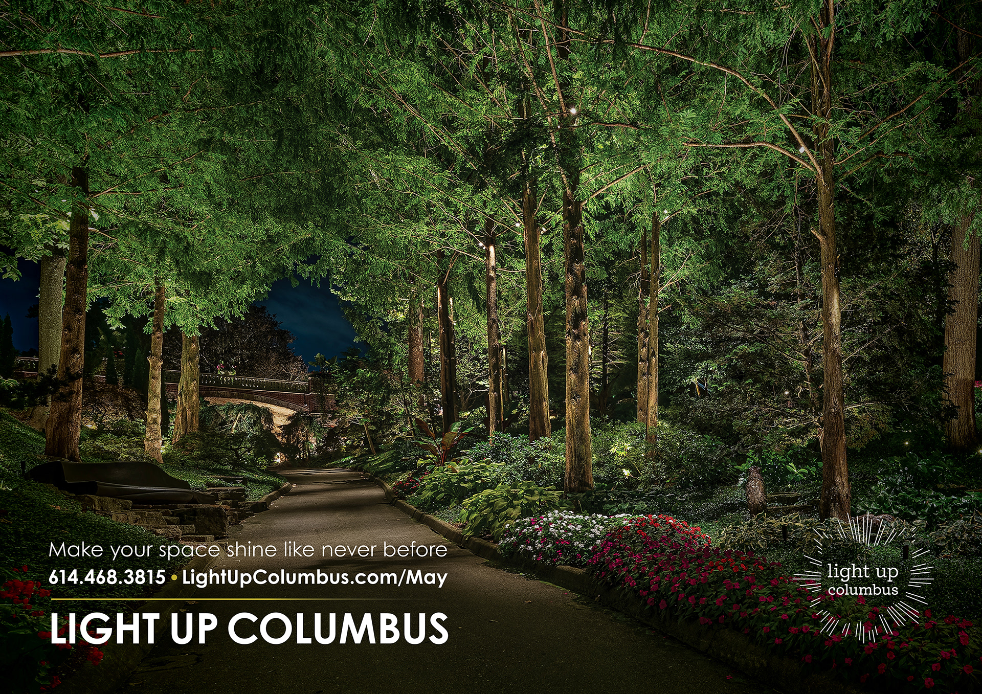
Direct Mail Front
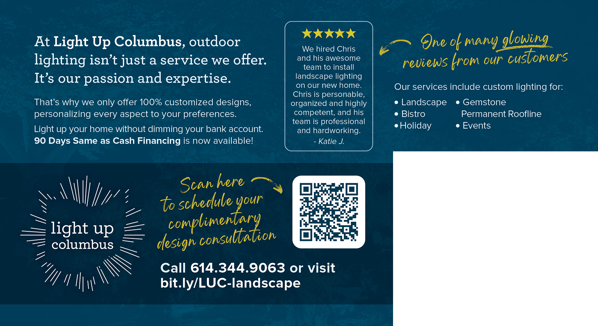
Direct Mail Back
Direct Mail for Neighbors Front
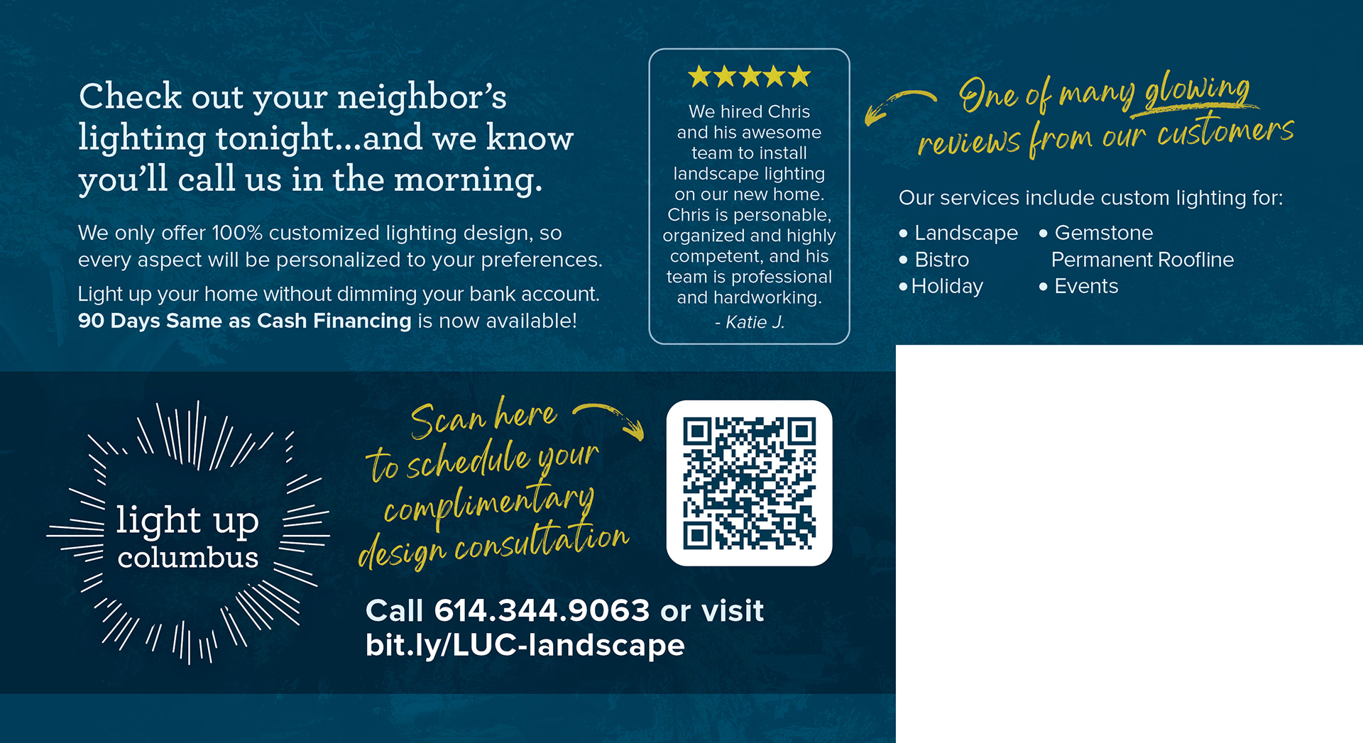
Direct Mail for Neighbors Back
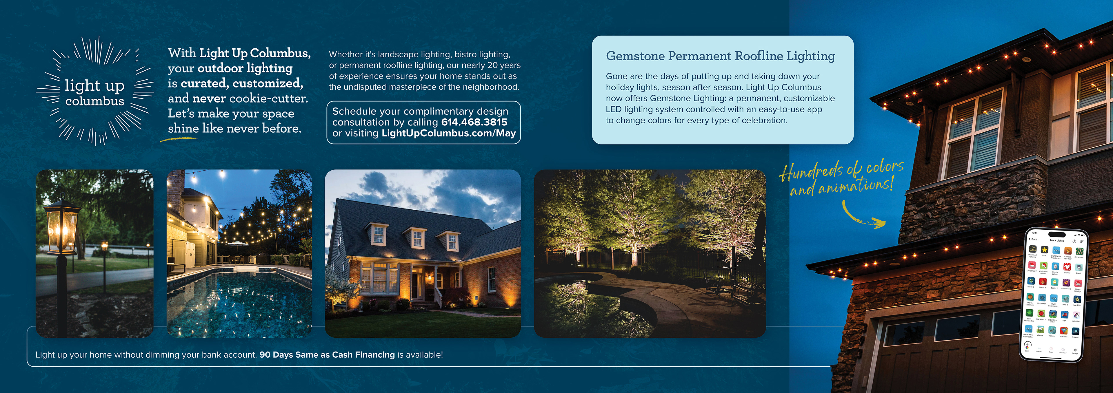
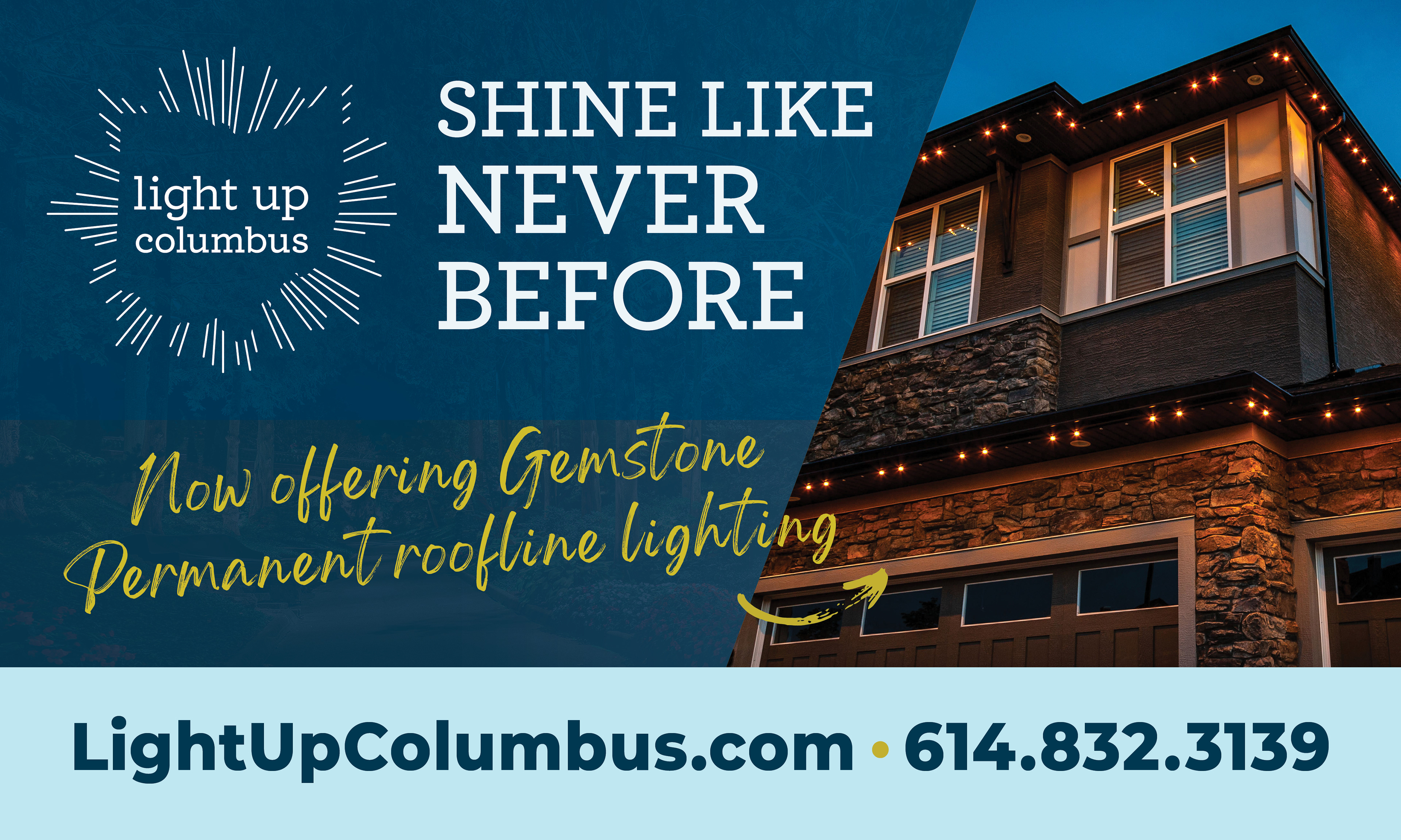
The client requested an additional version of the direct mail that spotlighted a different service, Gemstone Permanent Roofline Lighting. A working knowledge of the client's business allowed me to tailor this piece to the nuances of this service using the copy, callouts, and imagery.
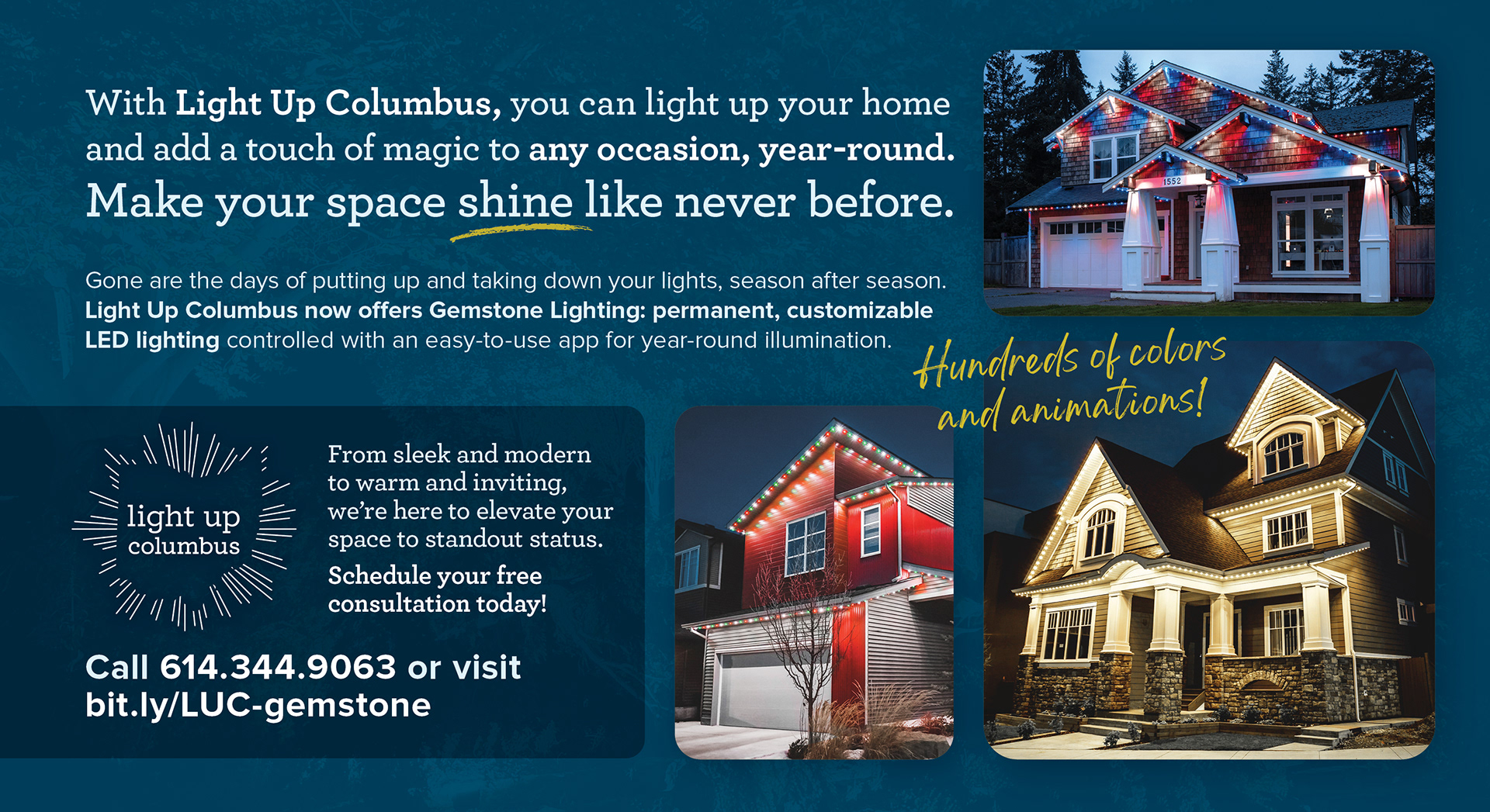
Direct Mail Front

Direct Mail Back
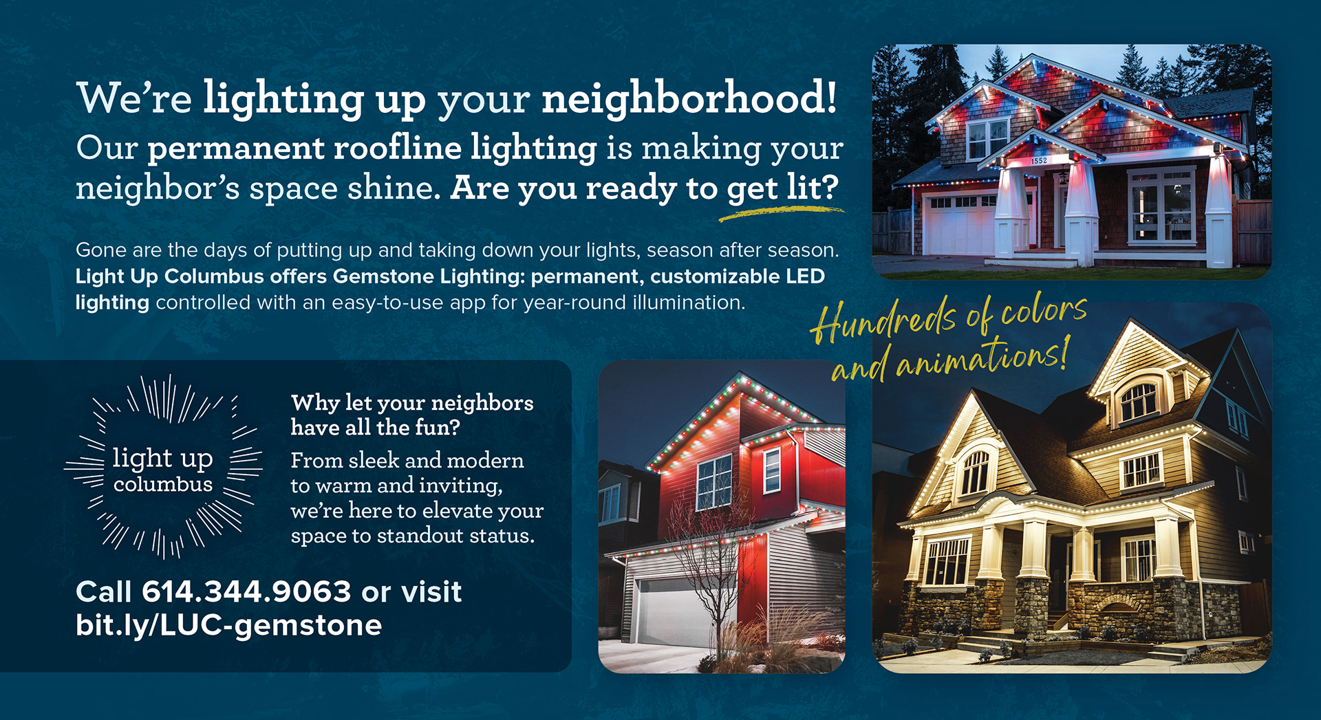
Direct Mail for Neighbors Front
Direct Mail for Neighbors Back
The brand styles extended into OOH deliverables as well, including yard signs and banners. In these pieces, large, to-the-point headlines and striking imagery are important to catch viewers' eyes in a short period of time. It's especially for deliverables like these that I was happy I made the decision to incorporate the yellow handwritten font - it gives an opportunity to include additional information while still keeping it secondary to the headline.

Yard Sign

Banner for Landscape Lighting
Banner for Gemstone Lighting
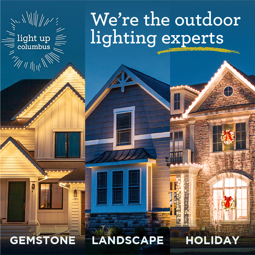
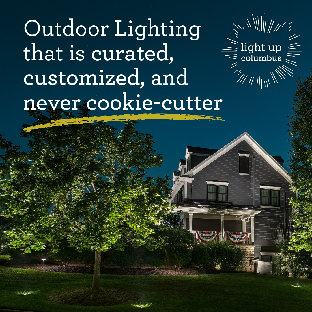
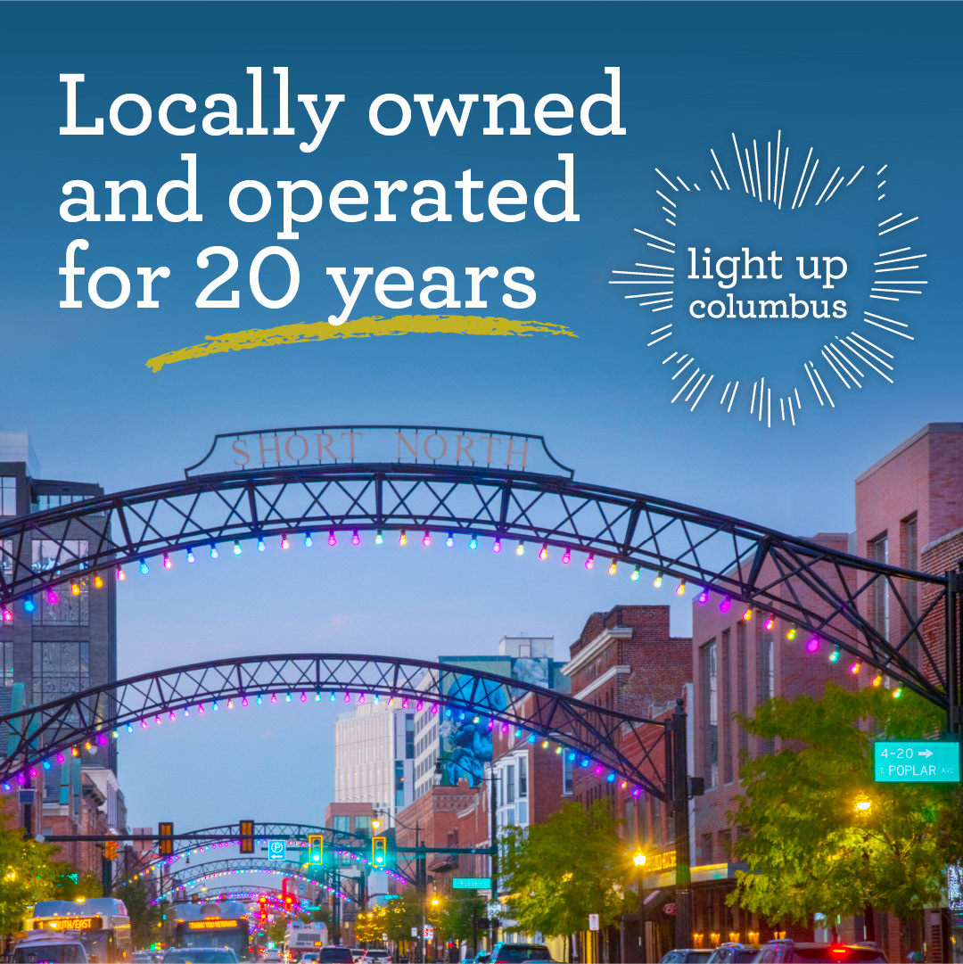
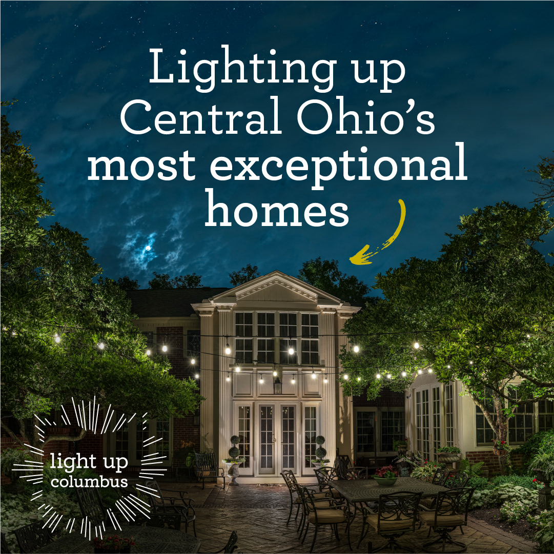
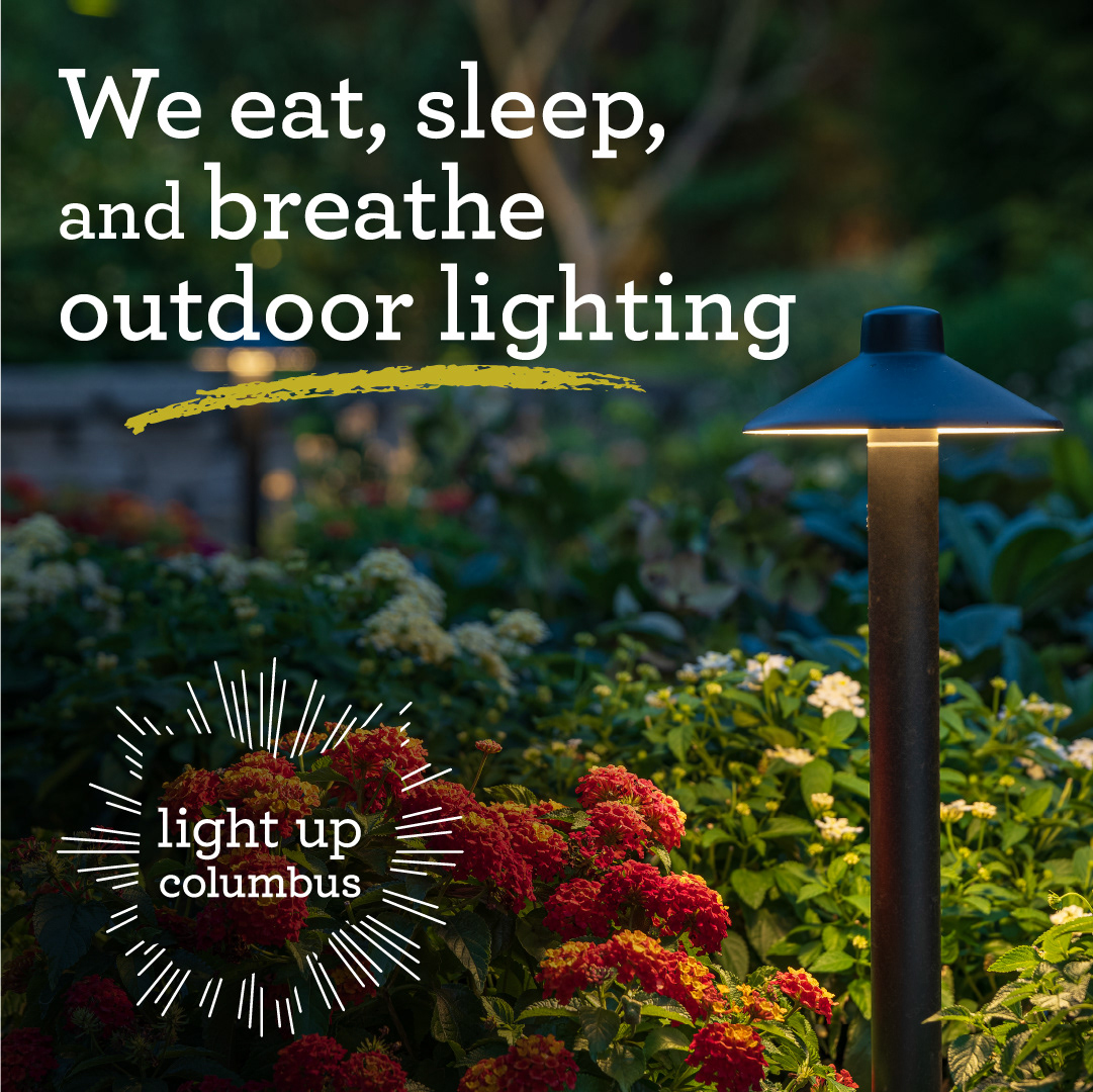
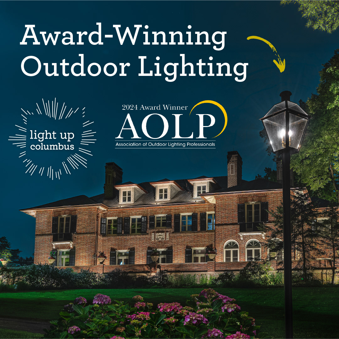
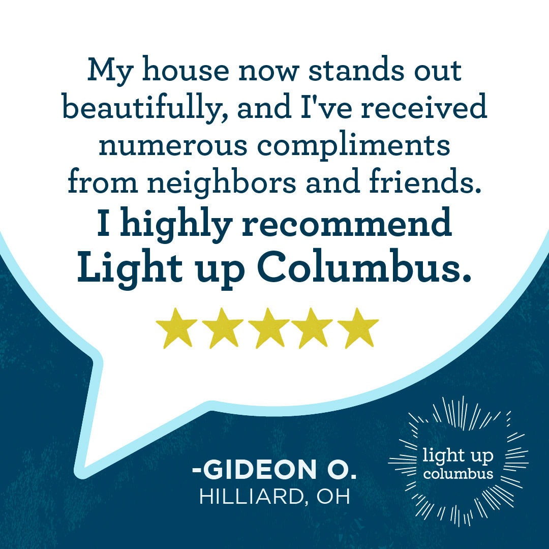
Similar principles apply with digital ads. While the client and I have partnered on many simple, logo-and-photo-only graphics for digital platforms, this lot was part of a special request for a series of Meta-only Evergreen Retargeting Ads. These ads would be billboard-like, simple, and meant to reengage or re-enforce that Light Up Columbus has what they need. To create these, I pulled some of our core value propositions, pairing them with beautiful imagery to catch the eye and communicate quickly and effectively.

Team
Client: Light Up Columbus
Director of Marketing: Becca Apfelstadt
Project Manager: Lisa Miller
Graphic Designer, Copywriter: Liz White