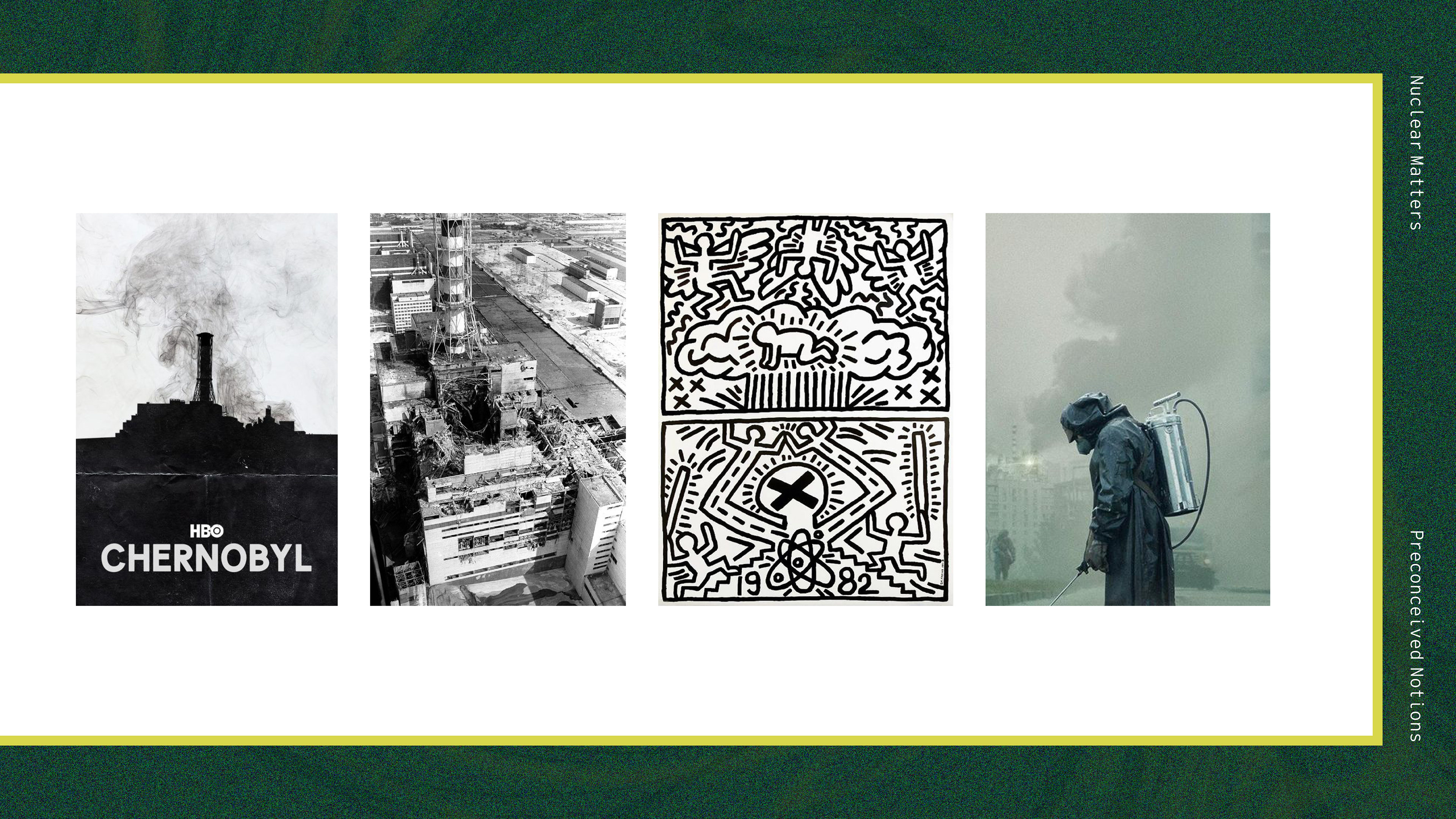
The word "nuclear" conjures images of mushroom clouds, radioactive symbols, large, threatening cooling towers, and the devastated rubble in places like Chernobyl and Fukushima. Especially with the popularity of HBO series Chernobyl, a whole new generation of Americans have been introduced to the possible horrors of nuclear power malfunctions.
Most people are unaware of the presence of nuclear plants in their home state, and the role that they play in the production of clean power. While nuclear power is not without its problems, it remains a source of reliable, affordable and clean energy that produces no greenhouse gases. I want to communicate this information and redesign the look of nuclear to influence two key demographics. The first is baby boomers, and those who grew up during the Cold War-era nuclear drills, who are scarred by memories of nuclear threats, and who currently influence a great deal of legislation regarding clean energy. The second is Generation Z and younger, currently between 8-23 years old. I chose to target this group to introduce the concept of clean nuclear energy into their lives at an early age, so they can carry these beliefs into adulthood.
I've chosen the organization 'Nuclear Matters' as the target for this rebranding. Nuclear Matters is comprised of the former CASEnergy Coalition and Nuclear Advocacy Network (NAN), combined to form a coalition with the goal of informing the public about the benefits of nuclear energy. I chose this organization because they are educational, and not focused on partisanship or politics.
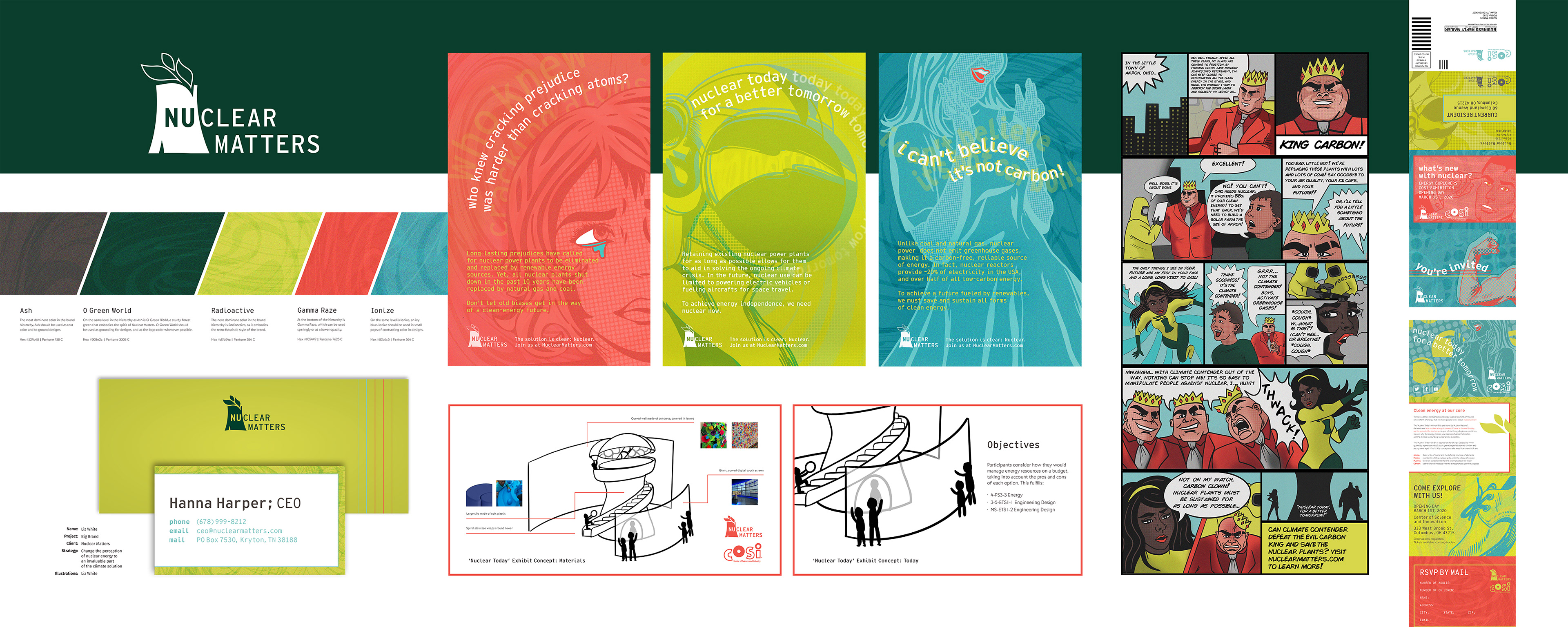
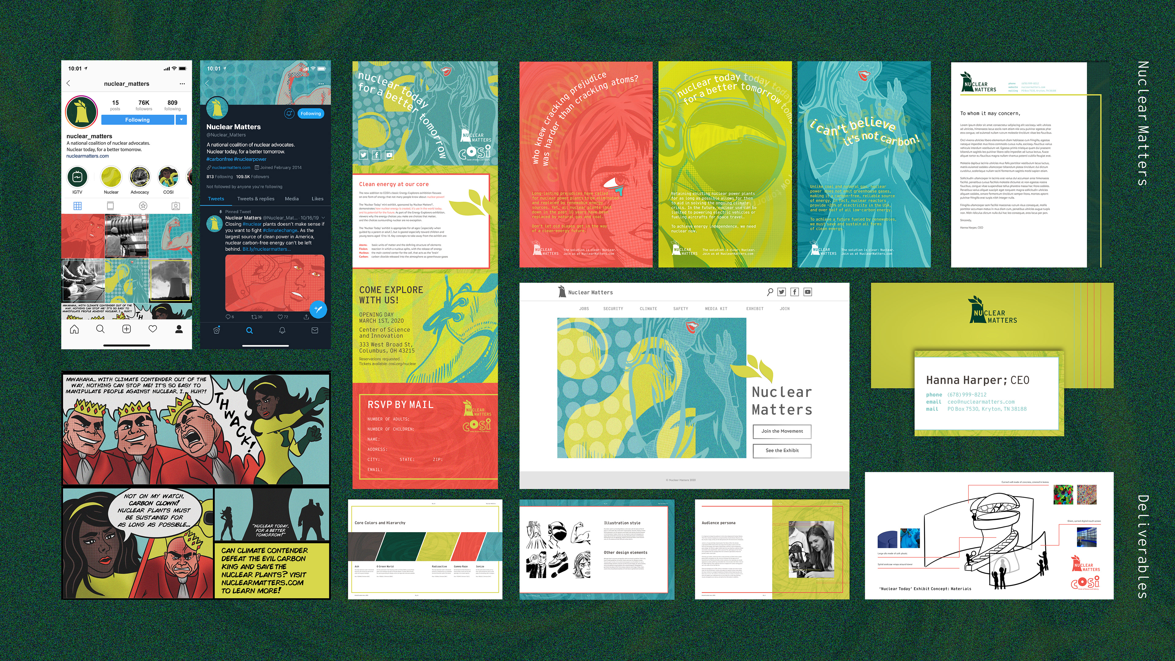
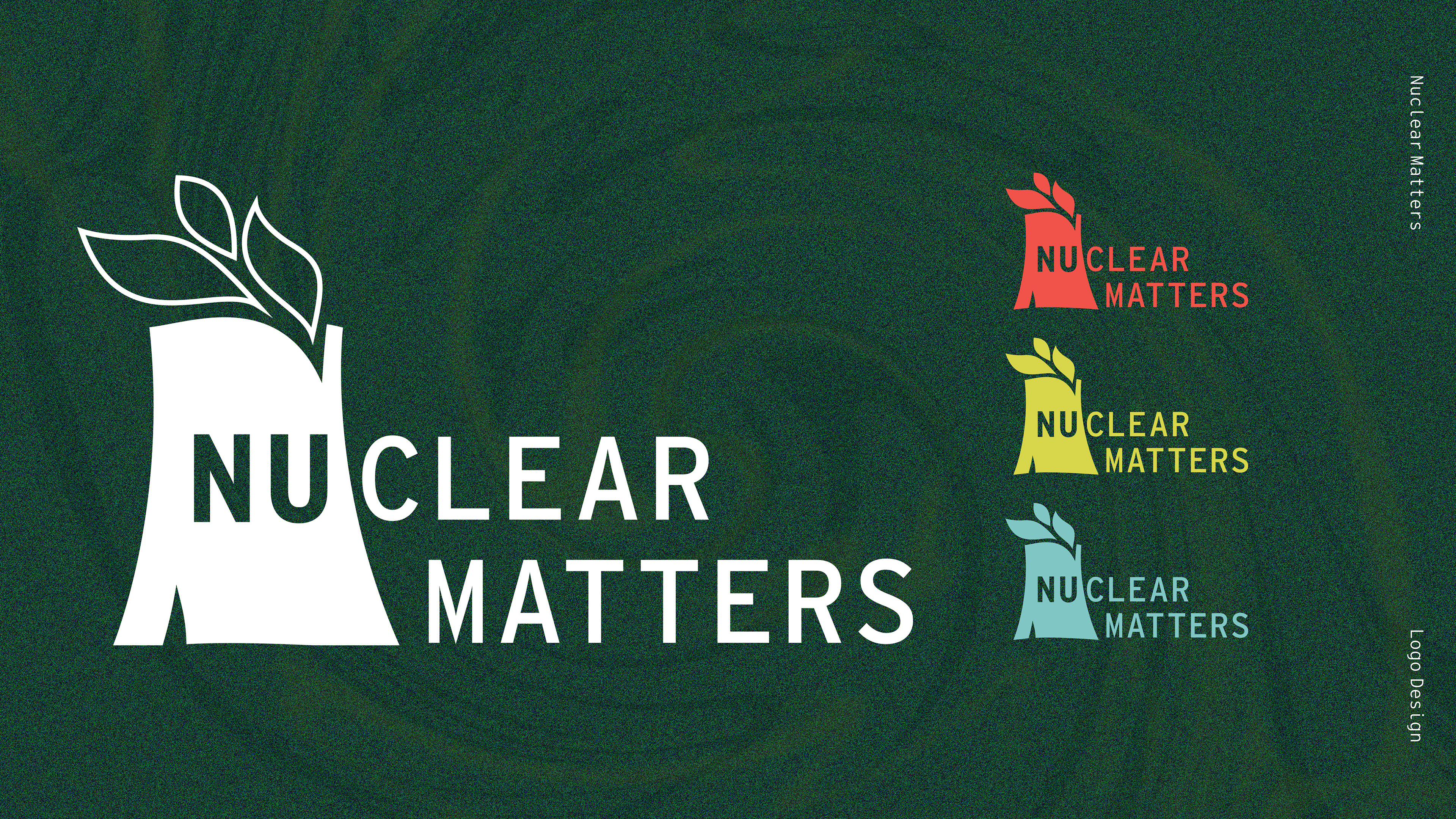
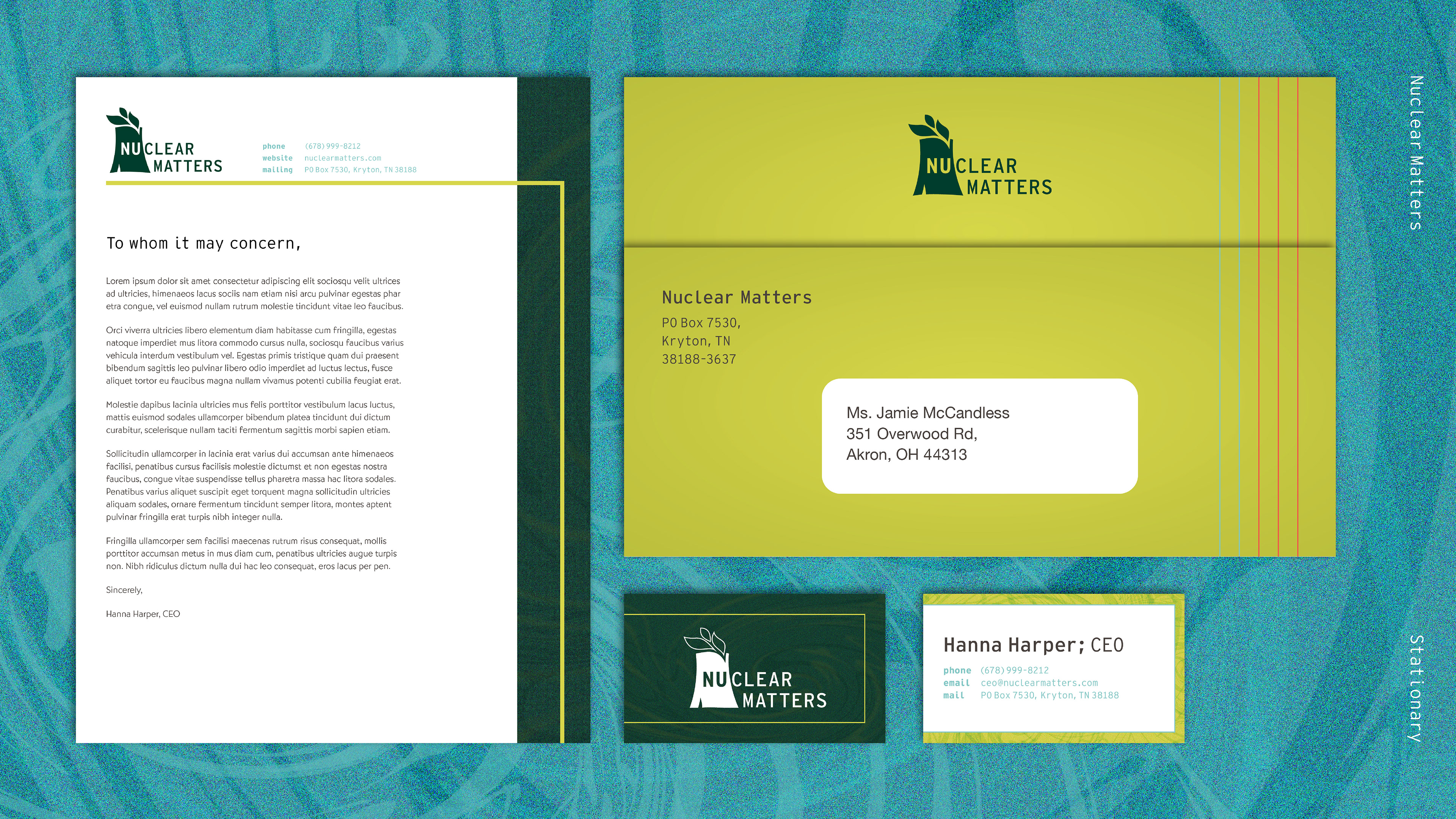
I redesigned the organization's logo as part of the creative brief, choosing to explore the image of a cooling tower, as it is the most recognizable feature of nuclear energy. I added highlights to the tower that mimic the form of a capital N, for Nuclear. The leaves flowing from the tower represent the steam the cooling reactor emits, which is clean in comparison to the pollution from coal plants. The type is set in Interstate Mono, in all caps, stylized in the horizontal lockup to emphasize the "nu" and "clear" as two distinct parts of the same whole.
To show some examples of the its use, below is formal company stationary using the new Nuclear Matters logo. It includes a letterhead, envelope, and business card.
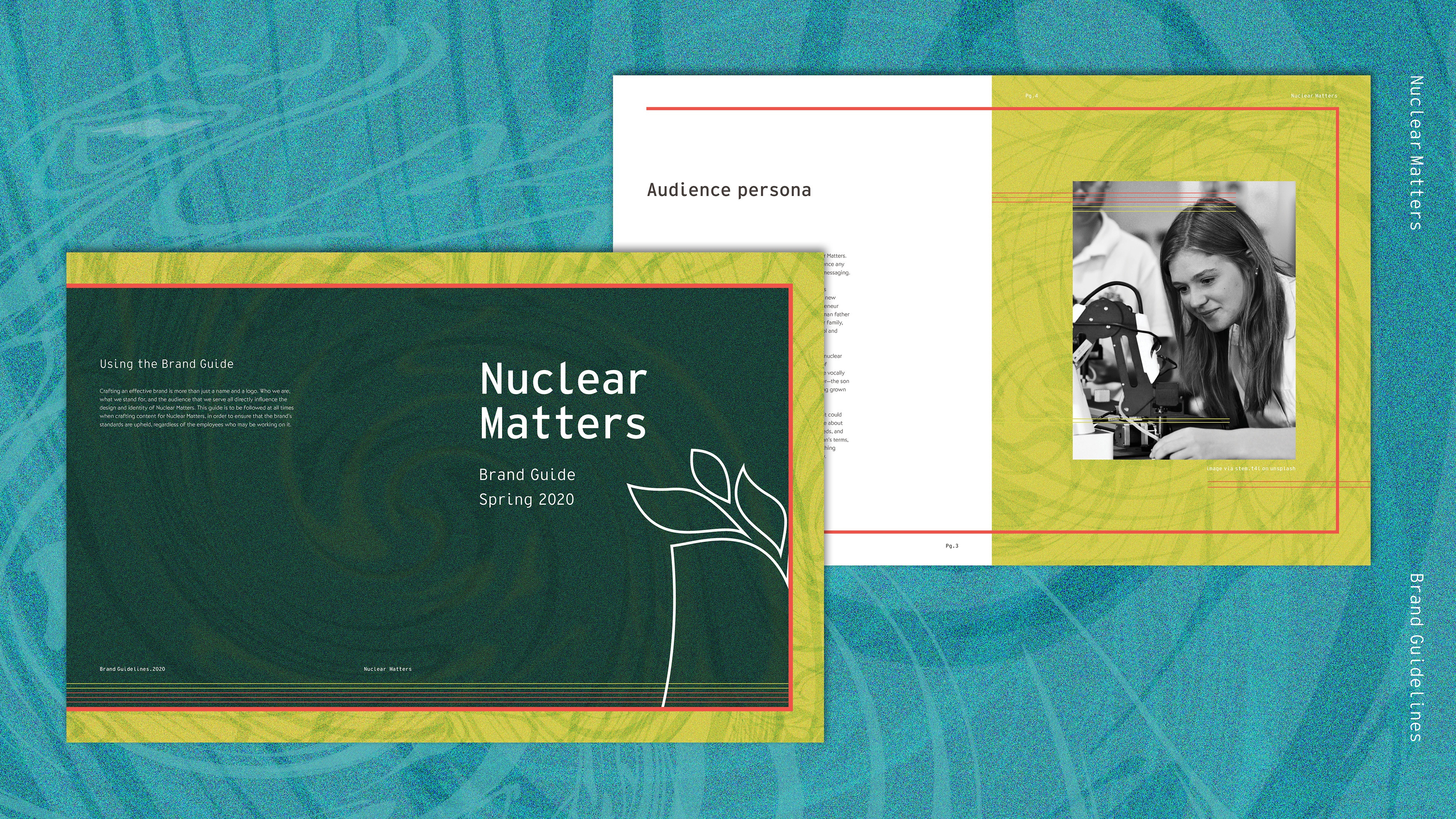
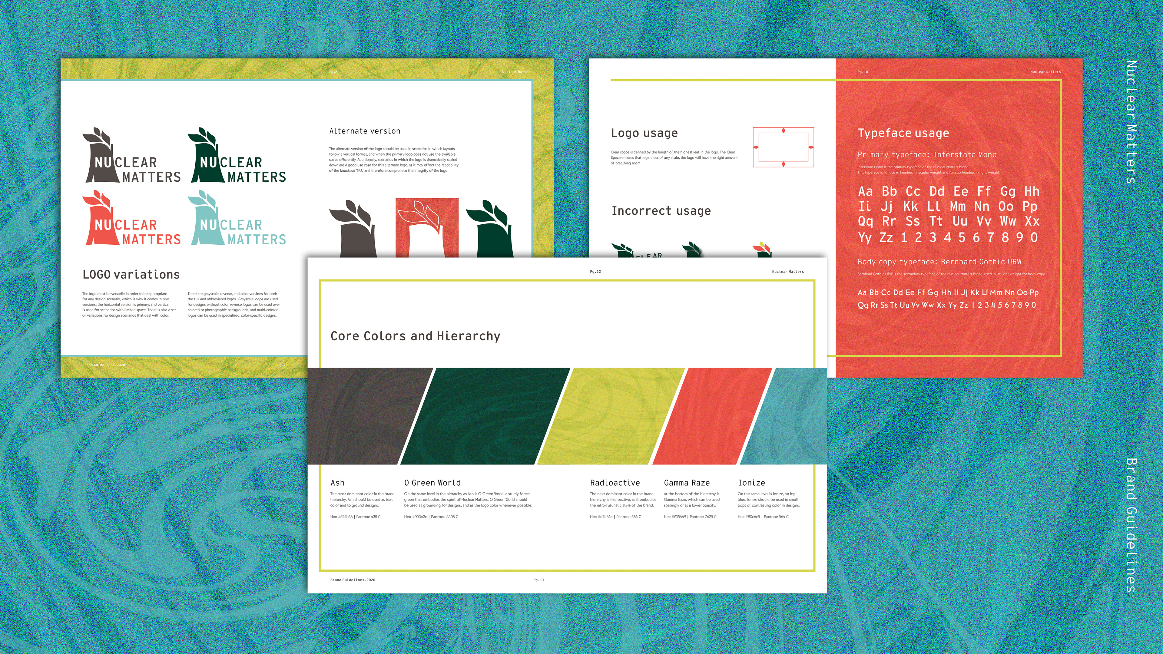
To establish the company's look and show associates how to use the new assets, I created a brand guide. I not only designed and established the brand standards for this guide, but I wrote the copy describing every last detail about how to use the new Nuclear Matters materials.
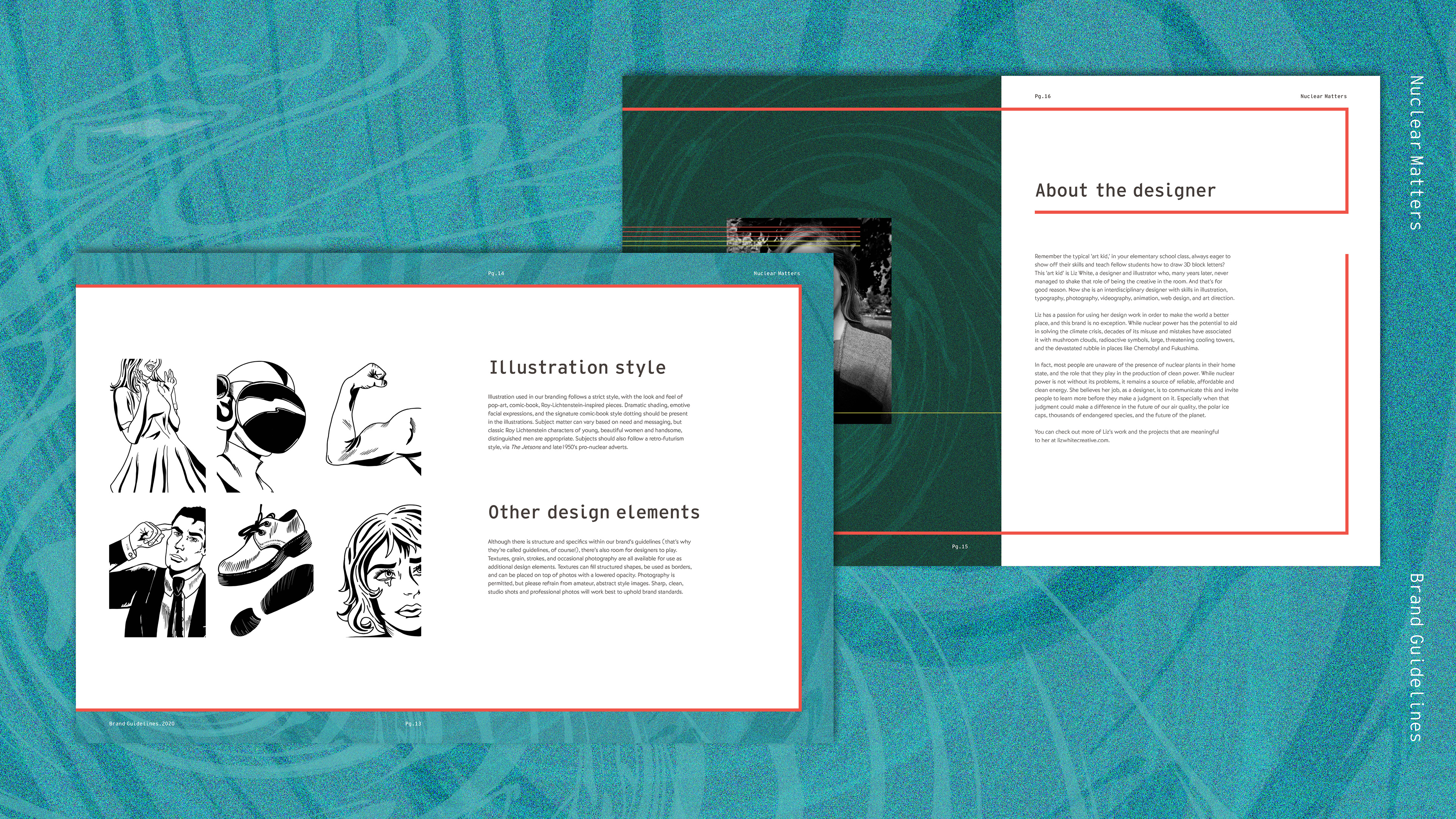
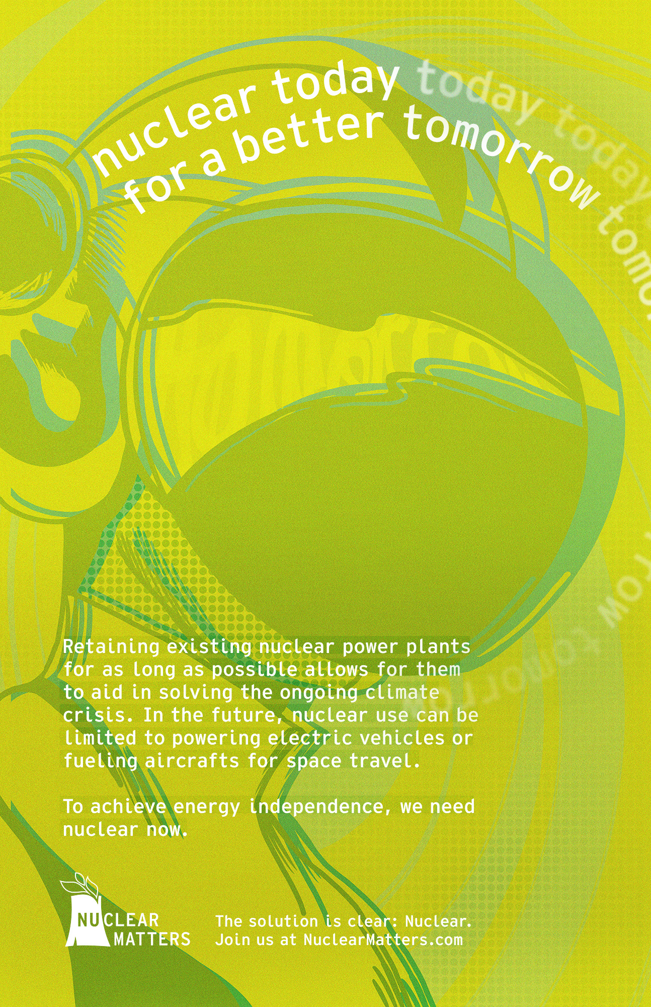
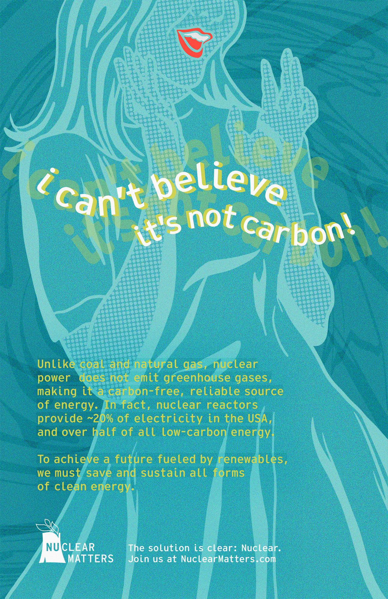
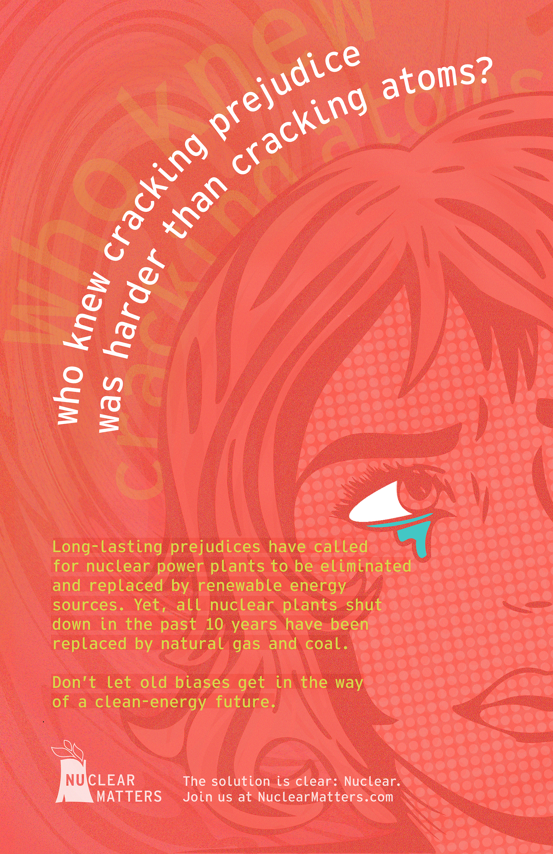
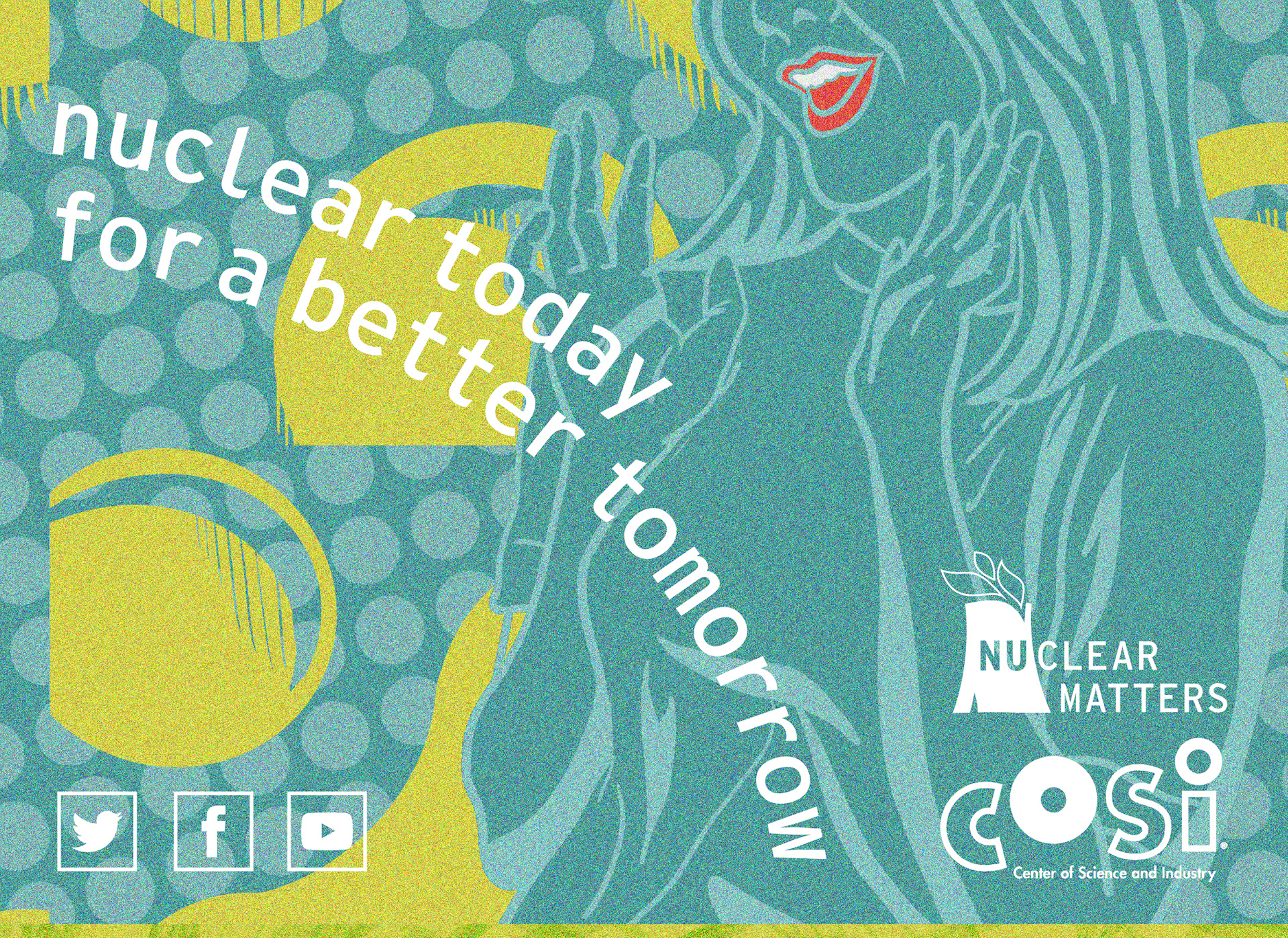
I created a set of three posters that could be resized and repurposed for various marketing uses. The illustrations, which take on a Pop Art, Roy Lichtenstein-style approach, were inspired by the cold-war era nuclear drills in the 1960's that baby boomers experienced. As part of my goal for this project is to change the memories associated with Nuclear, I thought using a style from the same era would be a good start. I wrote the copy, illustrated the images, and laid out each poster.
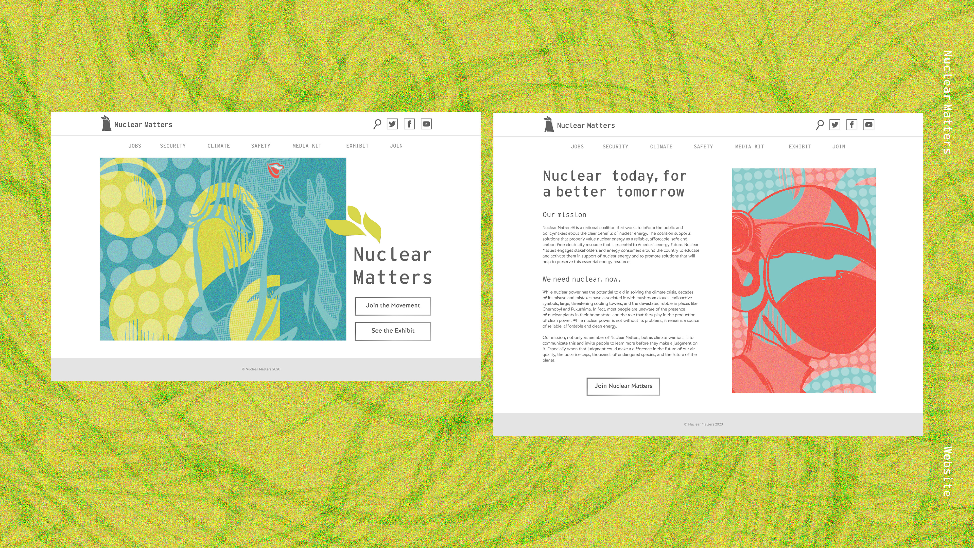
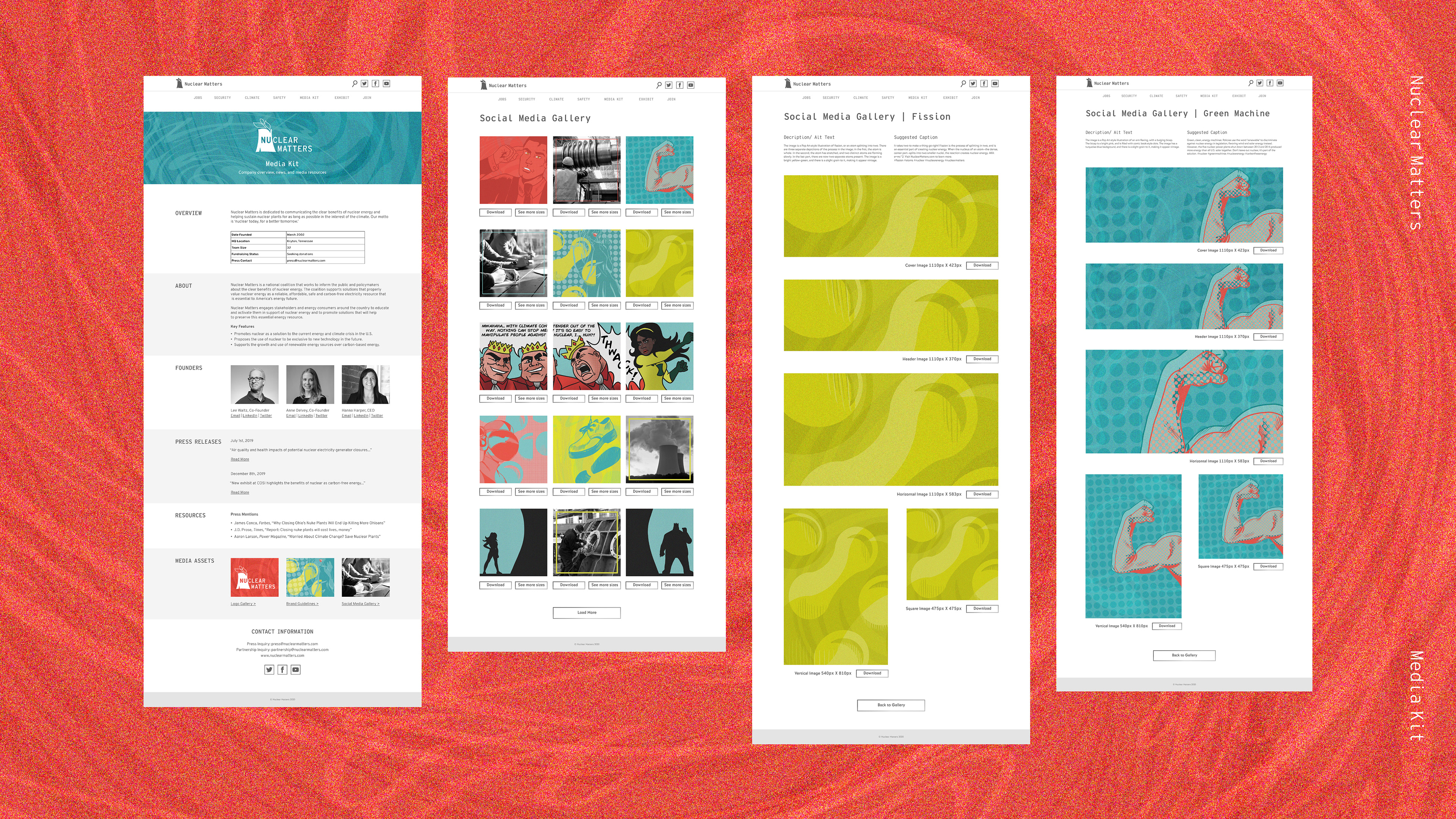
The posters direct the viewer to the Nuclear Matters website, of which I redesigned a few pages in the style of the campaign. The site is simple, with pops of color to reinforce the idea of 'clean energy,' while still looking current and youthful. I created a home page, an about page, and a media kit page, with active links to access each one. The media kit, another deliverable, is a page that provides basic information about the company to reporters and other media. It includes information about the founders, press releases and more, and contains a library of assets for use. These assets are a gallery of social images that are provided in multiple aspect ratios, and are supplied with suggested captions. If the process of finding relevant information and resources about Nuclear Matters is simple, the more likely it is for media to pick up stories on the company and give them additional press.
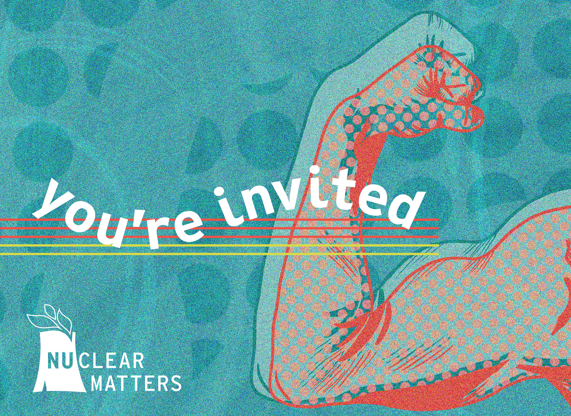
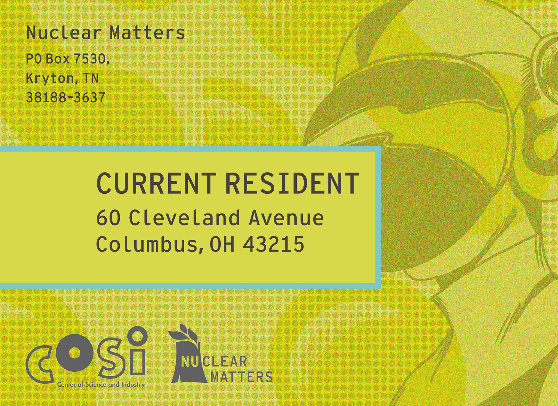
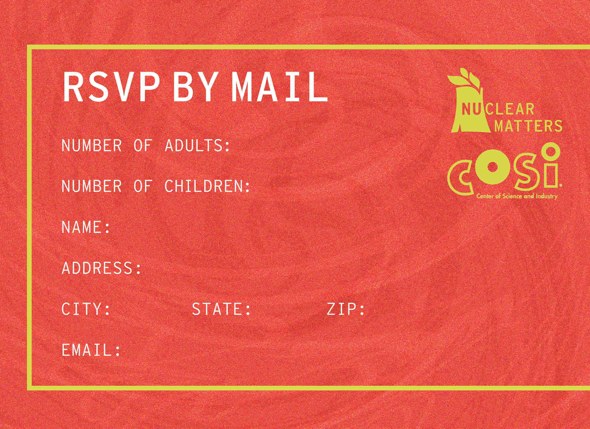
The direct mailer I designed has the function of promoting a COSI Exhibit, targeting kids 15 years old and younger. Sponsored by Nuclear Matters. It contains more original illustrations, an RSVP invitation for the opening of the exhibit, and some basic information about nuclear energy that will be covered. The design is bright and fun to catch the eye of its young audience.
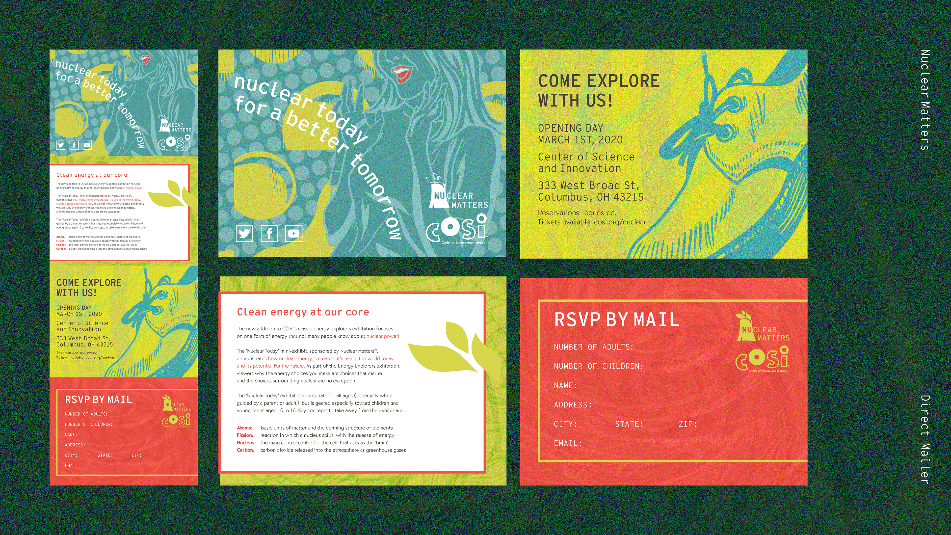
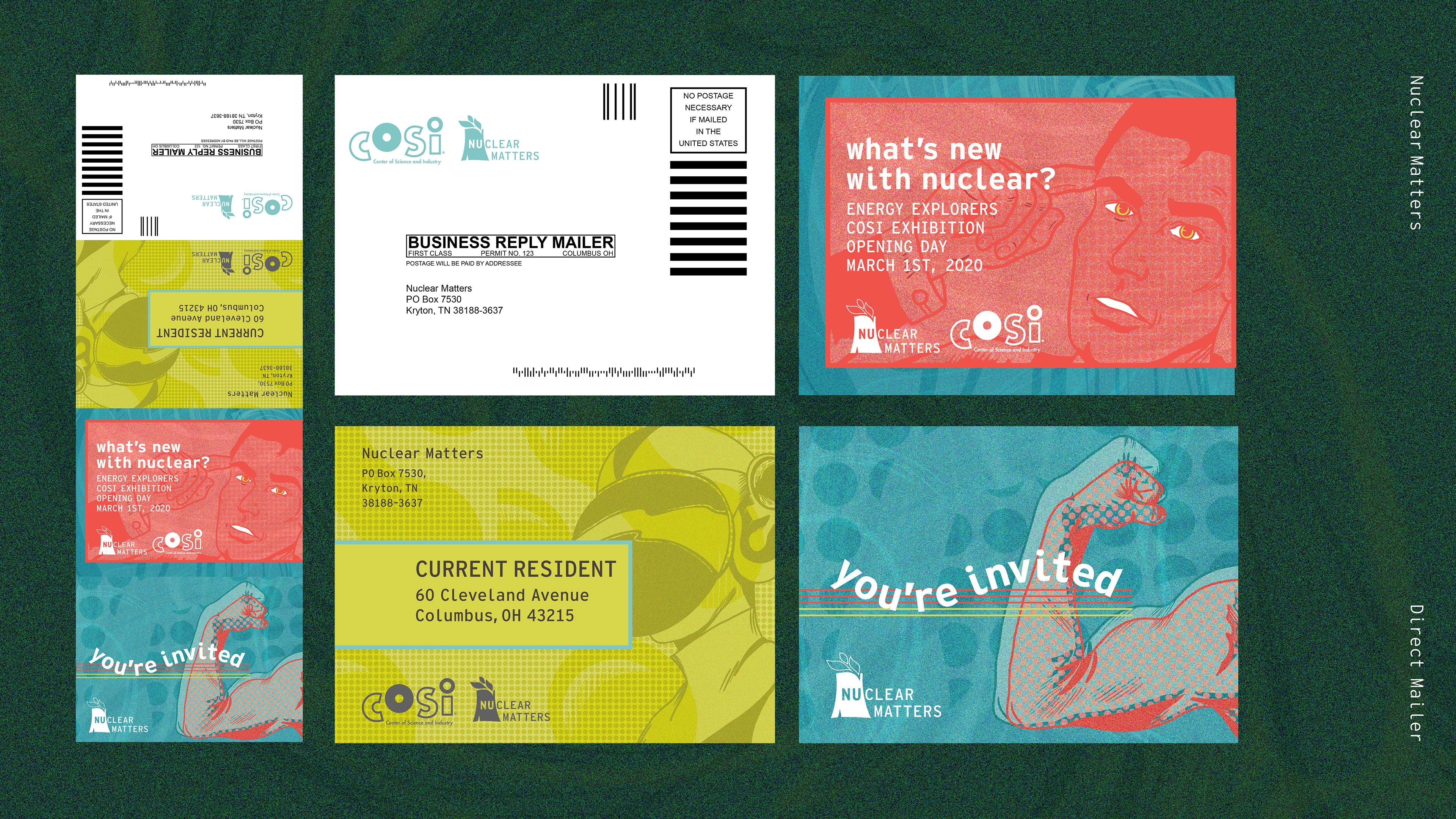
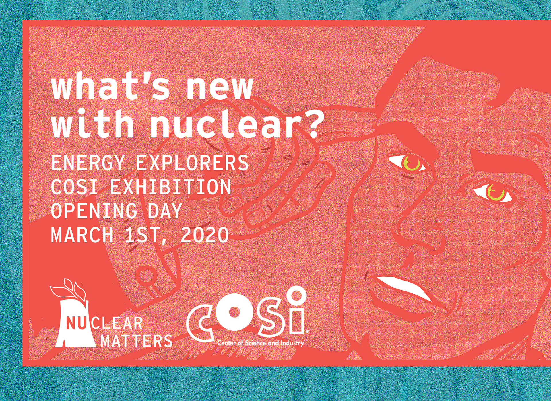
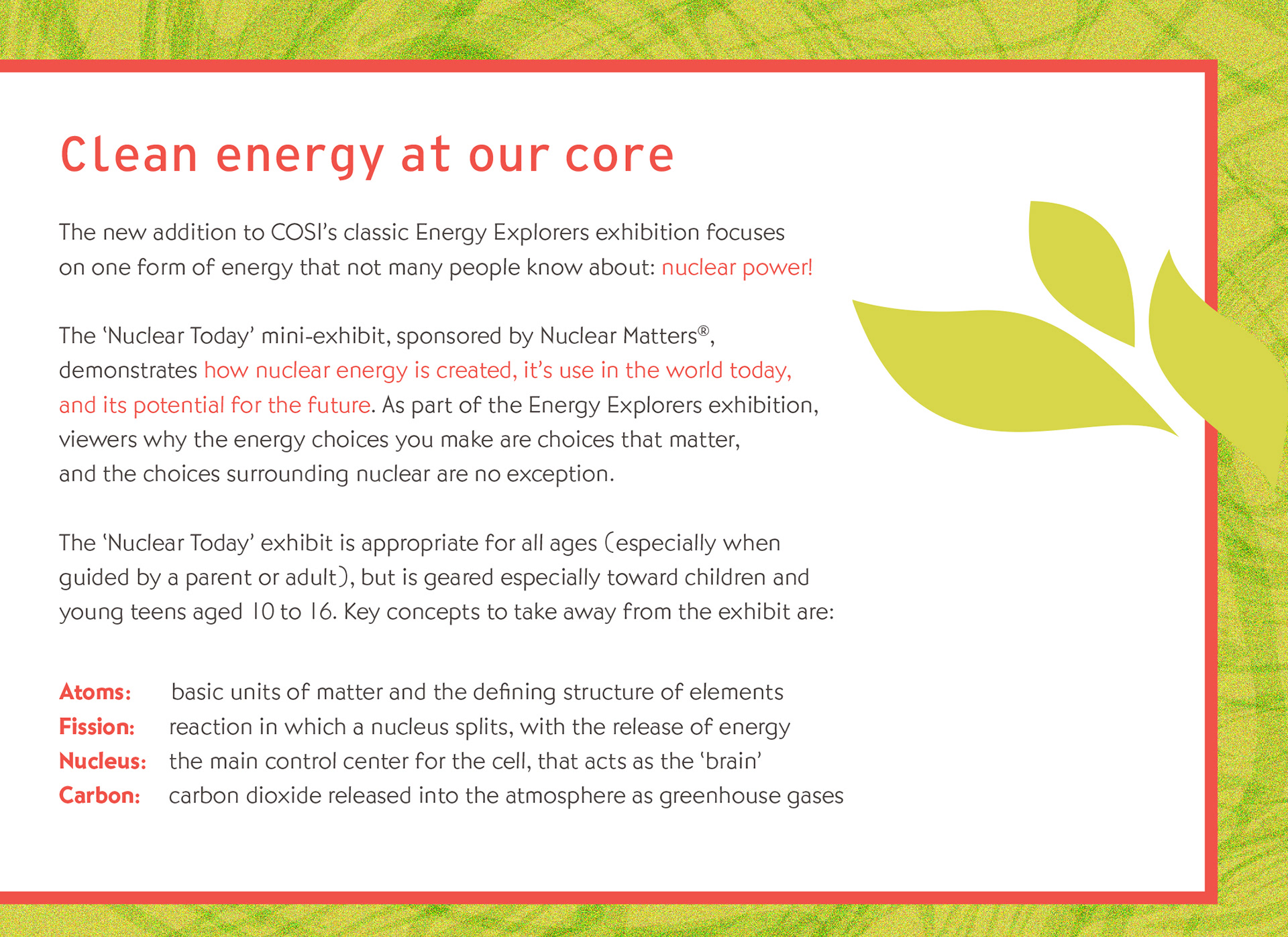
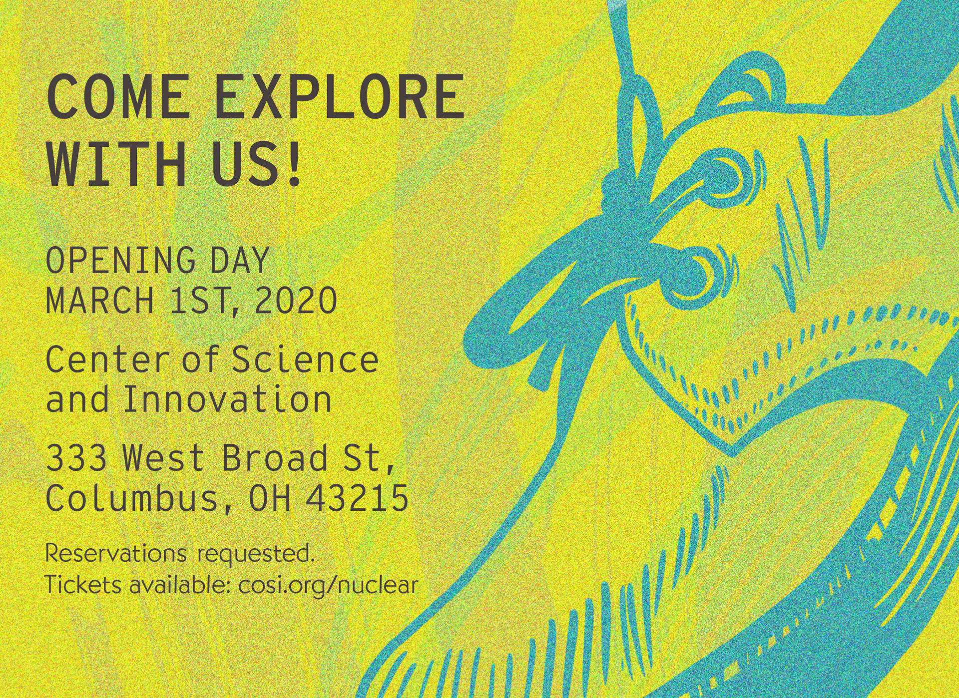
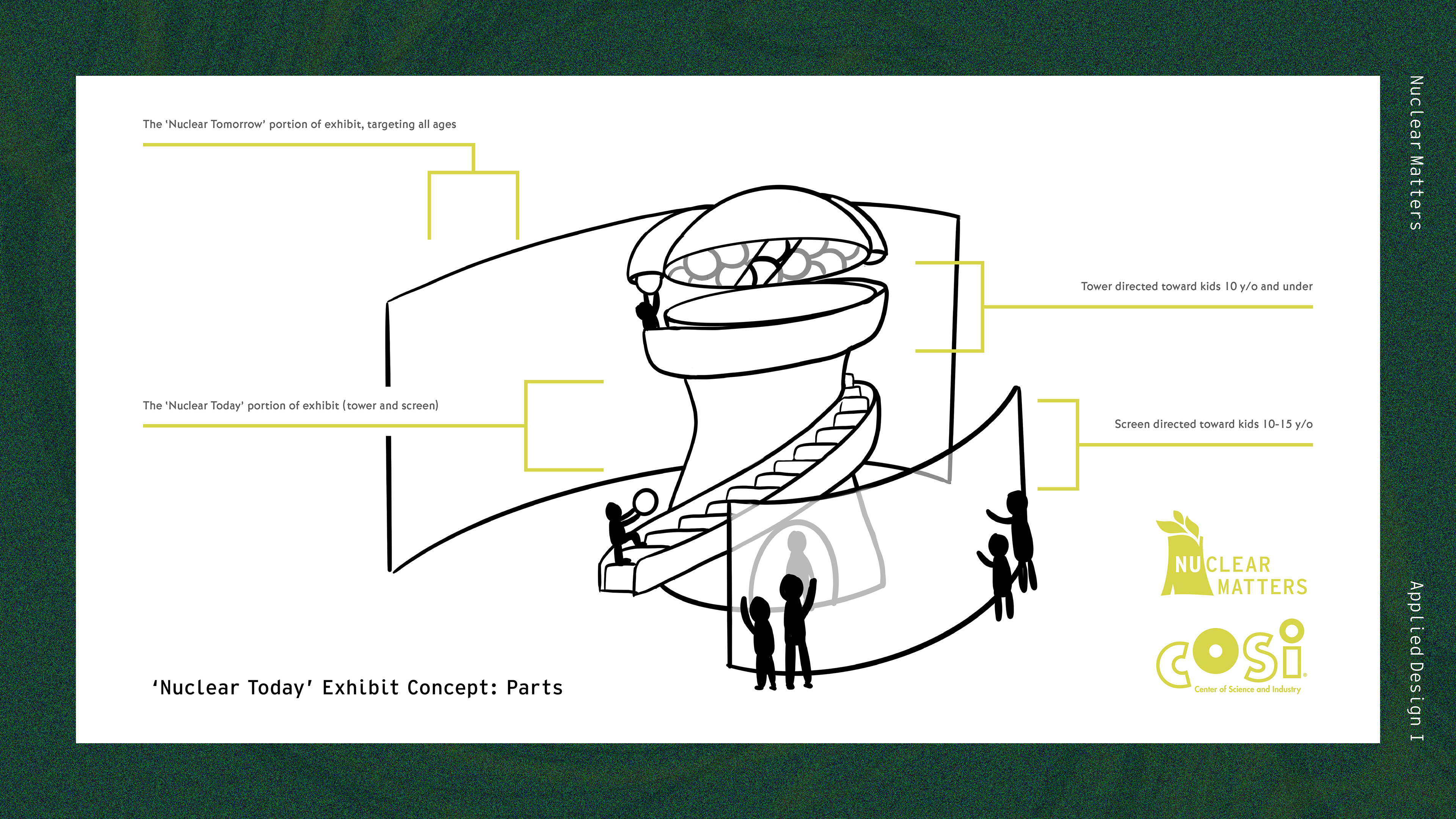
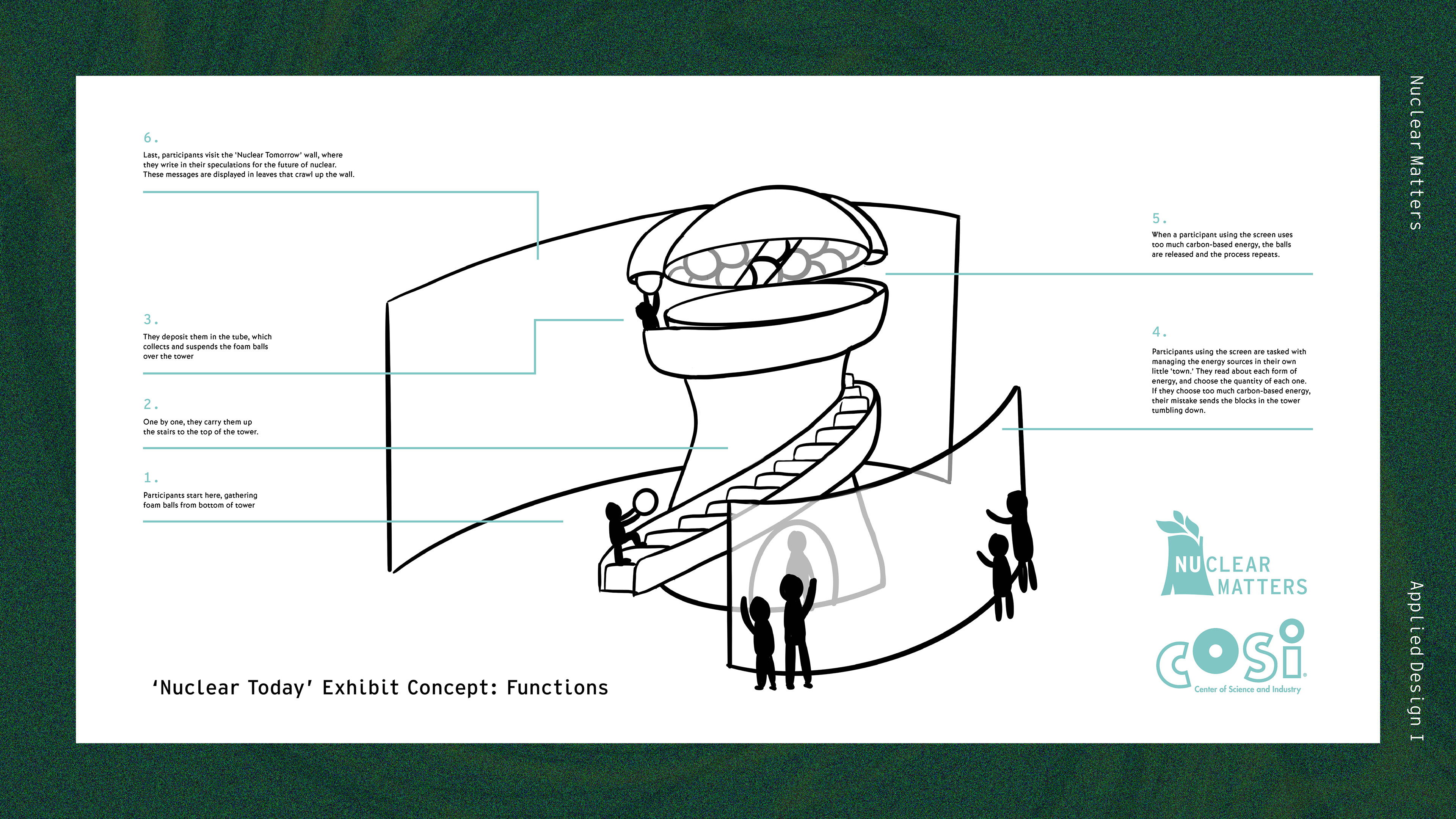
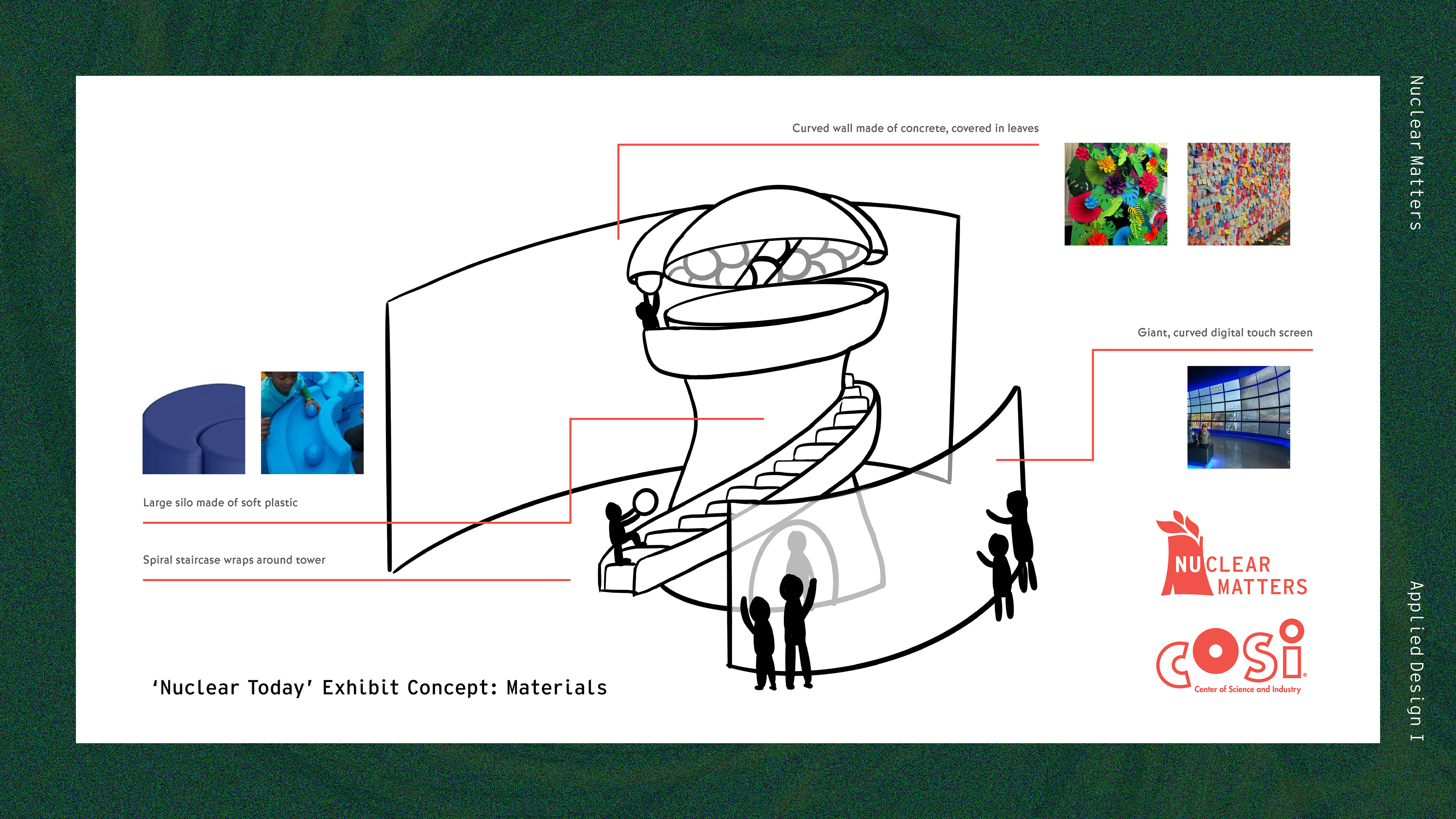
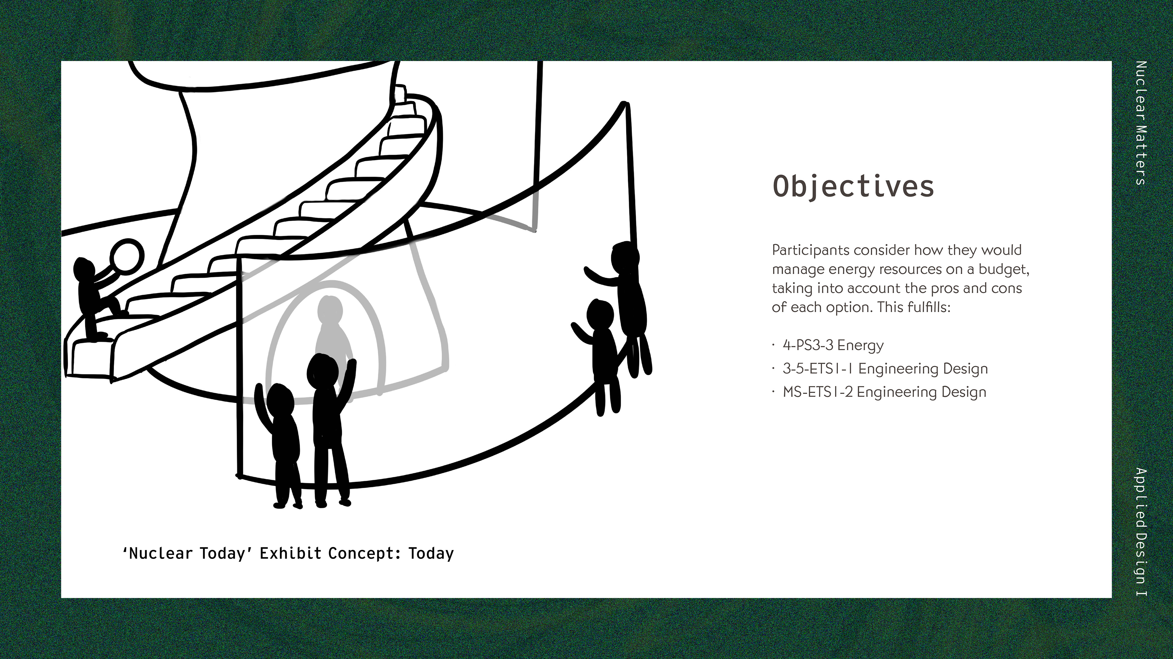
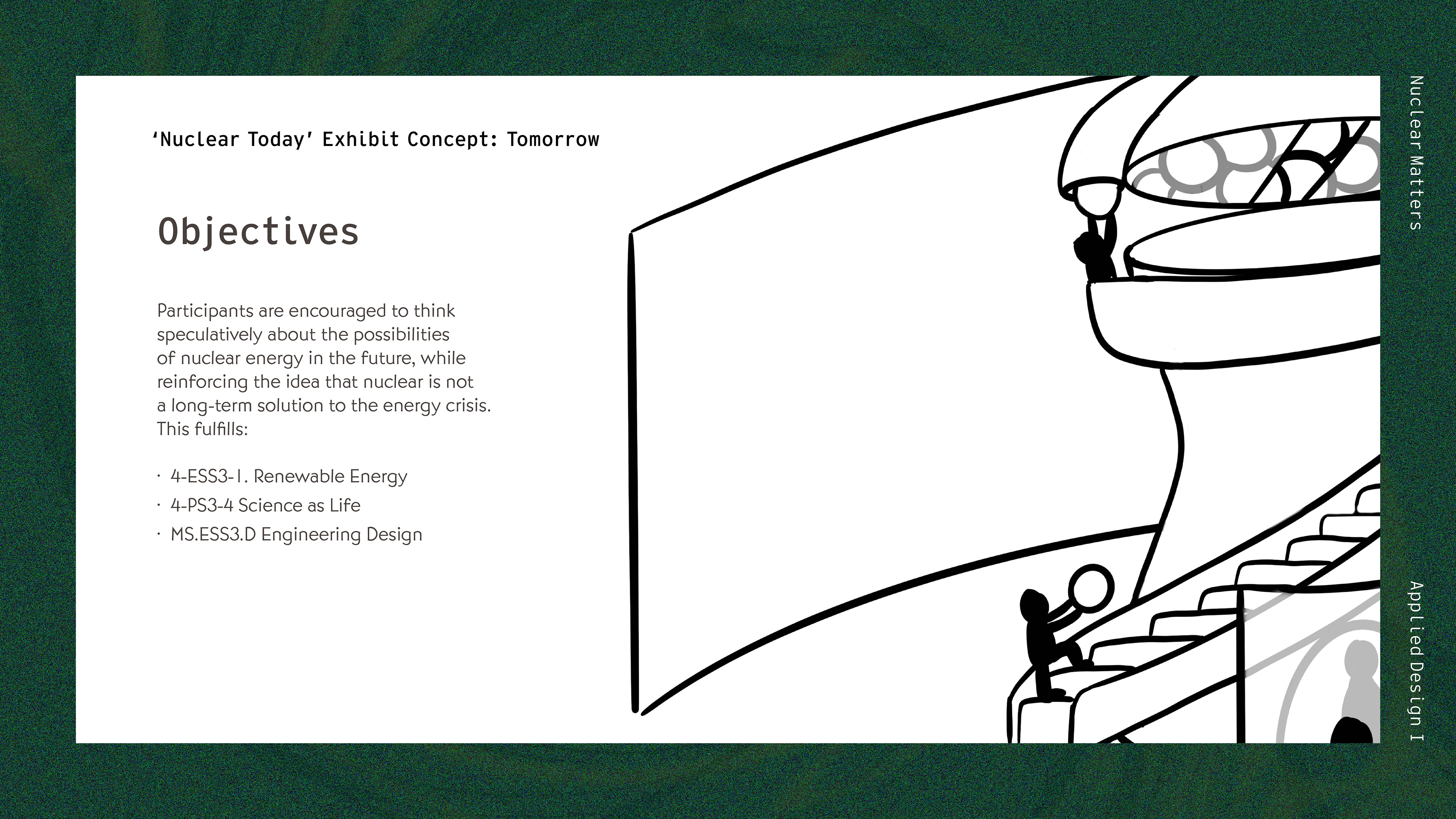
As another deliverable, I wanted to create a positive memorable experience around Nuclear Energy for my youngest demographic, Generation Z. To do this, I conceptualized a sponsored collaboration between Nuclear Matters and COSI - The Center of Science and Innovation. This collaboration would include an interactive, fun exhibit that highlights two key ideas: nuclear energy today and tomorrow. Nuclear Today is a play place for kids 10 years old and younger and digital challenge for kids 10 to 15 years old. Nuclear Tomorrow is an interactive and creative space for all ages. Each of these parts fulfill several key Ohio learning objectives for elementary and middle-school aged children; making the exhibit ideal for field trips and educational outings.
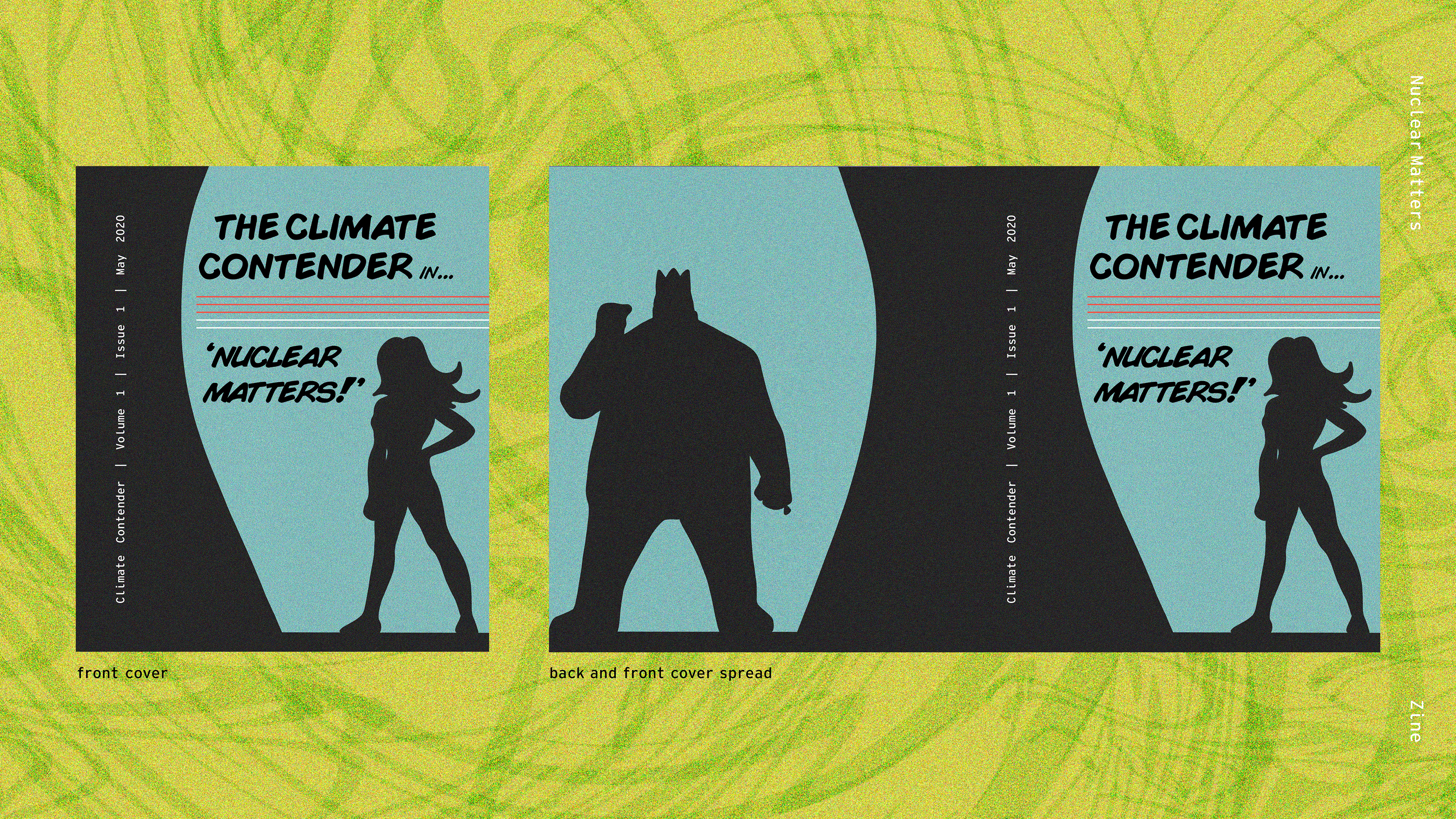
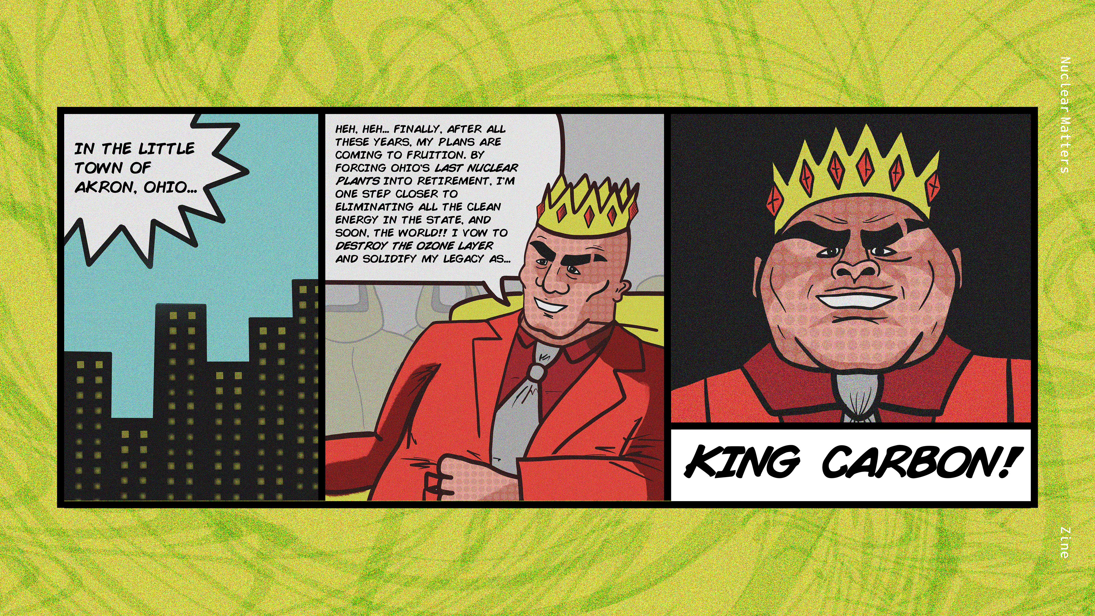
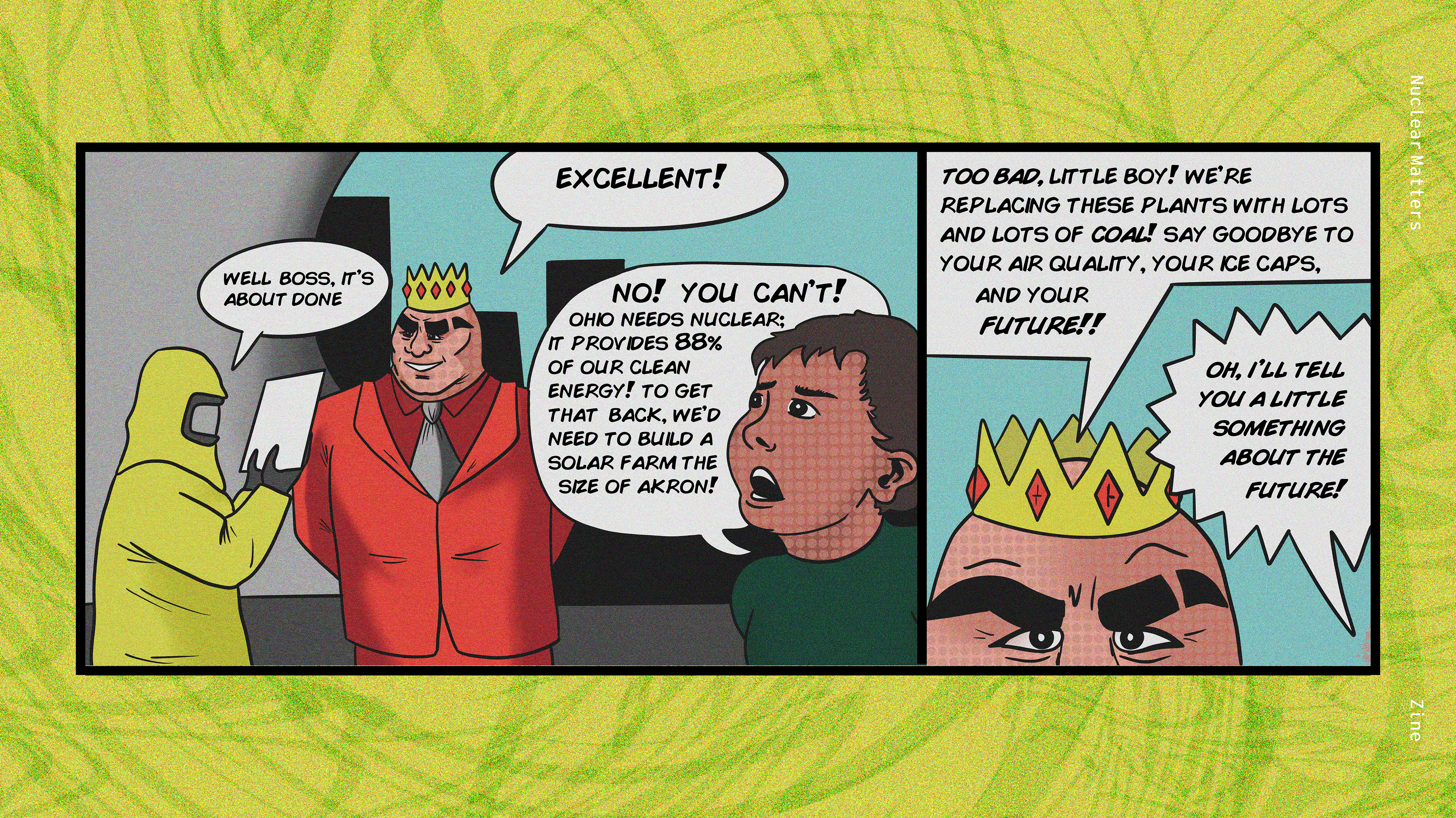
Kids who visit the COSI - Nuclear Matters exhibit receive a comic book-inspired Zine they can take home and collect. The Zine follows the adventures of the Climate Contender, a fictional superhero fighting for nuclear and other forms of clean energy. This take-home deliverable reinforces the ideas of the exhibit while keeping kids engaged and interested in learning more about nuclear energy. The Zine was conceptualized, written, illustrated, and designed by me.
Here is a final look at all of the deliverables and concepts for the Nuclear Matters rebrand and promotional campaign. Thank you for viewing!