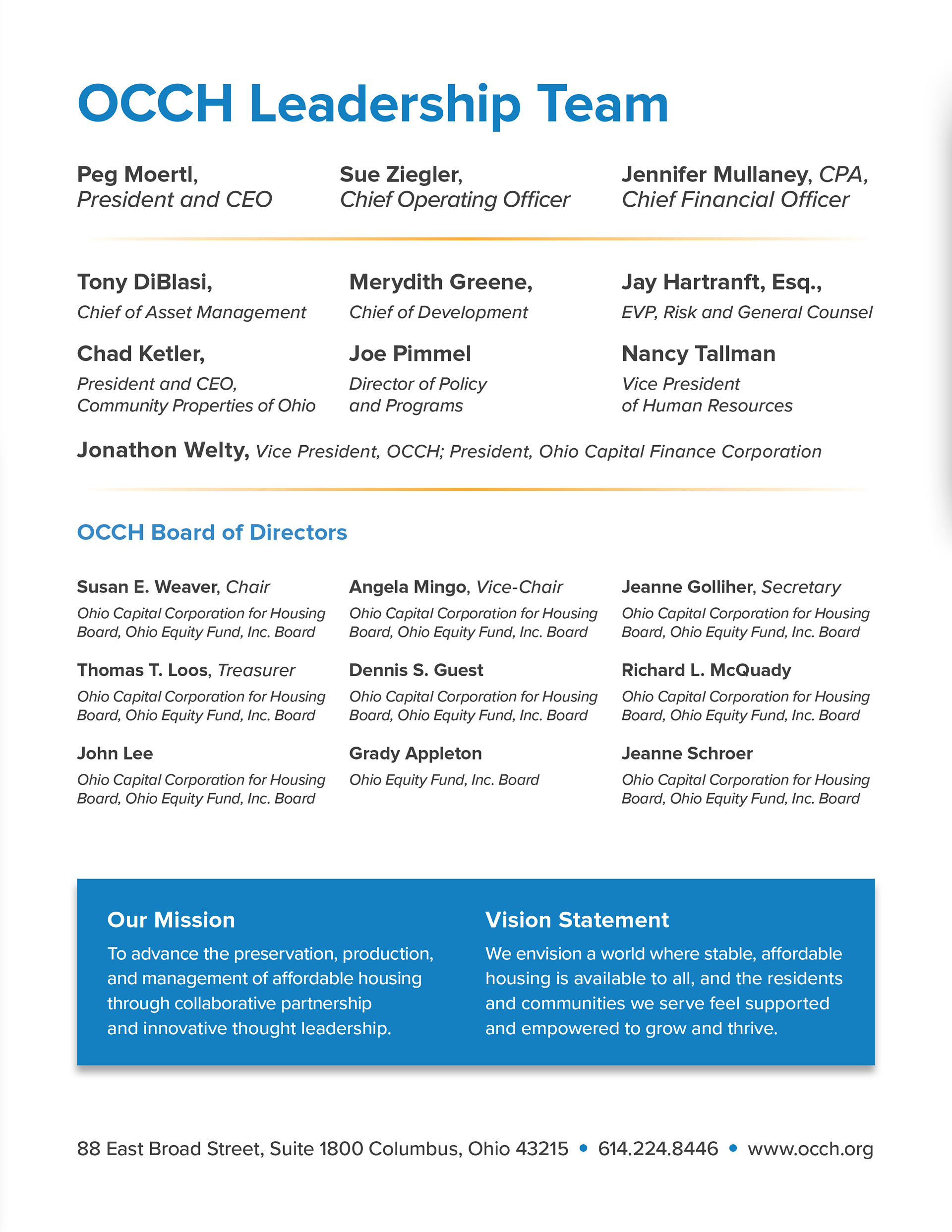
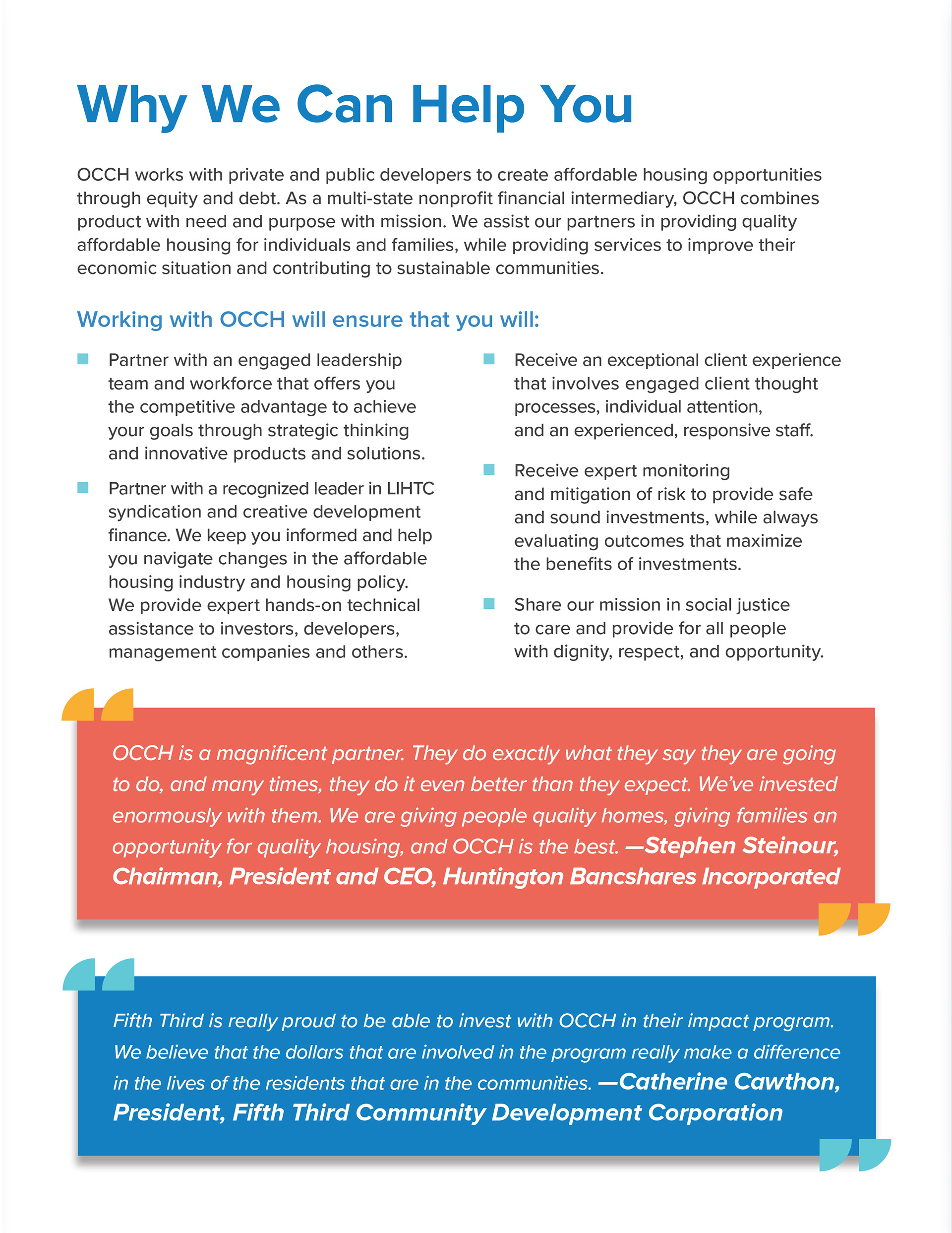
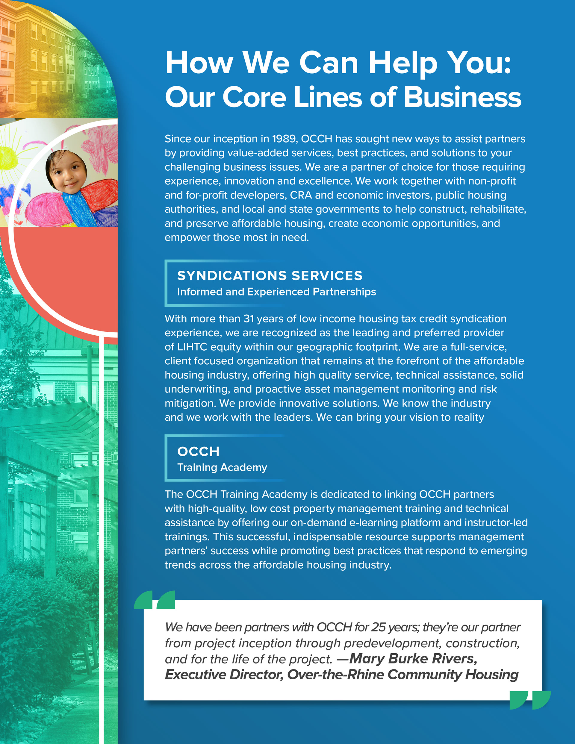
This project started with creating several cover concepts to give the client different options of how we would handle the design of the brochure. The brief requested that we use their full color palette and include photos of their properties and residents. The brochure had to be eye-catching to attract the attention of potential investors, so I explored a route that was bright and abstract. Below are the concepts I created and sent to the client.

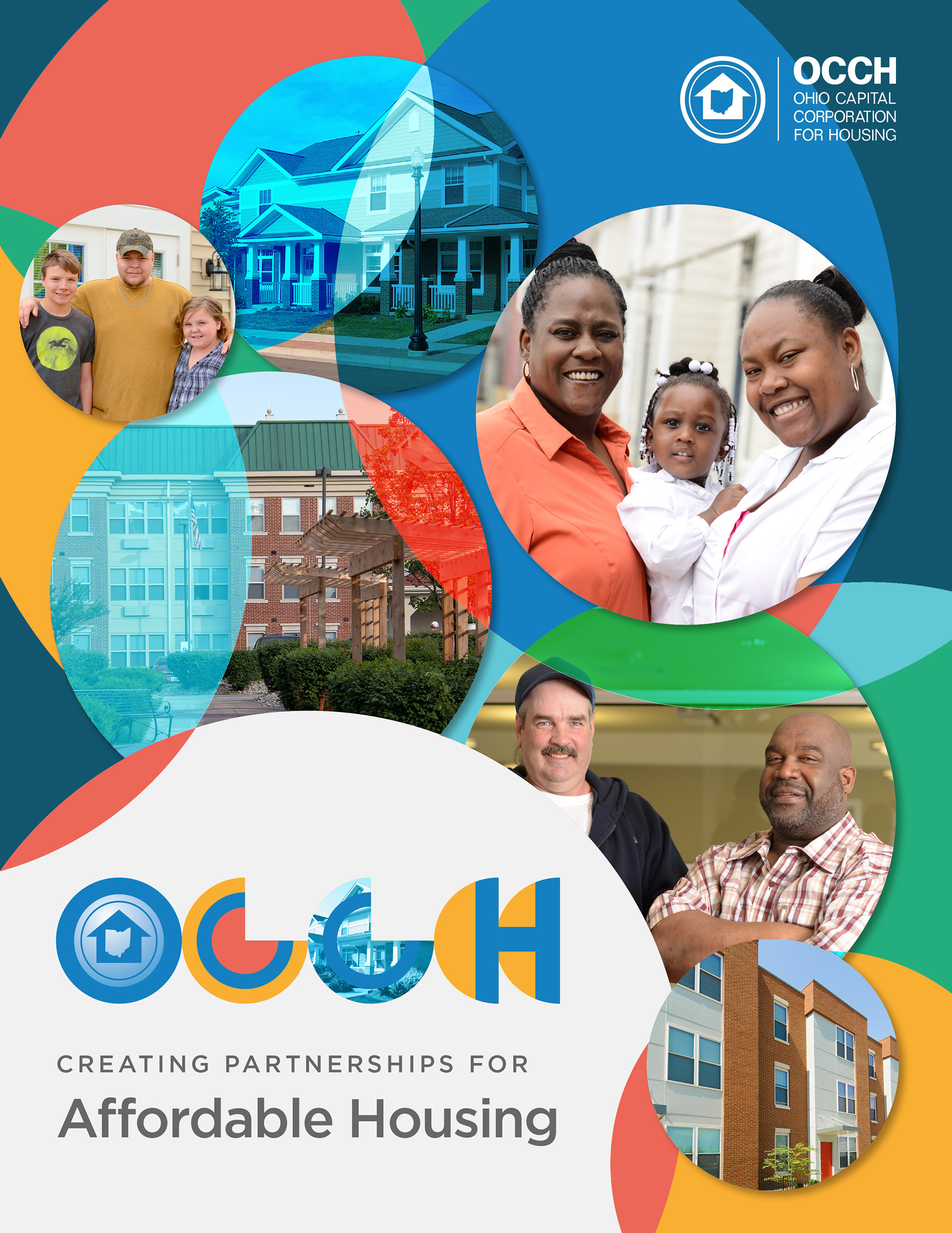
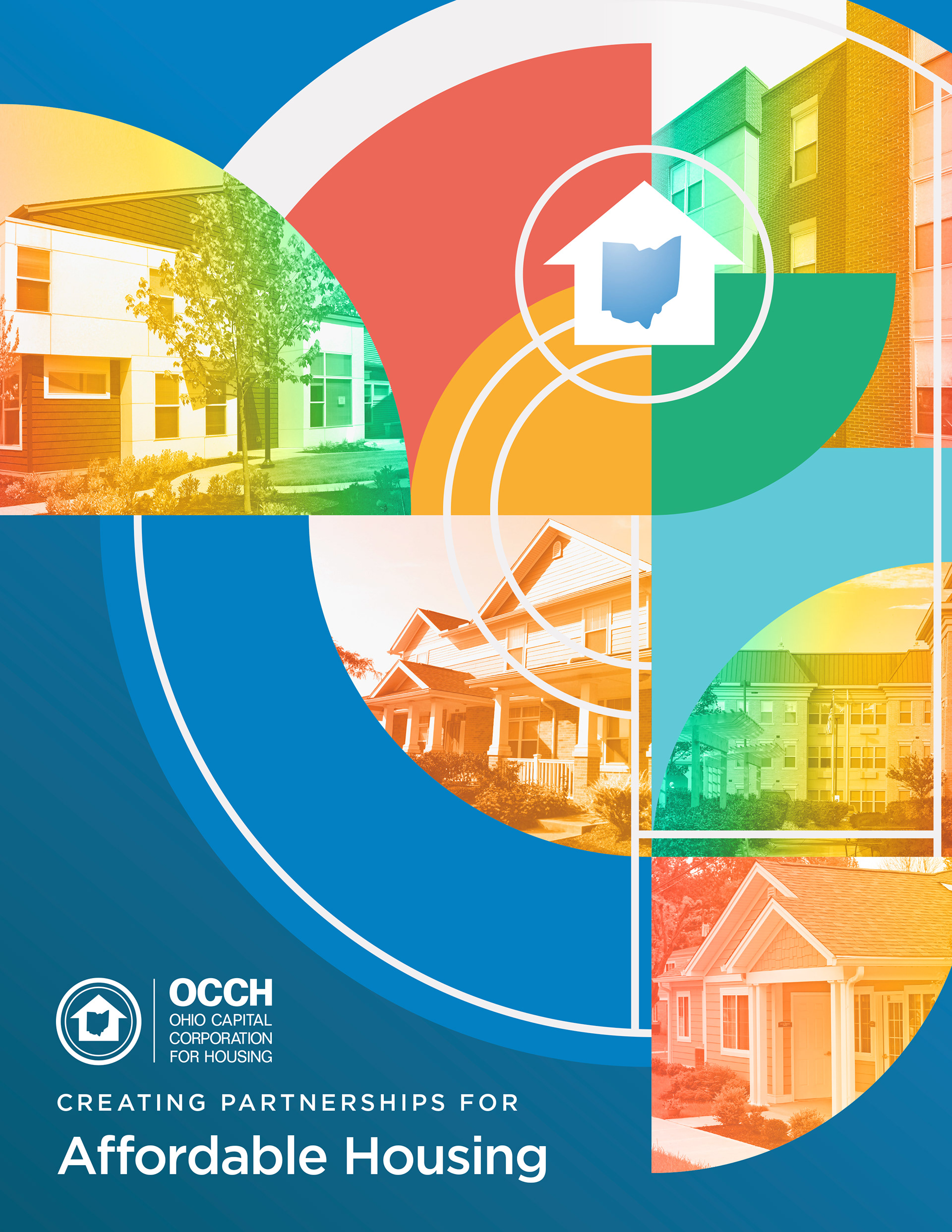
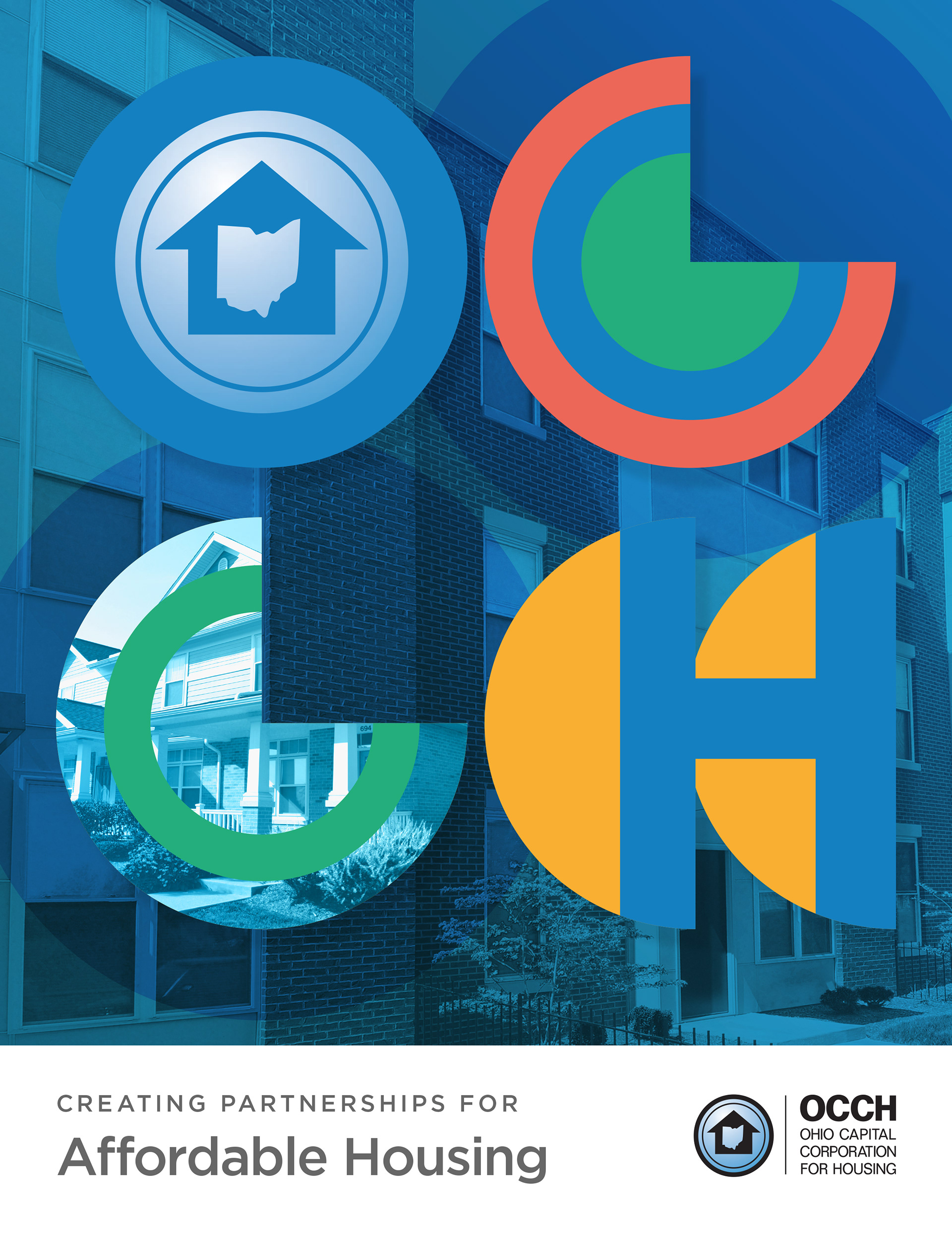
The client chose the third option, but requested photos of residents on the cover similar to the second option. I made these changes and then ran with the rest of the brochure, creating layouts inspired by and incorporating the segmented circle graphics used on the cover. It was a challenge balancing the graphics with the large amount of client-provided copy, but the result was a beautiful brochure with which the client was ecstatic.

